Intro
There’s been a debate raging for many years, which is better: time in the market; or timing the market? In this presentation I’ll show why it matters and how you can achieve superior gains with timing despite what you may have heard in the past.
What is “time-in” the market?
“Time in” the market is all about patience. That is, if you wait long enough, eventually capital growth will come. With this strategy, seeing a good return on your investment is all about spending more time in the market.
What is “timing” the market”
Alternatively, “timing” the market is all about picking when you buy. The idea is to time your purchase to occur just before the next boom. The “timing” approach might also include when to sell.
Alternative terms
- Time in – Wait – Hold – Long-term
- Timing – When – Trade – Short-term
Pros & Cons
Advantages of Holding
Eventually, property prices go up. That’s great for those with time on their hands like young investors.
Disadvantages of Holding
Some markets have been flat for decades in parts of the country. But even 5 years is enough to see a massive difference between a flat and a growing market. You’ll see examples following.
Advantages of Trading
Timing entry into the market gives the investor equity to reinvest sooner, getting compounding to work earlier.
Disadvantages of Trading
The big problem with trading property is the high entry and exit costs. Stamp duty is the biggie when buying. And CGT sucks the most when selling.
The big question
Property doesn’t always grow. In fact, quite often there can be long periods of zero growth and even negative growth. But the big question is whether an investor would be better off selling at the start of those boring periods and investing elsewhere, or holding throughout them.
Selling and re-buying is expensive. Anyway, where will you re-allocate your proceeds from the sale? Will it be much better? Perhaps holding on is the safest bet?
Examples
You’d think that stable markets like Sydney with its truly diversified economy would rarely spend long in the growth doldrums.
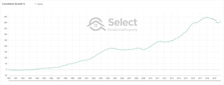
But in the last 30 years Sydney has spent more than half its time with a growth rate on par with inflation – shown in red boxes below…
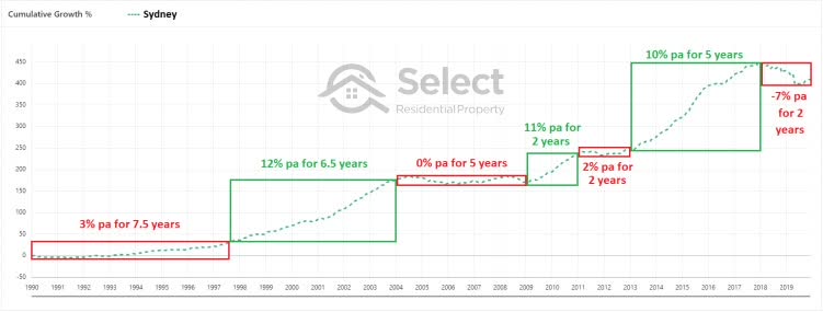
During these red periods, even if an investor’s property was cash-flow neutral, they’re real net position was going nowhere.
There have really only been three periods where ownership of property in Sydney has been worthwhile over the last 30 years – shown in the green boxes. One of those periods only lasted 2 years.
And remember, this is our most economically diverse city. But there are wastelands scattered around Australia with bigger growth gaps than Sydney.
Eyes outside Sydney
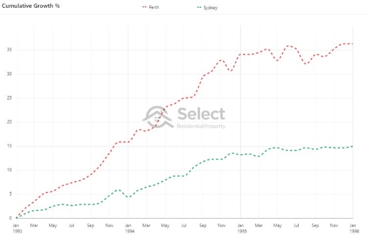
While Sydney was having these poor growth periods, other cities were booming.
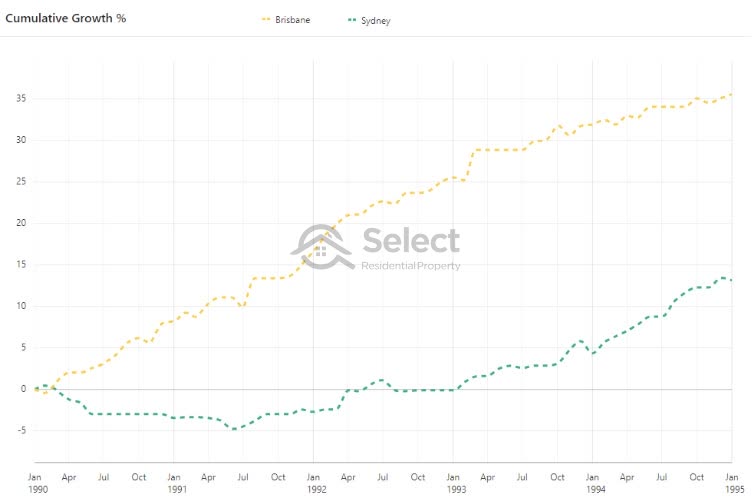
From 1990 to 1995 Brisbane had more than double the growth that Sydney did.
And from 1993 to 1996 Perth had more than double the growth of Sydney.
And from 2004 to 2010 there were 4 major cities that had good/great growth while Sydney was stagnant.
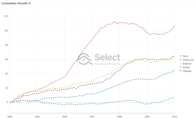
Melbourne’s growth rate was pretty normal at about 6% per annum. But that was still more than 5 times faster than Sydney.
But these are just examples. For more concrete evidence we firstly need a comprehensive sweep of the data rather than cherry picking possibly peculiar cases. Secondly, we need to carefully consider how much it costs to sell and buy elsewhere. And finally, we need a reliable means of picking where to buy and when to sell.
Prior modelling
You may have seen some modelling in the past try to compare the “time-in” and “timing” strategies to see if either had a clear benefit. But all the ones I’ve seen have been fundamentally flawed.
One model I’ve seen concluded that it really didn’t matter “when” you buy. However, that model assumed the investor never sold or bought an additional property. The timing was applied to the 1st and only purchase.
Recycling & Opportunity costs
Another thing crucial for this sort of modelling is estimating recycling and opportunity costs.
- Recycling costs – the cost to exit (i.e. sell) and re-enter (i.e. buy again)
- Exit costs (selling)
- CGT
- Agent’s commission
- Legal fees
- Re-entry costs (buying again)
- Stamp duty
- Legal fees
- Inspections (e.g. building & pest)
- Opportunity costs
- Current property’s predicted growth & rent
- Best alternative property’s predicted growth & rent
- Exit costs (selling)
Bad modelling
Some models I’ve seen have trivial methods for estimating the opportunity cost, or worse still, leave it out entirely.
And some models don’t consider exit costs. I’ve seen one model with incorrect calculations for the exit and re-entry costs.
In one case, the model assumed a trading investor would sell and re-buy every 5 years. I doubt any trading investor would use such a simple strategy. But I’ll show an example of a simple enough strategy where 5 years is set as the maximum hold period. And it actually works pretty well.
And there are some “reports” that reek of bias. It’s a lot easier to pick any suburb and tell your client it will eventually come good … y a w n … in the long-term. It’s the most common excuse I hear for failing to pick a growth market:
“It will perform well in the long-term”
Oddly, I’ve noticed that experts who claim to focus on the long-term aren’t shy of sharing their opinion about the short-term outlook for the property market. Hmm.
My modelling
In the following presentation I’ll model a handful of realistic and practical “timing” strategies and compare them to holding long-term.
Method 1 – last 10 years growth
Timing method 1 looks at the past ten years of growth to see if now is the right time to buy or sell. This method is based on a single metric called the LTG which stands for Long-Term Growth. The LTG is the per annum growth rate for a suburb over the last 10 years.
- LTG = Long-Term Growth
- % p.a.
- Last 10 years
The LTG is presented as a per annum growth rate calculated over a ten year period. It converts a total end-to-end growth into a per annum compounded growth rate. Here are some examples:
| Tot. growth 10 years | LTG % per annum |
|---|---|
| 22% | 2% |
| 22% | 3% |
| 48% | 4% |
| 63% | 5% |
| 79% | 6% |
| 97% | 7% |
| 116% | 8% |
| 137% | 9% |
| 137% | 10% |
This method is not something I’ve ever used nor would advocate investors to use. Instead, I’m simply checking to see if using it to trade property would be better than holding long-term.
The theory
The theory is that the LTG is a very rough gauge of supply and demand. If so, we can use it to determine when to buy and when to sell. Here’s how it works:
Towards the end of a suburb’s boom, higher prices start to push buyers away. This subdues demand such that further price rises slow and eventually stop. But sooner or later demand returns to the market and the cycle continues.
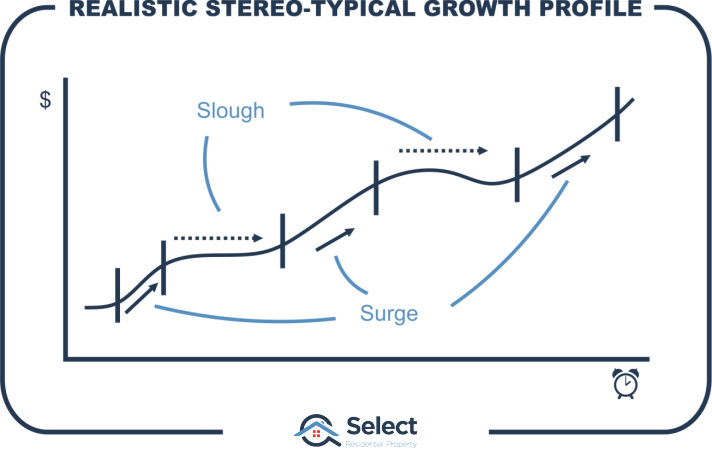
This surge and slough cycle can easily extend beyond ten years. If growth has been below average over the last ten years, we could assume that a market is “ready” for its next surge of growth.
It’s a hell of an assumption to make though since many markets can be depressed for more than ten years. And there’s nothing magical about ten years. Cycles can be quicker or shorter.
So, the LTG does not provide a very accurate means of estimating supply and demand. But it’s of some benefit and we have LTG data dating back decades. So, it’s worth having a look.
If we can use the LTG despite of how crude it is and we manage to outperform the long-term wait and see approach, then surely, we can apply even more metrics and get even better results.
Timing with historical growth
Here’s what I did. I came up with a very simple set of rules to pick which market to buy at any point in time, and another set of rules to know when to sell and buy elsewhere. Then I used the LTG and a bit of recent growth:
Buying rules:
-
- Find a market with an LTG as close as possible to 3% pa
- A low LTG identifies markets possibly due for a growth surge
- LTG must be between 0% pa and 6% pa
- Ignore danger markets (LTG < 0%)
- Ignore markets that may have boomed recently (LTG > 6%)
- Growth last 9 months of more than 4%
- Find markets showing recent green shoots of growth
- 4% over 9 months is faster than the 3% per annum
- 6 months is a bit too soon to say for sure a growth surge is starting
- 12 months is a bit too late to react to the new growth surge
- Find a market with an LTG as close as possible to 3% pa
Selling rules:
-
- Growth last 12 months less than 6% pa
- Growth rates are starting to slow below long-term national avg.
- But don’t sell within 3 years
- Give it a chance
- Good growth surges aren’t usually shorter than 3 years
- LTG is not an immediate growth indicator
- If growth didn’t come, exit quickly and try again elsewhere
- And always sell after 5 years
- 5 or 6 years should be enough time to capitalise on the growth spurt
- If there wasn’t one, exit and try again elsewhere
- We don’t want to wait forever to eventually be proven right
- Admit the mistake, exit early and move on
- Growth last 12 months less than 6% pa
Note:
There’s no examination of other supply & demand metrics. And there’s no examination of infrastructure projects or the economy or jobs or anything else. And of course, there’s no cheating, no looking ahead to see what happened. This is an extremely crude investment algorithm. If timing is so hard, it should not be this easy to outperform holding long-term.
A couple more rules
Before executing this algorithm against past data to see how it would have performed, there are a few more constraints I applied. But if you couldn’t be bothered you can skip the boring details and go straight to the results
Boring details:
- Houses only, not units
- House markets are more widespread than unit markets so there’s more data
- Unit markets don’t perform so well over the long-term. Some might think trading houses would therefore have an unfair advantage if compared against holding units long-term.
- At least 48 sales per year
- Small suburbs or low sales volume produce unreliable median values
- We need values for each market to be accurate to calculate accurate capital growth
- Calculate growth at the SA4 level not suburb level
- See next section on Capital growth calculations for a detailed explanation
Capital growth calculations
Capital growth is notoriously inaccurate when calculated at the suburb level. In fact, typically 1% of a suburb sells during a single month. This may be only half a dozen properties.
What if 3 out of 5 properties that sold in a month happened to be really cheap? Perhaps they were run-down on smaller blocks in less desirable streets of the suburb. In that case, the median for that month would be lower than the typical value of properties across the entire suburb. In this case, the median would be unrepresentative of the typical value of properties in that suburb.
Imagine next month another 5 sell. But this time 3 of them just happen to be really expensive. Perhaps they were in quiet streets on big blocks and were double storey houses in good condition. In this case, we’d see a really high median. Going from one month to the next, the median jumped dramatically making it look like there was amazing capital growth. But there may have been zero growth at all. Really it’s just a peculiarity with the data.
Zoom out
We can get around such misleading results by using a larger geography. This is because it’s less likely that the majority of sales will be in the same segment – e.g. cheap. In other words, the bigger the geography, the more the numbers balance out and the more reliable the median becomes.
Step back
Another trick to help get more accurate measures is to look at a wider time-frame. In most of the cases that follow, the median quoted is a 12-month median. That means it consists of sale prices over a 12-month period. This is far more accurate than sales over a 1-month period.
Suburb vs. SA4
In this analysis, I have used a geography that is a lot larger than a suburb. It’s called an SA4 – Statistical Area Level 4. These are defined by the Australian Bureau of Statistics in such a way as to make the population for each SA4 roughly the same.
There’s a hierarchy to the Statistical Areas:
- SA4 – like a region
- SA3 – like an LGA
- SA2 – like a suburb
- Another SA2
- Yet another SA2
- …
- SA3
- An SA2
- Another SA2
- Yet another SA2
- …
- SA3
- An SA2
- Another SA2
- Yet another SA2
- …
- …
- SA3 – like an LGA
SA4s consist of a set of SA3s. And SA3s consist of a set of SA2s. And SA2s consist of a set of SA1s.
An SA3 most closely resembles a local government area, i.e. your local council’s jurisdiction. An SA2 is roughly the size of a suburb. And an SA1 is part of a suburb, it might be only a few blocks.
The capital growth calculations in the following model are at the SA4 level to try and make them less debateable.
January 2000
The first SA4 the algorithm picked in January 2000 was “Shepparton”. By the way, I had nothing to do with this, it was the algorithm that picked it.
| Suburb | Buy mth | Buy val. | LTG at start | Recent growth % tot. | Sell or end mth | Sell or end val. | Years owned | LTG at sale | Cap. Gro. % tot | Buy costs | Sell costs | CGT | Post-tax gain | Comp-ounded gain % |
|---|---|---|---|---|---|---|---|---|---|---|---|---|---|---|
| Case 1 | ||||||||||||||
| Shepparton | Jan-00 | $94k | 2.7% | 14.6% | Feb-03 | $114k | 3.1 | 4.8% | 20.7% | $3.8k | $2.8k | $2.6k | $10k | 11% |
Buying
The median value in January 2000 for the Shepparton SA4 was $94,000. At that time its LTG of 2.7% was close to our target of 3%. And recent growth leading up to January 2000 was 14.6% – satisfying our buying rules.
Selling
Using our selling rules we would have sold out of the Shepparton SA4 just over 3 years later. By then the median had risen to $114,000.
Notice that the LTG went up to 4.8% from 2.9% over those years. As a result, we gathered 20.7% in capital growth.
Gain
To calculate a net gain we need to consider entry and exit costs. It cost us $3,800 when we bought. This was the total of: stamp duty, legal fees and inspections.
Moving on, the sale in Feb 2003 cost us $2,800. Which was mostly the agent’s commission. That didn’t include CGT which was another $2.6k = ($114k – $94k – $3.8k – $2.8k) x 50% CGT discount x 40% marginal tax rate.
All up, we only made $10k after tax. As a percentage of the original purchase price, it’s a measly 11% which is pretty bad for 3 years.
Simplifications
Note that I have excluded rental income, holding costs and depreciation from calculations for a couple of reasons. Firstly, they’re going to work out to be very similar to holding long-term anyway. Secondly, it simplifies the modelling. But most importantly, they’re insignificant compared to the differences in capital growth between trading and holding long-term. Taking net cash-flow into consideration would open up even more alternative markets to choose from, some with better net yields.
How’d we go?
The growth chart of Shepparton medians shows the market didn’t respond as we expected.
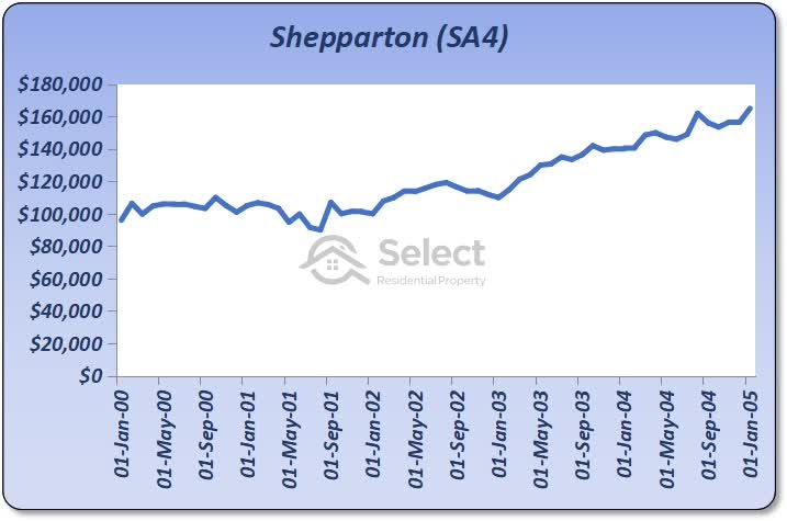
The SA4 was quite sluggish for the first 3 years. But then prices took off – just after we sold! Holding on a little longer would have proved very fruitful. This is a case where the simplicity of the algorithm worked against us.
Note that we’re not buying a specific house in a specific suburb of Shepparton. Instead, these performance calculations are based on the average for the SA4. So, in practise we could improve on this performance. We could buy a suburb in that SA4 that beat the SA4’s average. And we could buy a property in that suburb that beat the suburb’s average.
Next trade
After selling out of Shepparton in Feb 2003, the algorithm told us to buy again a few months later (May 2003) in a Queensland SA4 called, “Wide Bay” which is around Bundaberg.
| Suburb | Buy mth | Buy val. | LTG at start | Recent growth % tot. | Sell or end mth | Sell or end val. | Years owned | LTG at sale | Cap. Gro. % tot | Buy costs | Sell costs | CGT | Post-tax gain | Comp-ounded gain % |
|---|---|---|---|---|---|---|---|---|---|---|---|---|---|---|
| Case 1 | ||||||||||||||
| Shepparton | Jan-00 | $94k | 2.7% | 14.6% | Feb-03 | $114k | 3.1 | 4.8% | 20.7% | $3.8k | $2.8k | $2.6k | $10k | 11% |
| Wide Bay | May-03 | $130k | 3.0% | 13.0% | May-06 | $230k | 3.0 | 9.0% | 76.9% | $5.2k | $5.8k | $18k | $71k | 72% |
The median value for this SA4 was $130,000 at that time. 3 years later, the algorithm told us to sell in May 2006 when the median was $230,000. The LTG shot up to 13%. There was a gross gain of 77%. But because of entry and exit costs, including CGT, we ended up only $71k richer.
Accumulating gains
The rightmost column takes the gain from the last trade (which was 11%) and compounds it with the gain of the most recent trade to give a total cumulative compounded gain of 72% after 2 trades. That’s not 72% for the Wide Bay property, it’s 72% overall for both Shepparton and Wide Bay trades:
- First trade: $10k as a percentage of $94k = 11%
- Second trade: $71k as a percentage of $130k = 55%
- ((1 + 0.11) x (1 + 0.55)) – 1 = 0.72 or 72%
Some of the dollar figures have been rounded to the nearest thousand.
Remember that a doubling in value is the same as multiplying by 2 which is the same as growing by 100%.
How’d we go?
Here’s how the SA4 performed over those 3 years.
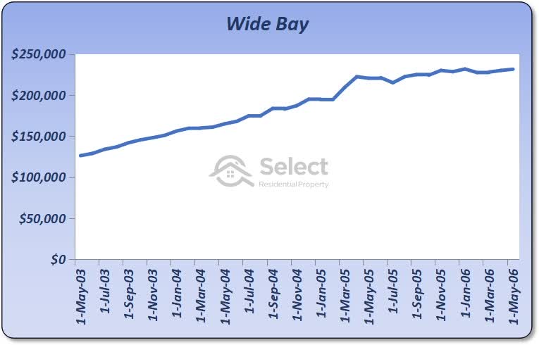
Our total compounded gain after the 2nd sale was 72% and 6 years have passed at this stage. Now things are looking pretty good.
More trades
There were 3 more purchases to bring us to the end of 2019 (time of writing).
| Suburb | Buy mth | Buy val. | LTG at start | Recent growth % tot. | Sell or end mth | Sell or end val. | Years owned | LTG at sale | Cap. Gro. % tot | Cap. Gro. % pa | Buy costs | Sell costs | CGT | Post-tax gain | Comp-ounded gain % |
|---|---|---|---|---|---|---|---|---|---|---|---|---|---|---|---|
| Case 1 | |||||||||||||||
| Shepparton | Jan-00 | $94k | 2.7% | 14.6% | Feb-03 | $114k | 3.1 | 4.8% | 20.7% | 6.3% | $3.8k | $2.8k | $2.6k | $10k | 11% |
| Wide Bay | May-03 | $130k | 3.0% | 13.0% | May-06 | $230k | 3.0 | 9.0% | 76.9% | 20.9% | $5.2k | $5.8k | $18k | $71k | 72% |
| Sydney – Inner South West | Nov-09 | $565k | 5.8% | 4.6% | Nov-12 | $696k | 3.0 | 3.9% | 23.2% | 7.2% | $23k | $17k | $18k | $73k | 94% |
| Sydney – South West | Feb-13 | $475k | 3.3% | 5.5% | Nov-16 | $755k | 3.7 | 7.3% | 58.8% | 13.1% | $19k | $19k | $48k | $193k | 173% |
| Hobart | Feb-17 | $383k | 3.0% | 4.9% | Dec-19 | $507k | 2.8 | 29.0% | 9.5% | $15k | n/a | n/a | $109k | 251% |
Note:
It takes time to sell a property and sign a contract for a replacement. This is included in the model. In fact, there were some periods where we couldn’t find a suitable replacement – nothing satisfied our buying rules. When the algorithm sold out of Wide Bay in May 2006 it bought in “Sydney – Inner South West”. But it took till November 2009 for that case to appear. There was nothing else that satisfied our buying rules.
Also, note that there was no time for a final sale of the last SA4, “Hobart”. It was only held for 2.8 years. So, for this last purchase the selling costs are not deducted. But there has been some equity gain, so this is added to the total compounded gain of 251%.
Let’s compare this trading performance with holding long-term.
Comparisons
If we held onto Shepparton for the full term of twenty years, values would now be around $257,000. That’s a gain of 169%. But “trading” in and out of SA4s gave us over 250%. So, “trading” outperformed “holding” in this case.
By the way, the total growth on average for any property market in Australia for that 20-year period was 277%. So, “trading” failed to beat the national average long-term “hold”. In other words, if you had picked any property market at random and held long-term, you would have beaten this first case of trading. That actually makes it a fail in my opinion.
Summary:
- Trading 251%
- Trading outperformed
- Holding 169%
- Trading underperformed
- National average 279%
- Sydney, Melbourne & Brisbane average 298%
- Syd, Mel & Bris within 10km of CBD average 331%
- Best significant urban area (Hobart) 402%
- Top SA4 (Mornington Peninsula) 450%
Overall, this trading case was a failure. It was beaten by almost every benchmark. But we need to examine more cases to be sure this LTG algorithm sucks.
Repeat cases
I re-ran the algorithm over the same time-frame with instructions not to select Shepparton, but to start with the second best SA4 instead. It picked “Sydney – Outer West and Blue Mountains”.
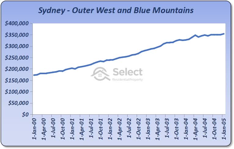
Case #2 had a very different end result with a total compounded gain of 560% – more than double the first case!
Case #2
| Suburb | Buy mth | Buy val. | LTG at start | Recent growth % tot. | Sell or end mth | Sell or end val. | Years owned | LTG at sale | Cap. Gro. % tot | Cap. Gro. % pa | Buy costs | Sell costs | CGT | Post-tax gain | Comp-ounded gain % |
|---|---|---|---|---|---|---|---|---|---|---|---|---|---|---|---|
| Case 2 | |||||||||||||||
| Sydney – Outer West and Blue Mountains | Jan-00 | $173k | 3.4% | 15.5% | Jan-05 | $355k | 5.0 | 11.0% | 104.6% | 15.4% | $6.9k | $8.9k | $33k | $132k | 76% |
| Queensland – Outback | Apr-05 | $122k | 4.0% | 11.1% | Jan-10 | $302k | 4.8 | 11.3% | 147.3% | 21.0% | $4.9k | $7.6k | $34k | $134k | 270% |
| Sydney – Sutherland | Apr-10 | $685k | 5.7% | 8.5% | Apr-13 | $760k | 3.0 | 3.2% | 11.0% | 3.5% | $27k | $19k | $5.8k | $23k | 283% |
| Sydney – Inner South West | Jul-13 | $740k | 3.1% | 6.3% | Aug-16 | $1.1m | 3.1 | 7.6% | 46.8% | 13.2% | $30k | $27k | $58k | $232k | 402% |
| Hobart | Nov-16 | $385k | 3.0% | 6.6% | Dec-19 | $521k | 3.1 | 39.6% | 11.4% | $15k | n/a | n/a | $121k | 560% |
Prices doubled in the 5 years following Jan-2000 in the “Sydney – Outer West and Blue Mountains” SA4. And the next trade was even better – “Queensland – Outback”. This gave us capital growth of 147% in less than 5 years. There was only one trade that failed to deliver double-digit growth.
How’d we go?
If we’d held onto the property we bought in “Sydney – Outer West and Blue Mountains”, our total cumulative gain would have only been 271%. We were literally twice as better off even after all the CGT and mucking about.
And we beat the national total growth over the same time-frame which was 279%. We also beat the 3 major cities and their inner rings. In this case, the algorithm even beat the best performing SA4 in the country over the total time-frame. Trading in case 2 clearly was better than holding long-term.
Here are the comparisons:
- Trading 560%
- Trading outperformed
- Holding 271%
- National average 279%
- Sydney, Melbourne & Brisbane average 298%
- Syd, Mel & Bris within 10km of CBD average 331%
- Best significant urban area (Hobart) 402%
- Top SA4 (Mornington Peninsula) 450%
- Trading underperformed
- Nothing
So far
At this stage we’ve got one fail and one success for this algorithm. I repeated this process again several times. Each time I told the algorithm to ignore the best SA4s from earlier cases. I repeated this 20 times. Here are the comparisons:
- Trading average 496%
- Trading outperformed
- Holding 310%
- National average 279%
- Sydney, Melbourne & Brisbane average 298%
- Syd, Mel & Bris within 10km of CBD average 331%
- Best significant urban area (Hobart) 402%
- Top SA4 (Mornington Peninsula) 450%
- Trading underperformed
- Nothing
There was only 1 case out of 20 where the trading algorithm failed to beat holding long-term. And the average performance was better than the best performing SA4 in the country over that time-frame. Pretty impressive for an algorithm that uses only one metric.
I stopped at 20 cases because the more cases I examine, for the same time-frame, the worse the algorithm performs. This is because I’m asking it to pick the next best SA4, not one of the top 20.
More testing
Just to make sure there wasn’t something special about January 2000, I repeated the 20 test cases starting from June 2000 instead of January 2000. Summarising all 20 cases:
- 100% of trading cases outperformed holding long-term
- Average trading performance 501%
- Average holding performance 295%
- All Australia average performance 264%
- Sydney, Melbourne, Brisbane combined 283%
- Sydney, Melbourne, Brisbane combined within 10km of the CBD 313%
- Best performing state capital (Hobart) 387%
- Top performing significant urban area (Hobart) 387%
- Best performing SA4 (Mornington Peninsula) 397%
Notice how not a single long-term hold benchmark managed to outperform trading.
Repeating
That’s only two time periods tested: from January 2000 and from June 2000. So, I repeated the process again for January 2001. The results were again very impressive:
- 95% of trading cases matched or outperformed holding long-term
- Average trading performance 418%
- Average holding performance 276%
- All Australia average performance 252%
- Sydney, Melbourne, Brisbane combined 271%
- Sydney, Melbourne, Brisbane combined within 10km of the CBD 297%
- Best performing state capital (Hobart) 396%
- Top performing significant urban area (Hobart) 396%
- Best performing SA4 (South East) 382%
And for June 2001 it was once again the same story.
Last 15 years
I tested the algorithm again from 15 years ago (i.e. 2005) rather than 20 years ago. However, the algorithm could only find 7 cases that matched our buying rules at that time. So, I couldn’t test over 20 cases:
- 100% of trading cases outperformed holding long-term
- Average trading performance 214%
- Average holding performance 77%
- All Australia average performance 78%
- Sydney, Melbourne, Brisbane combined 98%
- Sydney, Melbourne, Brisbane combined within 10km of the CBD 125%
- Best performing state capital (Melbourne) 154%
- Top performing significant urban area (Melbourne) 154%
- Best performing SA4 (Melbourne – Inner East) 186%
Method 1 conclusion
That’s a lot of SA4s examined over a number of different periods and clear results in every case. This is enough testing to know that trading has been better than holding if you used this simple LTG algorithm over the last 20 or 15 years.
Remember that this is a very limited algorithm. We’re only considering one metric – LTG. If we applied more metrics, we’re far more likely to improve on these results. And that’s before we even started our fundamental (i.e. non-numerical) research.
Now, some might argue I haven’t used a long enough period of time or there’s something fishy with SA4s or I got lucky with LTGs. So, let’s use a different algorithm with older data and compare at the suburb level.
Now that you get the idea of how I’m analysing an algorithm, I’ll go through this next one a bit quicker.
Method 2 – Neighbour Price Balancing
Neighbour Price Balancing (NPB) is a measure of the difference between the typical value of a suburb’s properties and those of its neighbours. Suburbs surrounded by more expensive suburbs may have gone unnoticed for a period of time and may now be undervalued. Once buyers recognise this, the suburb should go through a period of accelerated growth to “catch up” with fair value compared with its neighbours.
Buying rules
-
- Find a suburb with a median between 20% and 40% lower than neighbours
- A high NPB (20%+) might identify undervalued suburbs
- A ridiculouslyhigh NPB (40%+) might identify a problem/anomaly
- A neighbour must be within 10km of the suburb examined
- The suburb must have at least 10 qualifying neighbours
- Only the closest 20 qualifying neighbours are considered
- Growth last 9 months between 4% and 12%
- Find markets showing recent green shoots of growth (i.e. 4%+)
- Ignore markets showing too much recent growth (i.e. 12%+)
- 6 months is a bit too soon to say for sure a growth surge is starting
- 12 months is a bit too late to react to the next growth surge
- Find a suburb with a median between 20% and 40% lower than neighbours
Selling rules
These are much the same as for LTG except:
-
- Sell after a minimum of 2 years if nothing is happening
- Hang on for 6 years if growth is still above average
To save you time, I won’t delve into the additional rules for the NPB. They’re similar to those for the LTG anyway. They mostly exclude markets from consideration if they have unreliable data, for example, due to a low count of sales over the last 12 months.
Following is a list of the trades made from 1990 using NPB as the primary metric for choosing when to buy and when to sell.
1990
| Suburb | Buy mth | Buy val. | Typical neighb value | NPB | # of neigbs | Sell or end mth | Sell or end val. | Years owned | Cap. Gro. % tot | Cap. Gro. % pa | Buy costs | Sell costs | CGT | Post-tax gain | Comp-ounded gain % |
|---|---|---|---|---|---|---|---|---|---|---|---|---|---|---|---|
| Case 1 | |||||||||||||||
| INVERMAY TAS 7248 | Jan-90 | $52k | $71k | 36.9% | 16 | Dec-92 | $60k | 2.9 | 16.5% | 5.4% | $2.1k | $1.5k | $1 | $4.0k | 8% |
| GLEN ALPINE NSW 2560 | Mar-93 | $82k | $112k | 36.6% | 10 | Jan-96 | $95k | 2.8 | 15.9% | 5.4% | $3.3k | $2.4k | $1.5k | $5.9k | 15% |
| CARRARA QLD 4211 | Apr-96 | $159k | $194k | 22.0% | 13 | Apr-98 | $160k | 2.0 | 0.6% | 0.3% | $6.4k | $4.0k | -$1.9k | -$7.5k | 10% |
| CARLTON NSW 2218 | Jul-98 | $280k | $377k | 34.7% | 14 | Jan-01 | $365k | 2.5 | 30.4% | 11.2% | $11k | $9.1k | $13k | $52k | 30% |
| BLAIR ATHOL NSW 2560 | Apr-01 | $121k | $168k | 39.4% | 13 | Oct-04 | $370k | 3.5 | 207.1% | 37.8% | $4.8k | $9.3k | $47k | $188k | 234% |
| KOONDOOLA WA 6064 | Jan-05 | $166k | $229k | 38.2% | 16 | Feb-08 | $328k | 3.1 | 97.3% | 24.5% | $6.6k | $8.2k | $29k | $117k | 470% |
| NEWCOMB VIC 3219 | May-08 | $214k | $295k | 38.2% | 12 | Jul-11 | $275k | 3.2 | 28.6% | 8.2% | $8.5k | $6.9k | $9.1k | $37k | 567% |
| ST KILDA VIC 3182 | Oct-11 | $750k | $990k | 32.0% | 13 | Oct-13 | $635k | 2.0 | -15.3% | -8.0% | $30k | $16k | -$32k | -$129k | 453% |
| ST KILDA VIC 3182 | Oct-11 | $750k | $990k | 32.0% | 13 | Oct-13 | $635k | 2.0 | -15.3% | -8.0% | $30k | $16k | -$32k | -$129k | 453% |
| WILLAGEE WA 6156 | Jan-14 | $573k | $771k | 34.6% | 14 | Jan-16 | $585k | 2.0 | 2.1% | 1.0% | $23k | $15k | -$5.1k | -$20k | 433% |
| DALLAS VIC 3047 | Apr-16 | $325k | $452k | 39.1% | 17 | Mar-19 | $470k | 2.9 | 44.6% | 13.6% | $13k | $12k | $24k | $96k | 591% |
Assessment
The 1st few trades didn’t go so well. And it looks like the algorithm is turning over stock a little bit too quickly – see the ‘Years owned’ column. But by the end of the 30 years, the total compounded gain was 591%.
Note that with this modelling we’re not starting with a specific amount of money. If we had a million dollars to invest, we’d buy a dozen properties in Coopers Plains and Moonah. However, the modelling does assume we’re compounding our gains through each trade. The important figure is the one in the bottom right corner of the table.
How’d we go?
If we’d held the first property in Invermay, we’d have compound gains of only 503%.
Repeating the process with the 20 next best alternatives we have the following performance summary:
- 75% of trading cases outperformed holding long-term
- Average trading performance 606%
- Average holding performance 469%
- All Australia average performance 469%
- Sydney, Melbourne, Brisbane combined 497%
- Sydney, Melbourne, Brisbane combined within 10km of the CBD 665%
- Best performing state capital (Hobart) 569%
- Top performing significant urban area (Batemans Bay) 897%
- Best performing SA4 (Richmond – Tweed) 779%
Repeating the same process but starting a year later and again 2 years later, the results were pretty much the same.
Method 2 conclusion
Using the NPB over the last 30 years, investors would have been better off trading rather than holding long-term. Even though the NPB’s performance wasn’t as impressive as the LTG, it still beat “holding” long-term in most cases.
Method 3 – Ripple Effect Potential
Another metric for which we have 30 years of data is the Ripple Effect Potential (REP). It’s a measure of the growth that has occurred in neighbours relative to the growth in the target suburb. If neighbours have more recent growth than our target, then we can expect growth to flow into our target suburb.
Rather than bore you with details for yet another algorithm I’ll cut to the bottom line/s:
- Trading beat holding long-term in 70% of cases
- The average trading performance was 429%
- The average holding performance was 377%
- The national avg. growth rate was 448%
Assessment
The REP was not as effective as the NPB or the LTG. However, it was still better to trade than to hold in most cases. However, holding long-term in a carefully selected area may have outperformed trading using the REP.
Some refining of the parameters of the REP algorithm could have improved its performance. But it’s still pretty impressive to think that a single metric algorithm can perform so well. Combining all 3 metrics is bound to produce far better results with fewer failures. And there are a lot more than 3 metrics available for investors to use now days.
Modelling caveats
The modelling for these algorithms had some simplifications that need to be disclosed.
Incomplete equity allocation
Firstly, modelling assumed that an investor could completely allocate all of their funds in each market. But depending on typical price ranges of properties, this might not always be the case.
For example, you may have a budget of $1m but you’ve targeted a market in which houses sell for $600k to $800k. You can’t afford to buy two at $600k and an $800k purchase will leave some equity leftover.
This first shortcoming of the modelling unfairly favours trading. In practise, trading won’t perform so well.
Illogical sell timing
A second shortcoming is with exiting or selling. Ordinarily, the approach would be to look for better markets elsewhere and compare that opportunity cost against the recycling costs of selling and re-buying. If opportunity exceeds recycling, then you’d sell.
The modelling in this study firstly assumed there would always be a better market after 5 or 6 years. And secondly, assumed there was never a better market prior to 2 or 3 years.
Including a comparison of opportunity costs to recycling costs would complicate the modelling too far and wasn’t necessary anyway to prove the point. So, trading could be improved with more logical sell decisions.
Renovating
Another benefit of trading property as opposed to just sitting on it, is that you get more frequent renovation opportunities.
- Time in/wait
- Complete renovation about every 15 years
- Timing/when
- Complete renovation every 3-5 years
If you own a property long-term, you may only get a couple of chances to complete a full-scale renovation in your lifetime. You can’t keep renovating the same property every 5 years, they don’t deteriorate that quickly.
But if you buy a property that has some renovation potential, you can ride the wave of growth and then renovate before selling after a few years to add even more value. You can repeat that value-adding procedure far more frequently with the “trading” approach than with the “holding” approach.
And this is not limited to renovations. You could also throw subdivisions and developments in that list too.
Summarising
Summarising the benefits of timing the market:
- Accumulate a safety margin more quickly in case you’re forced to sell too soon
- Leverage from gains sooner to start compounding sooner with next purchase
- Don’t know how long you’ll have to wait with the long-term hold approach
- May have a short horizon, e.g. if you’re nearing retirement
- You may be able to “trade” property by timing your exit too
- Better data now days making even simple algorithms more successful than holding
- More frequent value-adding opportunities
Conclusion
As you can now see, timing entry and exit into and out of the market does indeed improve performance when compared to time in the market.
However, it takes quite a bit of data know-how to time it right. There’s a risk a novice investor may end up spending more money in recycling costs than they save in opportunity costs. For this reason, it’s actually not bad advice that experts give to beginners – to play the waiting game.
If on the other hand you’re employing the services of a professional, then they should have access to this kind of data and know-how.
If they still advise holding long-term, then you don’t really need their help; you can buy almost anywhere, so long as you have patience. All you need to do is:
- Avoid towns with low economic diversity
- Avoid areas with lots of vacant land
- Don’t buy units or not in areas where more can be easily built
- Don’t buy anything new
Fall-back
There’s nothing wrong with trying to time entry. If you get it wrong, just fall back on the wait approach – sit tight and you’ll be right. Its only timing exit that could bring a novice unstuck.
I’m sorry this took so many words and numbers. Thanks very much for getting this far through it all.
If this study has raised more questions than it answered, perhaps the following topics in this series will help: