Introduction
Just about every property investment advisor is going to tell you that property is a long-term investment. They’re especially likely to say this if the property market they recommended for you 3 years ago has failed to deliver any growth. “Oh, but long-term it will perform”. Argh, I hear that excuse all the time.
Contrary to many vocal professionals in the industry I believe that a focus on short-term growth is actually a superior strategy to a focus on long-term growth. In this presentation I’ll go through why.
Which is better?
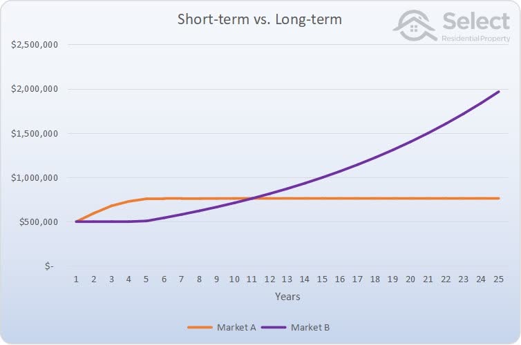
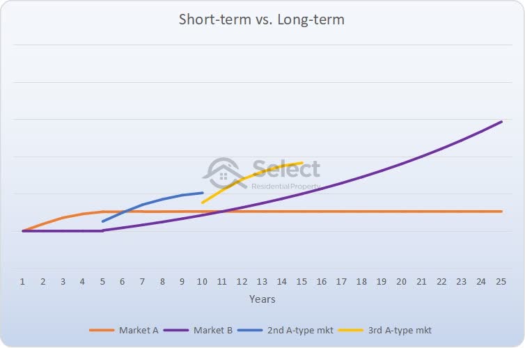
Have a look at this chart:
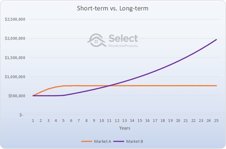
Which of these two property markets has the best growth? If you could only choose market A or market B and you knew their 25-year growth profiles, which would you choose to invest in?
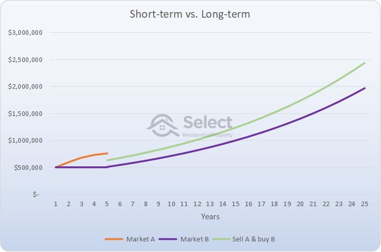
The best market would be A (orange), the one that starts off fast and flattens out. This is the best option because after 5 years you’d sell out of market A and buy into market B with more funds than you’d have if you started off in market B at year zero.
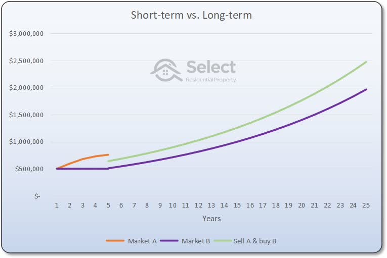
The chart shows the sale of the property in Market A at the end of the orange line and the start of the green line, which is at the 5-year point. You’d lose some money paying capital gains tax and other selling costs at the end of the orange line. You’d also lose money paying stamp duty and other entry costs at the start of the green line. In fact, you’d lose nearly $120,000 simply moving your equity out of A and into B. But you’d still have more money left over than what you started with because there was a 50% capital growth difference between the orange and purple lines over that 5-year period.
Even after considering the costs of selling, like paying capital gains tax and the costs of buying again like stamp duty, you’d still be better off following this strategy than if you had bought into market B at year zero.
From here on, investors who chose to buy in Market B, the purple line, and hold for the long-term will never catch up to the investors who bought in Market A, the orange line, and then sold at year 5 and moved their equity into Market B at the green line.
Problems with trading
Now there are two problems with this approach of “trading” property:
- Excessive exit and re-entry costs; and
- Growth forecasting
There’s a cost to selling your property, that is, exiting the market. It includes things like capital gains tax, an agent’s commission and more.
- Selling costs (i.e. exit the market):
- Capital Gains Tax
- Agents commission e.g. 2%
- Legal fees e.g. $1,000
- Clean up e.g. $500
- Buying costs (i.e. enter the market):
- Stamp duty e.g. 4%
- Legal fees e.g. $1,000
- Inspection reports e.g. $1,000
There are also costs associated with buying a property such as stamp duty and legal fees. These exit and re-entry costs are called recycling costs because you’re recycling your equity, you’re moving it out of one investment and putting it into a fresh one.
Recycling costs take a lot out of your profit. Later on, I’ll go through an example to show exactly how to estimate these costs. But for now, let’s have a closer look at the 2nd issue: forecasting future growth.
Can we know the growth profiles?
The smarty pants among you are saying, “Hang on, how can we know the growth profiles of both markets for the next 5 years, let alone the next 25 years”?
Great question.
We can never know with absolute assurance what the future holds. But we can make predictions with some degree of confidence. And the technology to do this is improving every year.
But there’s one really important point to note about this comparison between these two markets. The chances of market A (orange) outperforming market B (purple) by 50% over 5 years is far more likely than market B outperforming market A by 300% over the next 20 years.
- Chance market A beats market B by 50% over 5 years: possible/reasonable
- Chance market B beats market A by 300% over 20 years: unlikely/unreasonable
Putting it another way:
“Long-term outperformance is highly unlikely. Short-term outperformance is far more likely.”
Let me show you some examples.
Long-term is a level playing field
Here’s a chart of a property market’s growth profile over a certain period of time.
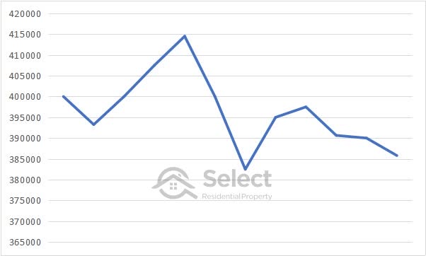
Guess how long that period of time was?
It was only over 1 year.
Here’s another over 1 year.
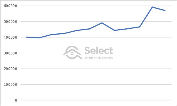
Completely different aren’t they.
Here’s one more, again over only a year.
All three growth profiles are radically different.
Now, here’s another growth profile. How long do you think this was for?
If you guessed it was over a longer timeframe, you’re right, it was over 5 years.
Here’s another over 5 years.
Different, but not radically different like the 1-year charts. Here’s another over 5 years.
Similar to the others but noticeably different.
Let’s step it up to 10 years.

The ups and down are less violent now and there’s a general upward trend from left to right.
Here’s another market’s 10-year growth chart.
One more over 10 years.
All 3 over 10 years have something in common that was less apparent in the shorter timeframes.
Are you starting to see a trend now? Let’s go for 25 years and see what they look like.
Here’s another 25-year median chart.
Here’s another.
What’s the trend?
Can you see what is happening as we step back further and look at a longer time-frame? Regardless of the suburb, the growth profiles all start to look similar. Over short timeframes, they look completely different. But over long time-frames they all start to look the same. Here are a few charts for suburbs in Melbourne over the last 45 years.
As you can see there’s very little difference. One suburb was south, one was east and the other was west.
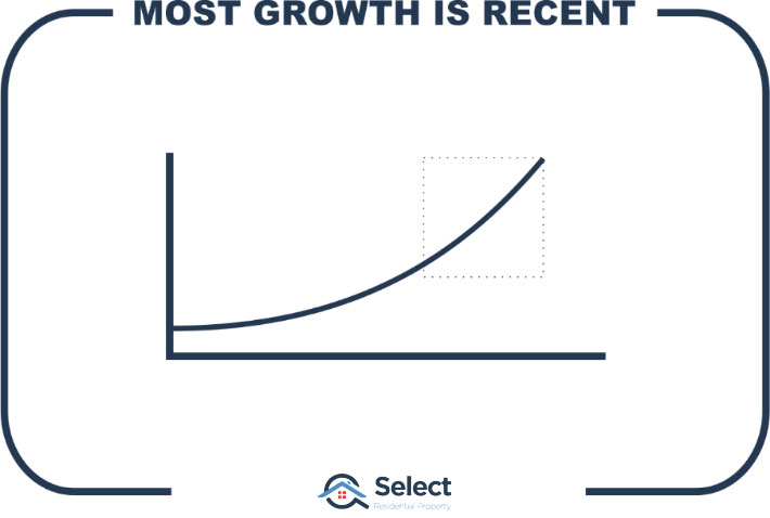
Every property market starts to show the same sort of growth profile long-term. They all start to show that stereo-typical long-term exponential curve. They’re all approaching this chart…
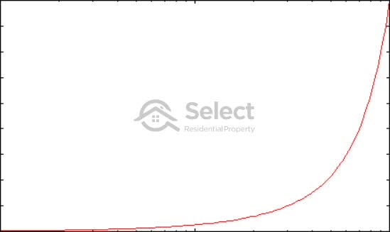
Now, no property market is ever going to precisely match this very smooth curve. But the more you step back and look at a longer time-frame, the more closely a property market’s growth chart will look like this.
How hard is it to pick long-term winners?
It is extremely hard to determine which property markets will outperform the average by a significant degree over a long time-frame.
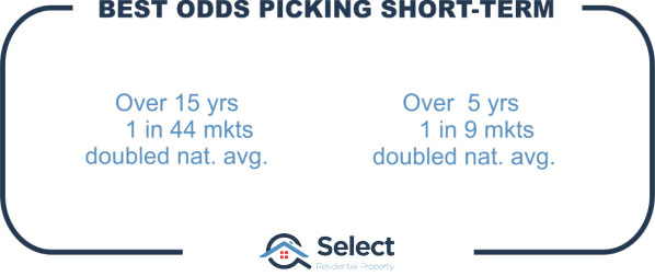
In fact, one in 44 property markets have had double the growth of the national average over the last 15 years. But 1 in 9 property markets have had double the growth of the national average over the last 5 years.
In other words, if your suburb selection method is purely random…
“You have nearly 5 times more chance of picking a short-term winner than a long-term winner”.
But that’s if you randomly select a suburb. If you don’t pick investment suburbs randomly, but apply some common sense, the odds stack up even more in favour of picking winners over the short-term. This is because there aren’t really any indicators to pick long-term winners. Most markets have very similar growth over the long-term.
“The longer the period, the closer the growth race between property markets”
The reason why picking a winner over the long-term is so hard is because time acts as a tremendous leveller of markets. In fact, the ripple effect concept is based on this levelling out. When a city goes through a boom, the growth starts in the centre of the city and moves outwards through middle ring suburbs to outer ring suburbs much like ripples on the surface of a pond.

Over time the growth ripples outwards from markets that have experienced strong recent growth into markets that now look like better value for money or look more affordable by comparison.
Apples & Oranges
To see why this happens, you simply must see the Apples & Oranges presentation:
It will explain the basic principle behind the ripple effect and why it’s so hard for one property, suburb or city to outperform another over the long term. Make sure you’ve seen that presentation, it’s a crucial concept.
The summary statement of the Apples & Oranges analogy is this:
“As a general rule – most property markets will have the same growth long-term”
But over the short-term, most are radically different. If you want radically superior capital growth, you’re only going to get it over the short-term because over the long-term the maths is stacked against you from outperforming.
Probability says you’re barking up the wrong tree if you try to pick long-term winners. The longer your focus, the more likely you’ll have the same growth as most other markets.
I’m not saying you shouldn’t invest for the long-term. I’m simply saying that long-term outperformance is unlikely.
- Long-term = less chance of outperformance
- Short-term = more chance of outperformance
But it’s not just likelihood that improves when your focus is short-term. The difference in performance can be extreme.
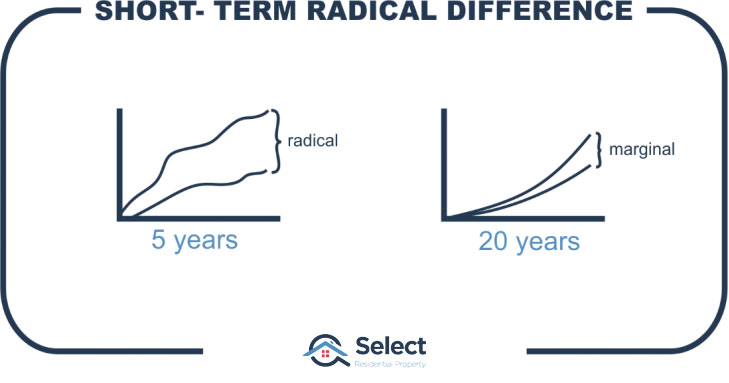
Over short time-frames the difference between winners and losers can be phenomenal, like 40% growth versus 4% over something as short as say 3 or 4 years. That’s a ten-fold difference in growth rates. But you won’t find those amazing differences over the long-term.
The point here is that:
“If you want to outperform the averages, you need to have a short-term focus”
The odds are stacked against you from accomplishing that over the long-term.
There are no long-term experts
Many professionals in the industry will suggest they can pick long-term outperformers. But none of them have a track record of picking winners. Go find one with a business that’s been around for 50 years. Ask them for a copy of their track record, you’ll be lucky to find any dating back more than 25 years let alone the 100 years you’d need to have a sufficient sample size to test their success rate.
There’s a chart they often show which looks like this one:
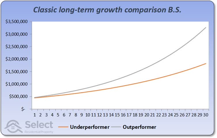
This is a nonsense chart. Every time I see this kind of thing I cringe. It highlights inexperience.
The chart compares one market with slightly higher per annum growth to another market with slightly lower per annum growth. The difference is staggering over 30 years.
The thing is, property markets don’t maintain an above average growth rate over the long-term. You would have to search quite hard to find a case like this where one market had 7% per annum growth consistently over the last 30 years while another only had 5% growth.
None of these experts have picked a market with this kind of above average long-term growth from 40 or 50 years ago. A lot of them probably weren’t even in the business of picking growth spots 40 years ago. Some of them were only picking their nose 40 years ago, if they were even alive.
Don’t swallow their marketing B.S. they neither have the track record, nor the nous to pick long-term winners. And the strategy itself simply defies logic and historical evidence.
“You’re better off focussing on a series of short-term investments if you want to outperform over the long-term”
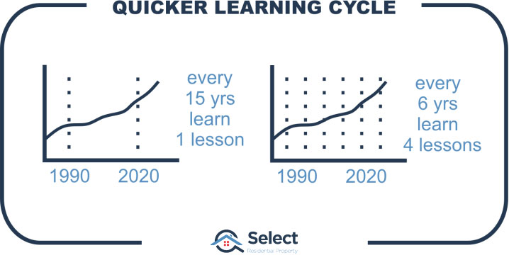
Learn from mistakes
Here’s another plus for focussing on the short-term. When you make a mistake at picking a short-term winner, you know you’ve made the mistake within about 18 months.
You can learn from your mistake and adjust your research to do better next time. Every few years you’re accumulating experience.
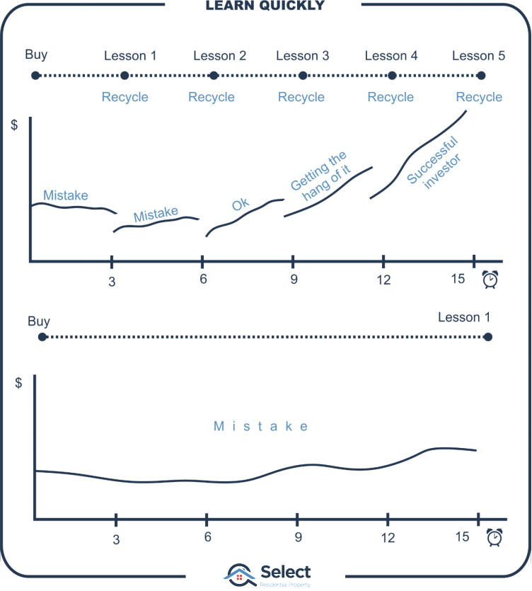
Over a 6-year period you’ll get 4 opportunities to rinse and repeat if you’re learning from mistakes every 18 months. In other words, you get feedback more frequently so you have time to improve.
Important: I’m not suggesting you trade your properties every 18 months. I’m simply saying that if you aim for short-term growth, you’ll know if you made a mistake after 18 months even if your planned time-line was over 4 years.
How can you rinse and repeat for a long-term growth strategy? If 15 years is enough to finally accept you made a mistake, it will take 60 years to get 4 slaps in the face to learn from. And that’s if 15 years was enough, you might like to wait another 15 just to be sure.
Not much help for investors nearing retirement, is it? They’re not interested in a 25-year growth forecast anyway. Even investors in their 40s might not have time to recover from a long-term mistake. But short-term gains suit both young and old investors.
Long-term pundits are really only guessing. They simply don’t have a 60-year track record to prove they’ve consistently outperformed over the long term. And that’s partly because they haven’t had the opportunity to learn from those mistakes.
But we have history
Now, some experts will admit they don’t have the 50-year history of success. But they’ll claim they have access to historical growth data dating back many decades that they can learn from. You may even hear them use the term, “Back-tested”. What that means is they’ve looked at historical data and assumed that what happened in the past will happen in the future. They’ve done the research to “future-proof” your investment from failure. They even call these suburbs and properties, “proven performers”. The irony is the historical evidence shows that past performance is no proof of future performance.
“The term ‘proven performance over the long-term’ is a misnomer. The data suggests nothing outperforms over the long-term.”
It’s ironic to call it “proof” when the proof says the complete opposite. By the way, there’s another presentation on that exact topic you might like to check out, it’s called:
“Buy props with high growth history – WRONG!”
Don’t assume that what happened in the past will happen again in the future. I continually here professionals suggest that investors check the long-term history of a market. Drives me bonkers that one.
“Every year a trend extends, is one year closer to that trend’s end”
Historical long-term growth
Now a lot of professionals will bang on about having growth data dating back 40 years and they can prove that market A has outperformed the national average growth rate for all that time. But it hasn’t. There are 3 reasons why a certain suburb looks like it outperformed the national average growth rate long-term:
- Anomaly in start value
- Anomaly in end value
- High recent growth
The following chart shows what I mean by an anomaly in the start value.
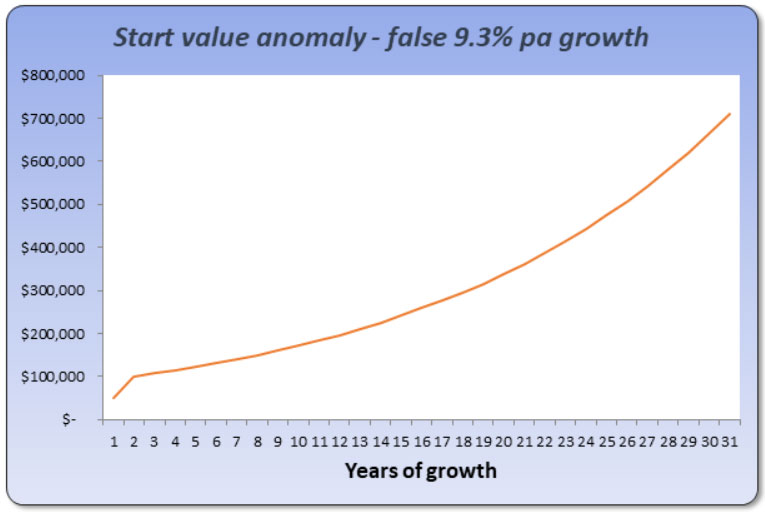
Medians can be horribly misleading. It happens all the time. Some of the cheapest markets 30 years ago weren’t actually that cheap, it was just an anomaly in the method used to estimate values back then – the median. Having an anomaly in the starting value can lead to incorrect growth calculations.
Or there could have been an anomaly in the calculation of the end value that made it stupidly high.
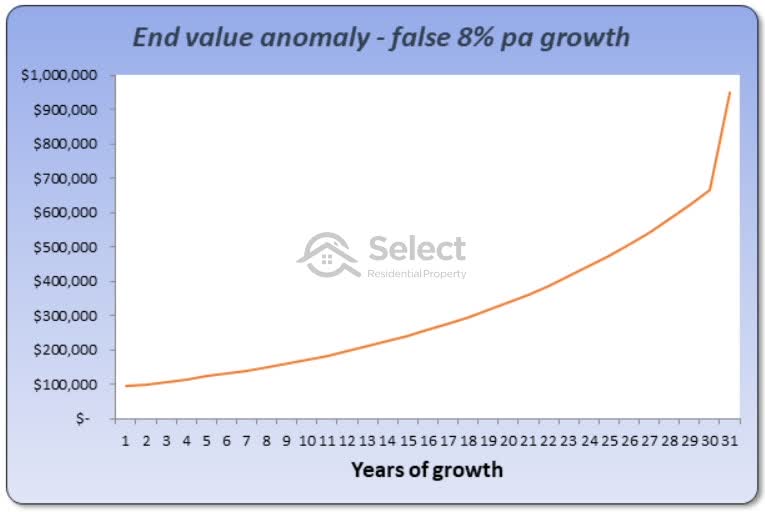
You can find a lot of suburbs that look to have stupendous growth long-term simply due to an anomaly in either the start or the end value.
But there’s another issue with the calculations. There could have been exceptional growth just recently, not consistently over the last 30 years.
There might not have been an anomaly in the start or the end values. But most of the growth could have happened recently.
The vast majority of the top long-term performers aren’t really long-term performers. They were either statistical anomalies or they had exceptionally good short-term growth… recently … but quite ordinary growth over the long-term.
Unless you analyse the historical growth profile, that is, the chart, and compare it with other markets, you won’t notice these anomalies. An over-simplistic analysis of historical data leads a lot of industry professionals astray.
Examples
Here’s a classic example.
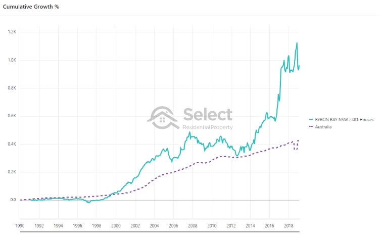
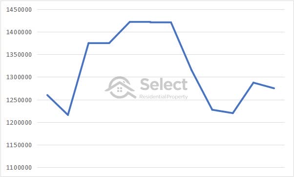
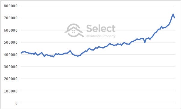
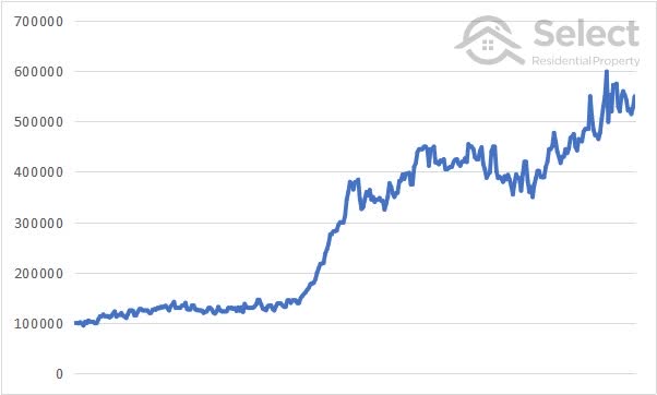
If you looked at the values of houses in Byron Bay in 1991 and compared them to values in 2019, you’d calculate a 9% per annum growth rate. That’s over a 28-year period. This chart shows in aqua the growth profile of Byron Bay houses.
The Australian national average growth rate over the same period was only 6% which you can see in the purple dotted line.
But as the chart shows, in mid-2012…
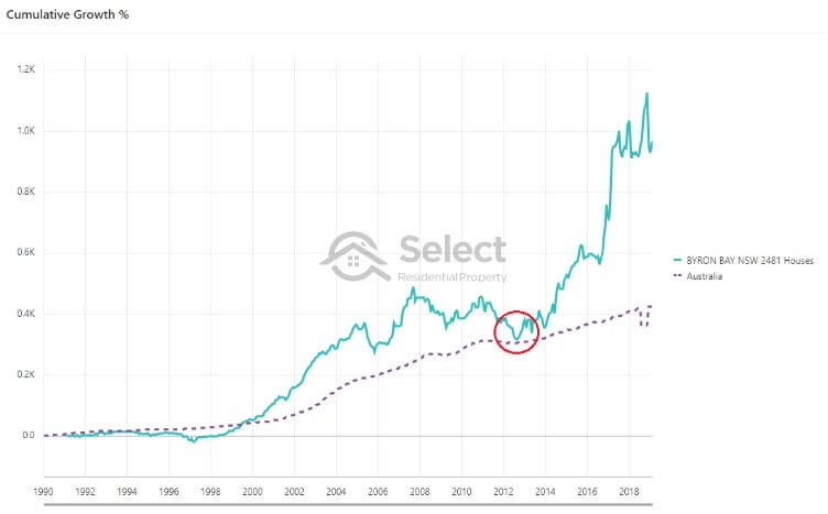
…both markets had practically the same growth rate. Byron Bay started to separate itself from the rest of the nation back in 2000. But by 2013, balance had been restored and Byron Bay house growth was back in line with the national average again.
Right now, it looks to have taken off again. But that has happened before in the past. Byron Bay will overcook again and will fall back in line with the national average growth rate eventually. It might not be in the next few years, but as is so often the case, it will eventually run out of puff and the rest of the country will catch up.
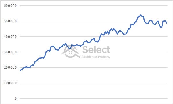
Here’s another example.
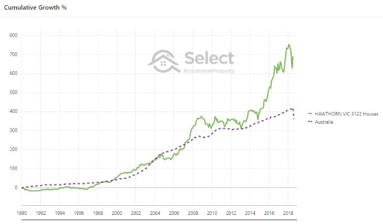
Houses in Hawthorn in Melbourne have underperformed and outperformed at various times over the last 28 years. But looking at values towards the end of 2018 you might think it’s a long-term outperformer. But only half a dozen years ago it was neck and neck with the national average.
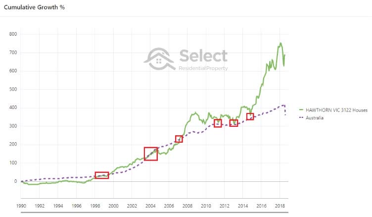
Long-term it all balances out
There are periods when markets get way ahead, periods when they get behind and periods when they track in line. But the longer you watch, the more times they’ll meet up again with that national average growth rate line.
“The best long-term gainers aren’t long-term gainers, they’re exceptional short-term gainers that have piled on the growth recently”
When you look at the charts of how these markets have moved, you’ll notice that invariably they have spikes of growth over 2, 3, 4 or 5 years.
Very few markets are capable of stretching their above average growth rate over more than half a dozen years. Then they’ll have a long period of no growth, maybe even a brief correction, before starting the cycle all over again.
Long-term growth is made up of lots of little spurts.
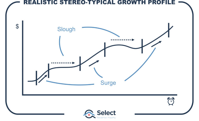
There are no suburbs that have had 40 years of steady consistent growth. They all have spurts and splats.
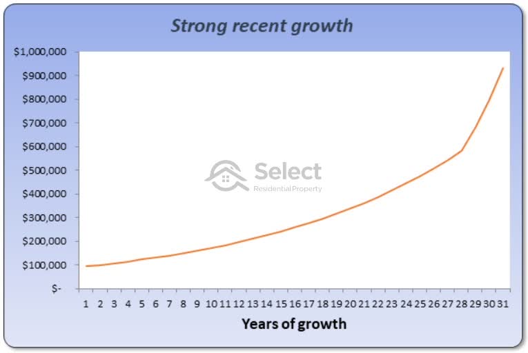
Last 100 years of growth
Here’s another point. This is one of the amazing things about compound growth that a lot of people really struggle to grasp. All the past growth for years and years is almost insignificant compared to the growth a suburb had during its last boom.
There are thousands of suburbs in Australia that have been piling on the capital growth for well over 100 years now. But in many of these locations about half of that 100 years of growth is about to be eclipsed in the next 10 years.
Can you get 50% growth in 10 years? Sure can, it’s very common in fact. Plenty of markets have done that.
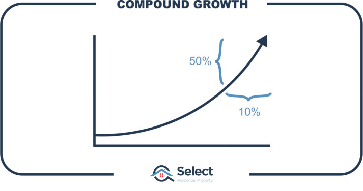
Despite building on the growth over 100 years, half of it will be dwarfed in the next 10. That’s 50% of the value being determined in just 10% of the history. Half the value being acquired in just a tenth of the history. That’s the whole thing about compound growth.

The majority of the growth happens in the last boom.
And the majority of the growth of the last boom happens in a very short period of time, like less than 5 years.
“Many of the outperformers of the last 30 years are simply the best performers of the last 5 years”
And many are a complete surprise. They’re not always those suburbs close to the CBD. BTW, if you think buying closer to the CBD works, you should have a look at another presentation in this series which debunks that myth too, it’s called:
“Why there’s no need to buy near the CBD”
Why do experts promote long-term?
So, why do experts promote, this long-term growth concept? The number 1 reason I suspect is that their most recent growth picks failed and they’re covering up a failure with an excuse.
Secondly, I don’t think they have any idea how to find short-term growth markets.
Thirdly, they know that in the long-run everything grows eventually, so they can’t lose by suggesting you hold for the long-term.
And fourthly, they believe the costs of selling and buying again (called the “recycling costs”) will exceed any benefit a superior short-term growth market can deliver.
- Excuse for failure
- No idea about short-term
- Everything grows… eventually
- Recycling costs too high
Now this last point is probably their most valid argument. There is actually some merit to this, so I need to go into detail here.
Recycling costs
It costs a lot to move your investment dollars out of one property and into another. These are called the “recycling costs” – the cost to sell and buy again elsewhere. The cost to move your equity out of one investment and into a different one.
CGT
By far the biggest cost is the capital gains tax associated with selling. It’s likely to be many tens of thousands of dollars. The precise amount depends on the time you’ve held the property, the ownership structure and of course how much capital gain you achieved.
Let’s assume CGT was $40,000. This was for a capital gain of $200,000. If you own a property for more than 12 months, you get a 50% CGT discount. Multiply that by your marginal tax rate at say 40% and you’ve got $40k payable in CGT.
- CGT e.g. $40,000 (varies dramatically depending on circumstances)
- $200k gain
- 50% CGT discount = $100k
- Marginal tax rate of 40% = $40k
Stamp duty
The next biggest cost is stamp duty which is payable when buying. It can range from 3% to 6% of the property’s price depending on which state you buy in and at what price. Let’s assume the buy-in price for the replacement property is $500,000 and the stamp duty is 4% of that which means we’ll be paying $20k in stamp duty.
This is for buying a replacement property. Remember we’re selling our existing property and buying an alternative. We’re adding up the typical costs associated with that process.
- Stamp duty $20,000 (varies from state to state and is based on property price)
- Next purchase $500k
- 4% stamp duty = $20k
Agent’s commission
Then there’s the agent’s commission on the sale which might be around 2%. Let’s assume the purchase price is also around $500k so the commission in that case would be $10,000.
- Agent’s commission $10k
- Property to sell $500k
- 2% commission = $10k
Legal fees
And there’s almost another 1% for the cost of legal fees, various inspections and your own time.
- Legal fees to sell & buy again, inspections, reports, your time $3k
Recycling equity out of this $500,000 property and into another of similar price set the investor back $73,000. It sounds like a ludicrous amount of money to just throw away doesn’t it.
But in this example, the property was bought 5 years ago for $300,000. It had 60% growth in that time, adding on $200,000 worth of equity for the investor. They have pocketed close to $130,000 in profit after buying another property of similar price.
- Bought 5 years ago
- Paid $300k
- Sold for $500k
- Gain $200k
- Minus recycling costs $73k
- Net profit $127k
I just need to repeat that, they have sold their property and bought another of the same price as the 1st and have an extra $127k in the bank.
Now, contrast that with an investor who hung on to a negatively geared property in a flat market for those 5 years. They’ve actually lost money.
CGT in context
For every dollar you pay in CGT, typically there’s about another 3 or 4 you cleared in take-home profit (i.e. after tax).
If you had the option of making 4 dollars and losing 1; versus making 2 dollars and losing none; you’d take the first option.
Earn 4 – pay 1 – net 3
Earn 2 – pay 0 – net 2
The difference in growth between a hot market and a flat one over the next 3, 4 or 5 years will be several times larger than the recycling costs.
But… that’s the difference between a hot market and a flat one.
Sydney vs Brisbane example
Think about buying in Brisbane in 2012 instead of Sydney.
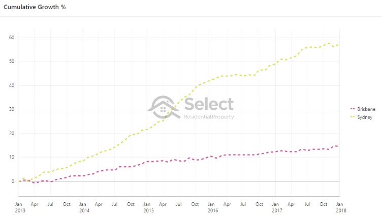
Sydney grew by 58% in the 5 years to the end of 2018. Brisbane grew by 15%. The difference was 43%. Now for a $500,000 property, that equates to $215,000. That’s a hell of a costly mistake to make and realised in only 5 years.
- Sydney growth 58%
- Brisbane growth 15%
- Difference 43%
- Difference $215,000 (e.g. $500k property)
- 5-year period
That’s what’s called an opportunity cost – what you’re missing out on by hanging onto a dud property rather than a better one.
This was not an isolated case.
Melbourne vs Perth example
Think about hanging on to a Perth property in 2015 instead of moving equity into Melbourne for example.
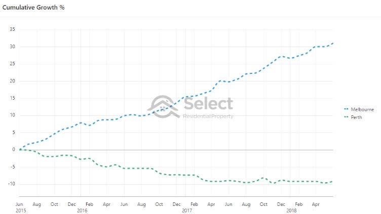
From mid-2015 to mid-2018 the growth difference between the 2 markets was 40%. Very similar to the previous example but instead of over a 5-year period, this was over only 3 years. That’s about a $70,000 opportunity cost per year – more than many Australians’ salary over that time.
Hobart vs Sydney example
And what about something a little more recent. Imagine hanging onto a property in Sydney in 2017 instead of selling and buying on Hobart.
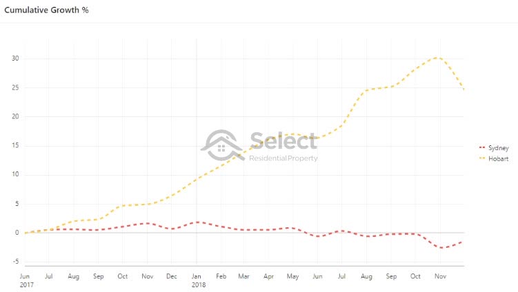
The growth difference for the first 18 months has been about 26%. Plus, Hobart has much higher yields.
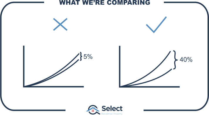
What are we comparing?
There could be literally hundreds of markets that will outperform the national avg growth rate by double over the next 5 years. And there are likely to be thousands of markets that will be flat for the next 5 years.
So, we’re not comparing 5 years of pretty average growth to 5 years of pretty good growth. We’re comparing 5 years of virtually no growth to 5 years of excellent growth.
If you hold property long-term you will have periods of no growth easily extending beyond 4 or 5 years in many cases. It makes no sense to hang on to properties like that for all that time if there are alternative markets around the country that are booming.
Research I’ve conducted found that there’s no growth in approximately two thirds of a property’s lifetime. It’s only worthwhile owning a property for about a 3rd of its lifetime – the time when it’s booming.
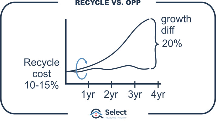
For example, it makes no financial sense to hang on in a flat market and miss out on as little as 20% growth in an alternative superior market, just to avoid paying 10% to 15% in recycling costs.
Now, I’m not saying recycling costs will approximate 10% to 15%. Everybody’s case is different, you need to work out the recycling costs for your specific circumstances. All I’m saying is that in typical cases, the recycling costs aren’t as high as most investors assume. They seem like big dollars, but opportunity costs are quite often a lot higher.
What the future holds
Here’s another reason why I believe a short-term focus is a good idea – we’ve got some idea of what the short-term future holds, but no idea of the long-term.
What impact will driver-less cars have on property markets? What impact will the next generation of remote access technology have? Will there be a big push to work from home 2 days a week? What impact will magnetic levitation vacuum tubes have?

There could be technology of the future that radically alters the way we live within the next 20 years. Technology that nobody has even contemplated yet. How do we know the property markets we picked for long-term growth won’t be tragically affected? If you’re relying on long-term growth, you’re at greater risk of a change in technology affecting your plans.
The good thing about investing for the short-term is that because the exit horizon is so much closer, you’re less likely to encounter significant negative changes. A short-term focus makes an investor more agile to new world changes that might radically spoil long-term plans.
Use of technology to pick short-term winners
OK, my last point that supports a short-term focus.
Remember how I said you’ve got more chance picking short-term winners than long-term even if you select a suburb at random. And I also mentioned that there’s very little data you can use to pick long-term winners.
Well, there’s been advances in data science that make picking short-term winners relatively easy.

So, there’s better technology to support a short-term focus than there is to pick long-term winners.
Conclusion
OK, so in summary I believe a short-term focus is superior to long term because:
- Most of the growth of the last 100 years happened in the last 10
- You’ve got better odds of picking short-term winners
- Short-term winners radically outperform short-term losers
- Long-term winners don’t outperform long-term losers to the same degree
- You can learn from mistakes more quickly and recover
- You’re at less risk of technology change spoiling things
- Short-term prediction technology is a lot better now days
Remember, nobody has a track record of long-term growth picking success. Don’t accept the excuses of the self-proclaimed experts. Instead, get confident about seeking out short-term growth markets. Learn all you can about how to predict markets with imminent growth potential.
Just before I go, remember the chart I started with…
Remember how I said that you’d be better off buying in the superior short-term market and then selling.
Why buy in market B after 5 years? Wouldn’t it be better to find another A-type market?
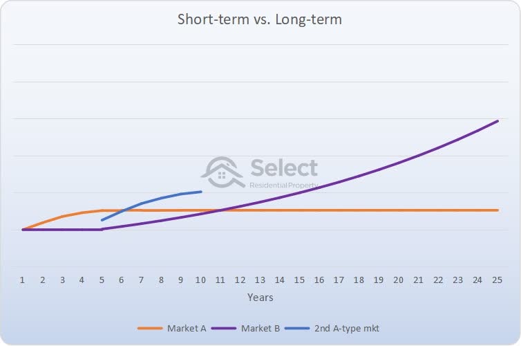
And then we could repeat this process.
Again and again.
Even after losing more than a 3rd of your gains to recycling costs, you’ll still be better off.
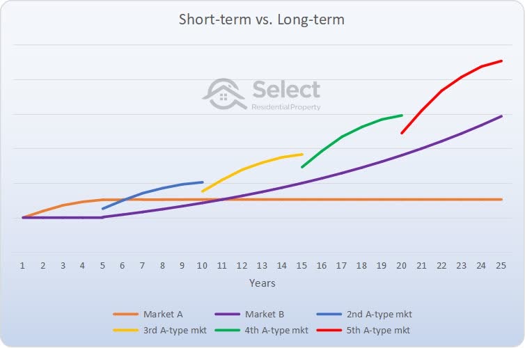
That’s the difference between short-term and long-term focus.
If you’re looking for where to go from here, check out this presentation in the series…
“Why timing is better than time-in”
It proves beyond any reasonable shadow of doubt that times have changed. Principles of the past no longer apply. The future is bright for well-informed property investors.
Well done for reading this far. I hope it was insightful.