Introduction
The longer the timeframe, the more likely all property markets will perform pretty much the same. Here’s why…
Fruit shop
Imagine you walked into a fruit shop 100 years ago.
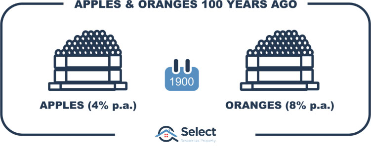
You saw a crate of apples and a crate of oranges side by side. Apples back then were 1c each while oranges were 2c.
If oranges had an 8% per annum growth rate while apples only had 4% per annum growth, then 100 years later a single apple would cost 50c while a single orange would cost $44.
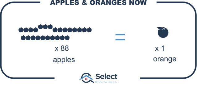
In other words, you could buy a whole box of apples for the price of a single orange.
Picture it
Now imagine walking into that fruit shop and seeing that extraordinary price difference. What would you buy?
Long before prices for oranges got that ridiculous, people would stop buying them. Shoppers would consider the price of oranges way too expensive and would start looking for a cheaper alternative.
That would not only reduce demand for oranges and therefore slow their growth rate, but it would also increase demand for apples and accelerate their growth rate.
After a period of outperforming oranges, the growth rate in apples would level out and start growing at the long-term average again. It is far more likely that after 100 years, apples would be 50c and oranges would be a dollar. In other words, they would have exactly the same growth rate long-term.
If there was a change to the nature of a piece of fruit, it would have a change in its growth rate. For example, if oranges were made to be seedless with skin that was easier to peel or was sweeter. If there was a change in the relative nature of a fruit, then its performance would change. But it would only be for a short period until the new difference was factored into prices. Once fully factored into the price, growth would once again be the same – largely in line with the rate of inflation.
Fruit vs. Property
I’ve had one “expert” try to tell me that this analogy might only work with fruit, not property. (Oh boy).
So, change the words “fruit shop” to “street”. Then change the fruits into properties. Lastly, change their prices from 1c and 2c to $1,000 and $2,000.
In 100 years in the same street you’d have one property worth $50k and another worth $4.4 mil. It’s the same concept, no property buyer could justify the massive price difference.
Ripple effect
We see this time and time again during booms in city prices. The more desirable suburbs start off the next growth phase. Once their growth seems too excessive, buyers start looking for cheaper alternatives.
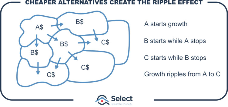
The growth phase ends with the most affordable suburbs finally appearing too expensive for even low-income home buyers. And the growth cycle stops.
Exponential growth
What people fail to realise is that exponential growth creates a bigger and bigger margin between property markets. Eventually that margin gets so big that the price difference can’t be justified.
Eventually, all the benefits of living in a suburb are balanced out by the higher prices of properties in that suburb. It used to look like good value for money. But eventually it balances out.
Growth probabilities
Here’s another way of looking at it. The following chart shows data from the last 40 years of house prices across Australia.
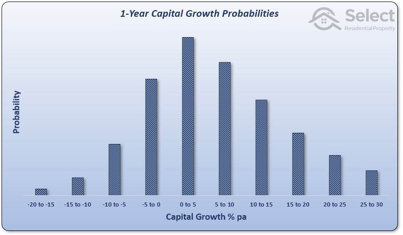
Capital growth has been split into 10 groups. If a suburb had a single year of growth at any time in the last 40 years between 0% and 5%, it would be counted in the tallest middle column. This is the most likely, most probable growth.
But there are less-common cases. The rightmost column shows there’s a slim chance of getting 30% growth in a single year. And some unfortunate owners have had -20% growth in a single year. But these cases are rare, that’s why they’re the shortest columns.
Here’s the same chart but for 2-year growth.
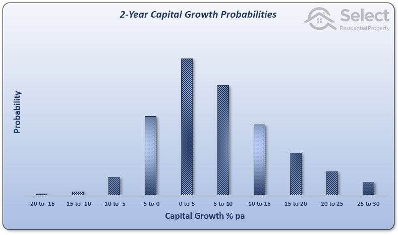
It looks pretty much the same. But there’s a slight change that becomes more obvious when we step up to 4-year growth.
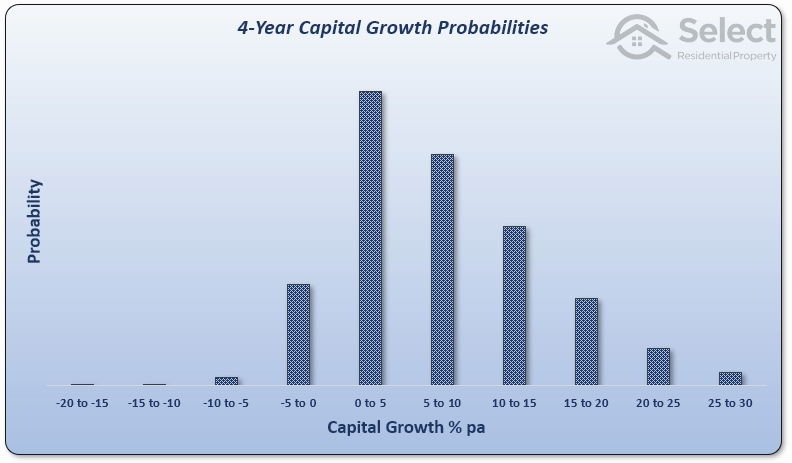
Are you starting to see a trend? Perhaps the 8-year chart makes it clearer.
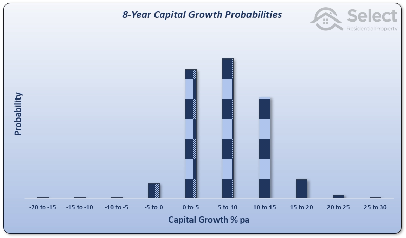
The range of probable growth rates is shrinking. It’s highly unlikely you’ll have extreme growth over a longer period. Here’s the 16-year growth probability chart…
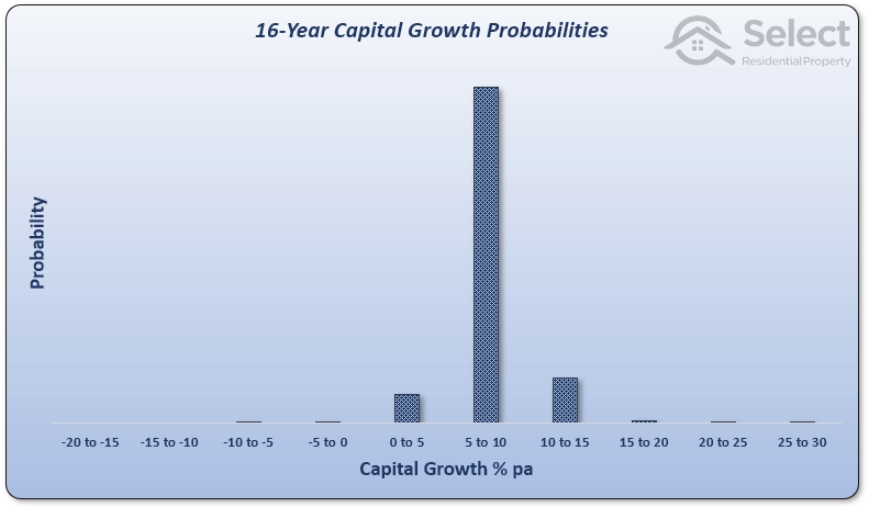
It’s really obvious now. Extreme growth over a long timeframe is highly unlikely. Last chart is for 32-year growth.

What this series of charts is saying?
“Long-term, there’s a tendency for all property markets to end up with the same growth rate”.
Now you might argue that you only need 0.5% better growth over the long-term to be way better off. That’s true and there are plenty of charts I’ve seen over the years like this next one:
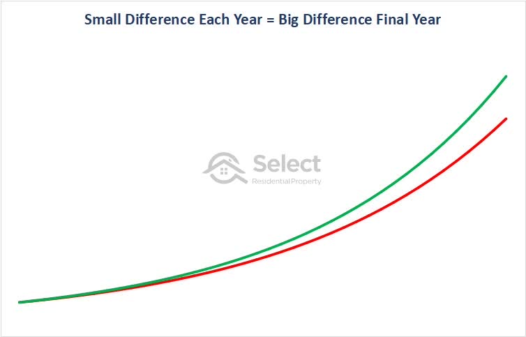
Over 40 years there’s hundreds of thousands of dollars difference between 6%pa growth and 6.5%pa growth.
There are 2 issues with these type of growth charts. Firstly, growth like this has never happened. The above chart is completely fictitious. Not a single property market has followed either of those growth curves. You simply can’t find a market that will outperform by half a percent or any percent over the long-term.
A much more typical growth curve looks like this next one:
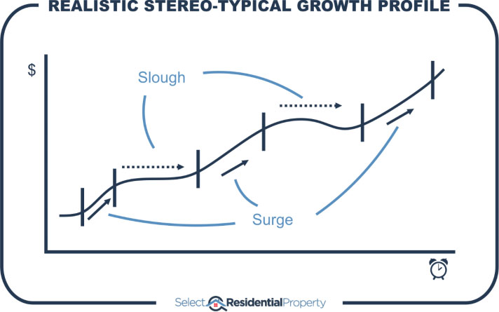
There are surges and sloughs and everything in between. Over multiple decades, there will be multiple cycles and nothing consistent and smooth about any of it.
Secondly, suburbs that have been calculated as outperformers over a 40-year period, haven’t actually outperformed throughout that period. They are more often than not “recent” outperformers, not “long-term” outperformers.
This is because price change is always higher at the right edge of the chart, recently. The most recent growth surge has a bigger impact on overall historical growth calculations than a massive boom that happened 30 years ago.
There is no logic or data to suggest that a property market will outperform over the long-term. However, …
New amenities
New amenities may come to a market like a business park, train station, shops or schools. This results in an accelerated rate of growth as the suburb becomes more appealing to buyers. But once prices have factored in these new amenities, it’s once again business as usual. The growth continues on a much more subdued path, in line with the long-term average.
Only if a suburb can continually acquire new amenities will it continue to outperform the long-term average.
Conclusion
Because of the nature of compound growth, no property can continually outperform another in the same “fruit-shop” for a very long time. Eventually the price difference becomes so extreme, buyers look for cheaper alternatives.
The data suggests that over time, all properties, all suburbs and even all cities tend towards having the same compound annual growth rate. Trying to pick a true long-term outperformer is statistically improbable.