Introduction
How many times have you heard the cliché, “Location, location, location”? There’s been this widely held belief that the 3 most important aspects to property investing are: location, location and location. The idea is that if you find a property in the right location, you’re set. You can’t change the location of the property once you’ve bought it. So, get the location right.
Now there are many arguments about what constitutes a “good” location. But it doesn’t really matter because the cliché of location, location, location is now completely out of date advice.
“It doesn’t matter so much where you buy, but when you buy”
The three most important aspects of property investing are not: location, location, location but more likely: timing, timing and timing.
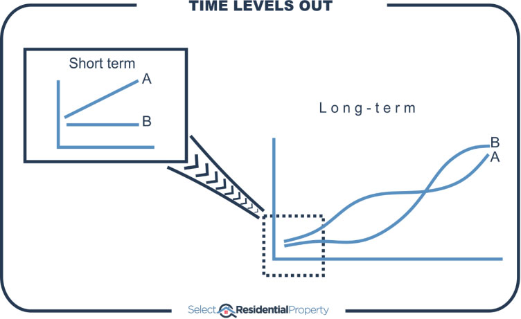
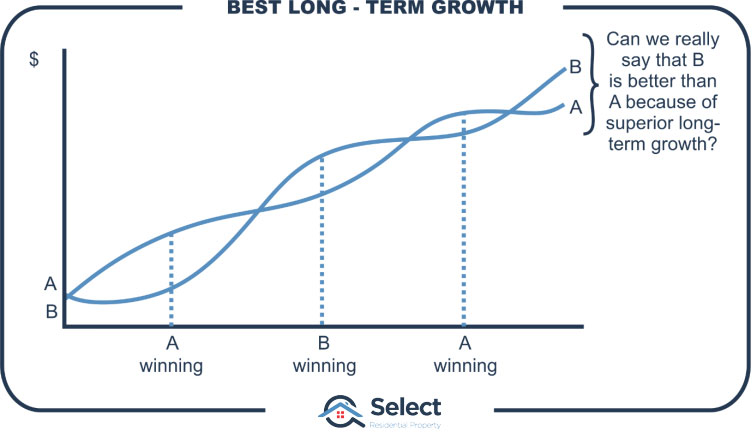
If location was important
If location was so important, eventually good locations would get ahead of poor ones. As more and more time passed, the difference would become greater and greater.
But it simply isn’t true. In fact, the longer the time-frame, the more likely two distinctly different properties in the same suburb will end up with very similar results. And it’s the same with suburbs. Two different suburbs in the same area will end up with pretty much the same growth. And it’s the same with cities too.
Over the long-term there is a tendency for all property to grow at the same rate. It’s actually over the short-term that results are most likely to be radically different.
Apples & Oranges
To highlight why it’s so unlikely for one property to outperform another long-term, we need to go over my Apples & Oranges story. For those of you who have never heard this before, check out this link before going any further…
Now you can see what I mean. It’s highly unlikely that over the long-term any property can continue to outperform other properties in the same suburb. It’s not impossible, but the probability diminishes with each passing year.
Similarly, it’s less likely any one suburb will outperform others in the same city over a long time-frame. And the same can be said about cities in the same country.
Large city example
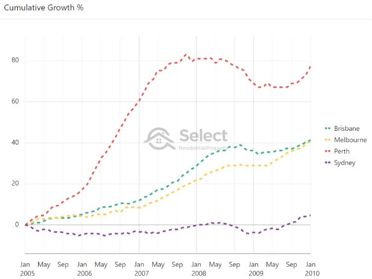
The following chart is a cumulative growth chart.
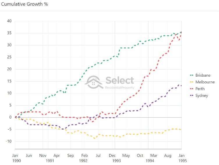
It shows the growth, in percentage terms, for the four biggest cities in Australia over a 5-year period from 1990 to 1995. All lines on the chart start at zero percent.
Perth and Brisbane, in red and green, had almost identical growth. It was pretty moderate growth, totalling 36% for the 5 years. But notice how they took distinctly different paths to get to the same end point. Brisbane was more consistent. It’s almost a straight line. While Perth rushed up in the latter half of the 5-year period.
Sydney, in yellow, had negative growth of –6%. Melbourne, in purple had 15% growth.
The growth difference between the top and bottom markets over only 5 years was 42%.
Here’s the next 5 years with the same 4 cities. This is from 1995 to 2000.
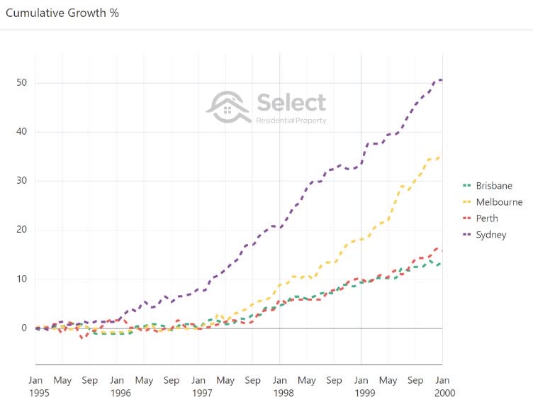
Now its Sydney and Melbourne’s turn to shine with 51% growth and 36%. They beat the pants off Perth and Brisbane who had only 16% and 14% growth.
Let’s step forward to the next 5-year interval from 2000 to 2005.
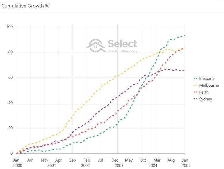
In this period none of the big four stood out from the others. They had varying levels of success, but it was pretty good across the lot. This was a great country-wide boom.
At the top was Brisbane with 94% growth. And although Sydney was at the bottom, it still managed 66% growth in just five years which is pretty awesome. That works out to be double-digit per annum growth.
The next 5 years went back to normal. And by “normal” I mean some cities kicked while others cracked.
This time Perth was at the top with 77% growth in just 5 years. And Sydney was at the bottom with 1% growth per annum. Brisbane and Melbourne were neck and neck on 41% which was moderate growth.
There’s one more 5-year interval I want to show you. It’s from 2010 to 2015.
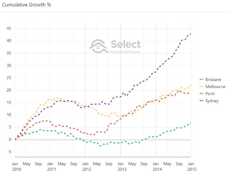
This time Sydney topped the pops with 43% growth. Melbourne and Perth were pretty close around 20% and Brisbane took the wooden spoon with only 7% growth.
As you can see from these 5-year intervals, every one of the big four has had:
- Booms;
- Busts;
- Flats;
- And moderate growth
You’ll also notice that the difference in growth between the top performing city and the bottom can be staggering in only a few short years. Across all these 5-year intervals, the average growth difference was 43% between top and bottom.
In 4 out of the 5 cases there was at least one city where investors were high fiving while at the same time in another city, investors were treading water or drowning their sorrows.
And keep in mind these aren’t volatile markets. These aren’t regional markets. They aren’t small markets.
- Large population
- Diverse economy
- Low volatility
They are the 4 largest cities by population and some of the most heavily diversified economies in our country. They are literally the least prone markets to volatility in the country. If I showed you comparisons amongst smaller markets, you’d see some even more amazing difference in growth rates.
Notice that I didn’t pick intervals that perfectly matched the growth spurts of any particular city. I just picked 5-year intervals out of convenience.
And did you see how a lot of the truly excellent growth took place in only 3 years, not even 5. And most cities had around a 10-year period of relatively lack-lustre growth before having a decent boom again.
- Booms are short
- There’s a long wait between booms
Now let’s look at the full history for all 4 cities.
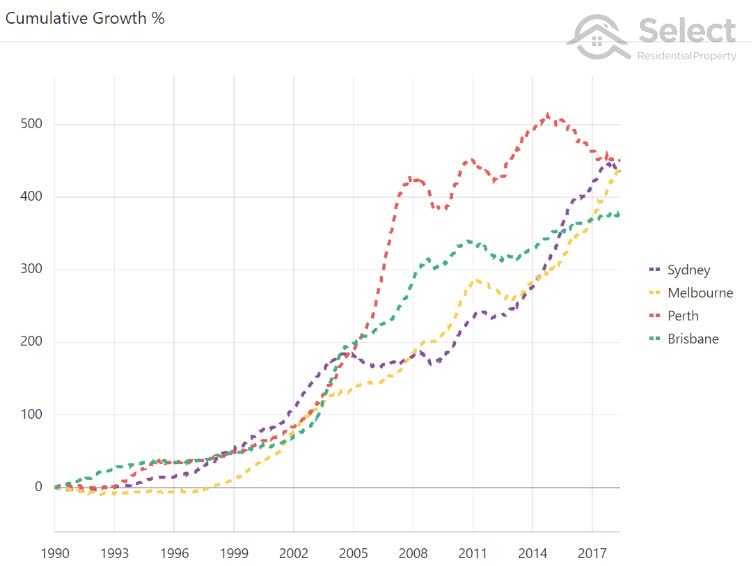
This is actually a 28 year period from 1990 to June 2018 (time of writing). As you can see, they’re all pretty much the same. There’s very little difference between each city’s total growth in the end. And this isn’t even truly long-term.
The fact they all seem to end up at nearly the same point long-term is no coincidence. This is a perfectly natural phenomenon. It’s the apples and oranges story being played out among cities. People look for affordable alternatives. That search takes them away from markets that have had rapid growth and have become over-priced. And it directs them towards alternative markets that haven’t had rapid growth for a fair while. That shift in demand affects the growth rates, keeping everything in balance – eventually.
Capital growth race
The following clip shows a race between the state capitals. Each bar in the chart represents a city. The bar length reflects the city’s historical growth rate. The animation plays out from 1990 to 2020.
Note that data was unavailable for some cities in earlier years. But those cities appear later on in the clip.
As a city has different periods of growth, its long-term capital growth rate changes and this is reflected in the length of its bar. If a city’s bar length exceeds the city above it, those cities swap places on the leader-board.
As you can see, there’s a continual shuffling of cities. They fall behind and then they catch up. One gets ahead and then it runs out of puff and is caught by the rest. The leader-board is constantly changing. And this is just what the Apples & Oranges analogy suggests.
So, what’s the point picking anywhere in particular when they’ll all end up the same?
The key point is they all took different paths to get where they ended up. They had booms at different times.
What it all means
What can we take from all this?
“Over a long time-frame most markets will have pretty much the same growth rate. But over a short time-frame, they’ll have radically different growth rates.”
Let’s say you’re trying to answer the question, “Where should I invest? What’s the best location?” You might start with a state of Australia or a city. As you can see from these charts, it won’t really matter which city you pick. What matters is when you pick it.
You don’t really need to put a lot of thought into where to invest, you just need a long investment time-frame. Over the long-term where you invest doesn’t matter so much. But over the short-term when you invest is crucial.
To achieve above average performance, you need a short-term focus and you need to time your entry. For more on that topic, check out this…
You shouldn’t focus on long-term growth
City suburb examples
The difference in price growth over short periods is even more pronounced when we compare individual suburbs rather than cities.
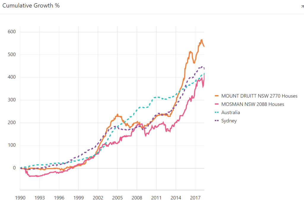
This cumulative growth chart compares two suburbs in Sydney to the Sydney average and the national average.
The brown line is Mount Druitt near Blacktown and the pink line is Mosman on the north shore. The dotted lines show the growth for Sydney in purple and Australia in aqua.
There’s not much difference between all 4 markets over the long-term. But over the short-term it is significant.
The difference in performance between Mosman and Mount Druitt over the last 28 years has been fairly trivial really, despite these markets being polar opposites in terms of price, location and demographics.
But note how Mount Druitt only had two 5-year spurts of outstanding growth in that entire 28-year history.
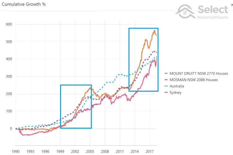
It only started to outperform Mosman in the last 9 years and outperform Sydney in the last 5 years.
The next chart compares two more Sydney suburbs: Parramatta with Cabramatta.
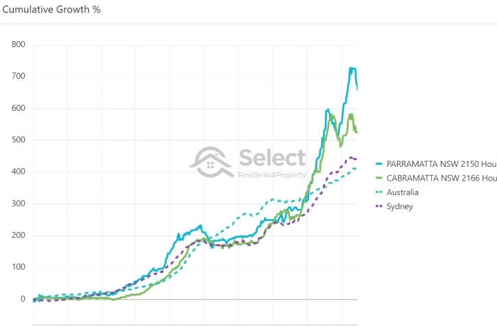
Again, you can see there’s not much difference between them in the end. And that difference came about in the last few years of a 28-year comparison. There were periods when Parramatta outperformed Sydney and Australia and periods when it underperformed.
The next chart compares Noble Park with Deer Park in Melbourne.
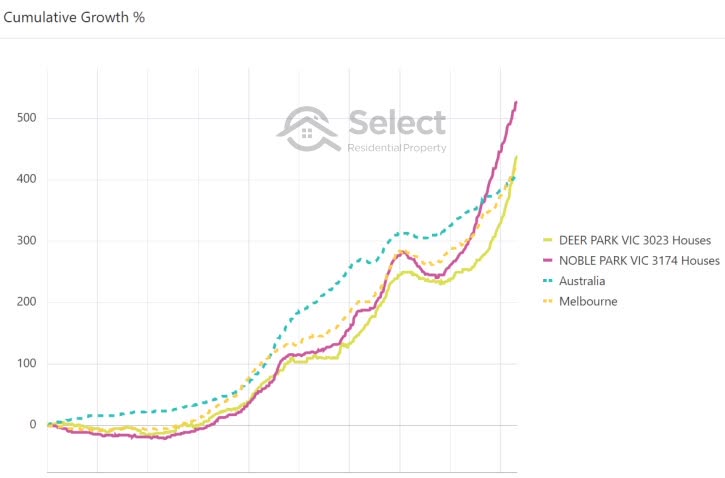
They’re on opposite sides of the city but had similar growth rates over 28 years. And both were pretty similar to the movement of the Melbourne average and the Australian average. Both were behind the Melbourne average in 2013 and above it by 2018 – a complete turnaround of a 28-year trend in just the last 5 years.
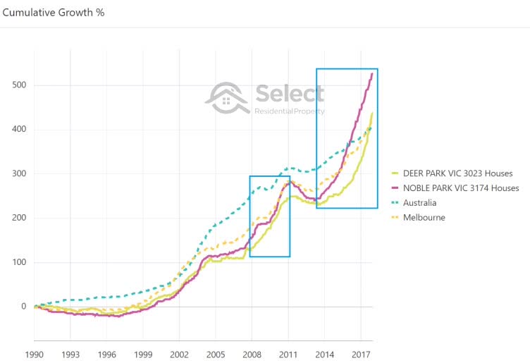
Over 28 years neither market really excelled. But for the 3 years from 2008 to 2011 and the 4 years from 2014 to 2018, their growth was excellent – easily outperforming the Melbourne and Australian averages despite having pretty ordinary growth over 28 years.
Here’s an example of some better Melbourne performers: Essendon and Richmond.
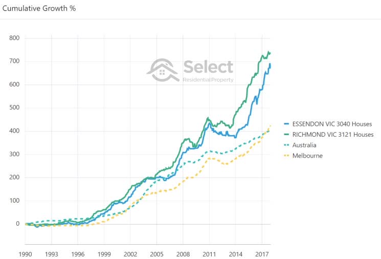
Look at the tremendous difference in performance after 28 years. But if you look closely…
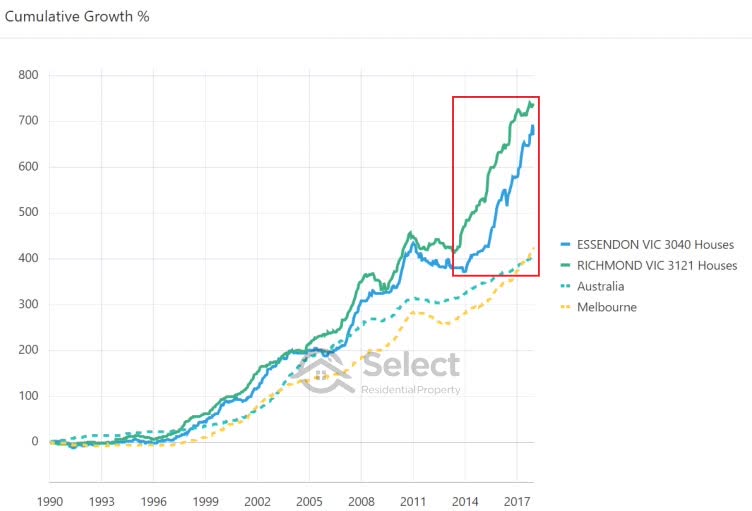
…you can see that there were really only 2 or 3 short bursts when these suburbs outperformed Australia and the Melbourne average. And the majority of it happened in the last 4 years.
Here’s another example showing that the majority of growth happens in a few short years and it’s usually the last few years.
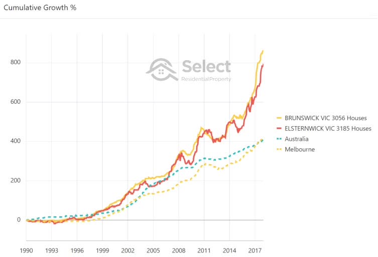
You can see that in mid-2009 Elsternwick and the national average had been neck and neck after about 20 years. Then Elsternwick had a 2-year spurt. It sprung into life again for the 3 years from 2015 to 2018. Elsternwick grew by about 100% in the last 20% of the 28-year history shown.
There’s nothing particularly special about that concept though. This is the thing with compound growth – it all happens at the end. There are some suburbs in Australia that are 200 years old. Over the next 10 years they’re about to double in value. In other words, they’re about to pile on 100% of growth in the last 5% of their history.
Brunswick did pretty much the same thing.
It had the same growth rate as almost any suburb around Australia did for the first 17 years. Then it had a series of growth spurts and corrections until late 2015 when it took off.
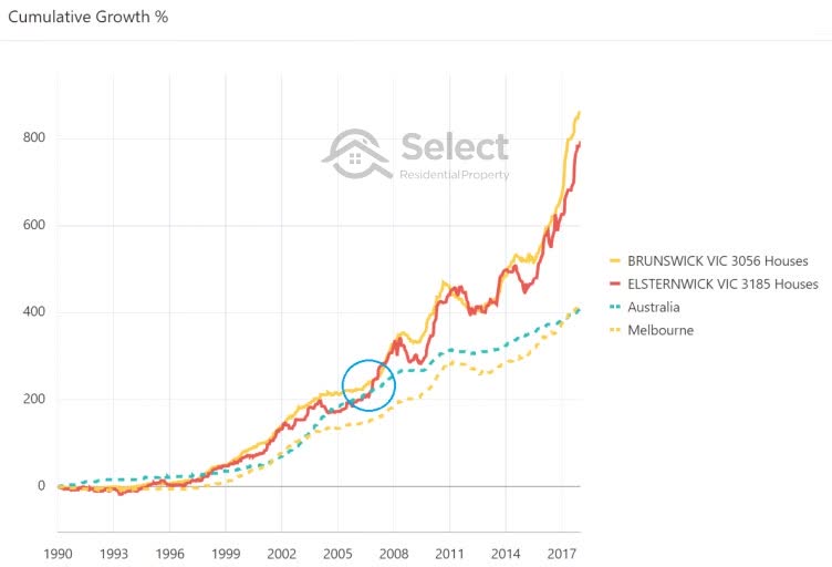
Let’s zoom in on the 3 years from 2015 to 2018 for a closer look.
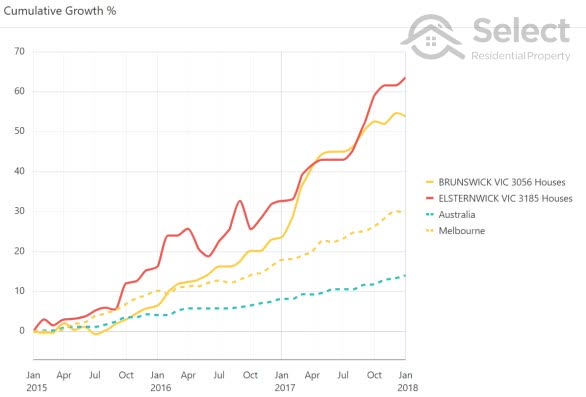
Brunswick only managed to pass the Melbourne average growth rate in early 2016. Over the 3 years shown, Brunswick added on 40% more to its value than the average Australian suburb. Elsternwick grew even more and put 30% between it and the average Melbourne suburb. And it happened in less than 3 years.
I’m not picking these suburbs because of their stellar performance. I picked them because they ended in “wick”, same with Noble Park versus Deer Park and Cabramatta vs Parramatta, in other words, somewhat randomly. If I was after top performers, I could find even more dramatic differences than these.
You’ll see the same story around the country. Let’s look at some suburbs from Brisbane for example.
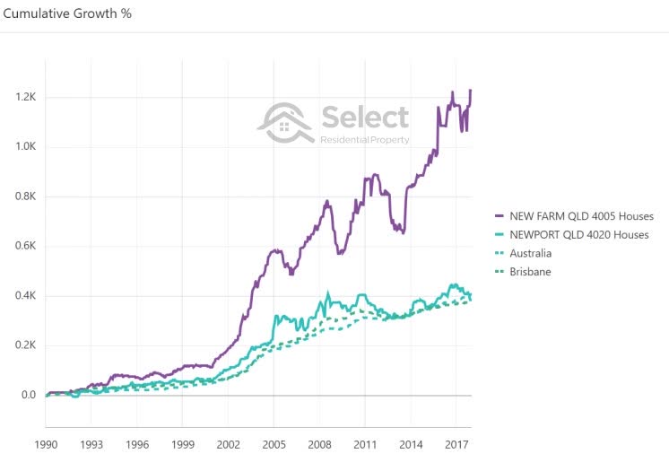
Here’s a big difference. New Farm outperformed Newport and the rest of Brisbane in median growth over the 28 years being compared. But for the first 10 years there wasn’t much difference. Most of the growth came in short spurts that didn’t last more than 4 years. 80% of the growth happened in only 40% of the time-frame. Most of the time New Farm was either: dawdling, flat or reversing.
Here are two more suburbs with distinctly different growth histories.
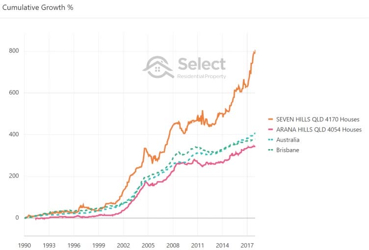
Seven Hills separated itself from the national average growth rate back in 2001 after 11 years of fairly moderate growth. The gap widened significantly in the 5 years since 2013. The 5 years before that were practically flat. And the 6 years before that were awesome.
90% of the growth happened in about 40% of the time. In the entire 28-year period of analysis there were really only 2 growth spurts worthwhile being an owner of property in Seven Hills.
Arana Hills on the other hand underperformed Brisbane as a whole and Australia too for the 28-year period. But if we zoom in to one of the fastest growth periods for Arana Hills:
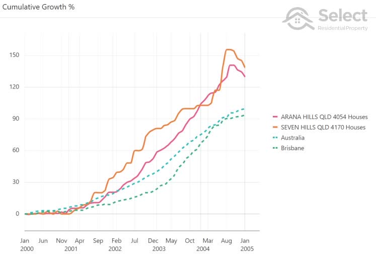
We can see that Arana Hills performed just as well as Seven Hills for one of the best 5-year periods in Seven Hills’ history. Arana Hills outperformed Brisbane and Australia, more than doubling in value in this time. And you can see that it was neck and neck with the Australian growth rate in the aqua dotted line right up until 2002. So, really it separated itself from the pack in only 3 years.
One more example, this time from Perth:
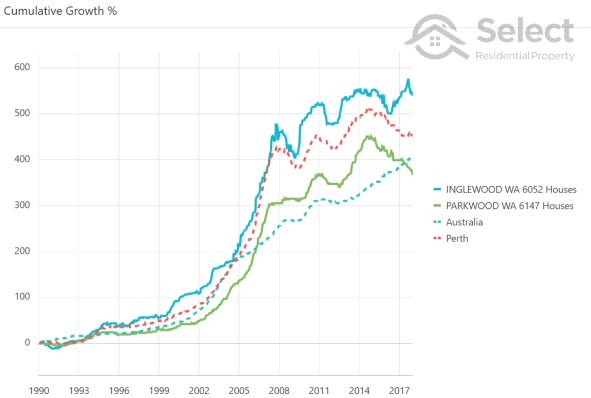
Inglewood is the blue solid line at the top. Parkwood is the green solid line. Perth is the dotted red line.
Most of the growth for Perth happened for the 5 years from 2002 to 2007. This is a rare case where the majority of growth didn’t happen in the last ten years. Roughly 80% of the growth happened in only 20% of the history shown.
Long-term there’s very little difference between Australia’s average growth rate of 6.0% per annum and Perth’s of 6.2% over this time-frame.
And the difference between Inglewood and Parkwood over these decades is largely attributable to a few very short periods of either superior growth by Inglewood or negative growth by Parkwood.
What does all this mean?
As the city charts that I showed you earlier clearly indicate, there can be a radical difference between two Australian cities over a short time-frame. Long-term however, the growth difference is not as significant.
But an investor doesn’t buy a city average. An investor will buy a property within a suburb of a city. And the most recent charts I’ve just shown you indicate that the growth difference between individual suburbs within the same city add an extra level of radically different results on top of the radically different city performance.
What can we take from all this?
- Many short-term boomers
- Few long-term boomers
- Many flat
There are literally hundreds of suburbs which over the next few years will perform way above the Australian average. But over the long-term, they’re unlikely to be able to keep that cracking growth rate up. It also means that thousands of suburbs will lie dormant for many years waiting for their next time to shine.
Calculations
I’ve done some calcs, having a closer look at thousands of property markets over the 28 years from 1990 to the time of writing. After examining more than 8,000 suburbs, there were only 24 that had an annual growth rate that was always somewhere between 4 and 10% pa. In other words, “normal”.
- 28-year history
- 8000+ suburbs
- 24 had growth between 4% and 10% pa
- e. 1 in 300
That equates to 0.3% or one in 300. In other words, it is highly unlikely any investor will get consistent growth in a “normal”, moderate or “goldilocks” range.
Over a shorter time-frame there’s more chance for some consistent growth to happen. Over the 10 years from 2008 to 2018, about 4% of all property markets had growth between 4 and 10% per annum each year.
- 10-year history
- 1 in 25
That’s one in 25. In other words, it’s 10 times more likely to have consistent growth over only 10 years than over 28 years.
You can see that the longer the time-frame, the harder it is to have consistent growth. Over the 5 years to 2018, only 4% of markets had consistent growth.
- 5- year history
- 1 in 24
Even over a 3-year period it was only 5% of all property markets country-wide.
- 3-year history
- 1 in 20
Over the year from June 2017 to June 2018 only 16% of property markets had what might be considered a “normal” rate of growth.
- 1-year history
- 1 in 6
The point is that “normal” growth doesn’t last very long before there’s either flat growth, a boom or a correction.
I did some more calcs examining the history of growth in large geographical areas around the country. The typical boom phase has only lasted about 20 months. A typical flat phase lasts 18 months on average. And there are 25 months on average where the rate of growth is neither boom nor flat, but moderate.
- Booms last ~20 mths
- Flat or negative lasts ~18 mths
- Moderate growth lasts ~25 mths
So, the typical market cycle lasts about 63 months, just over 5 years.
Approximately 31% of a market cycle is spent in boom with double-digit growth per annum.
29% of the cycle is spent in a flat or declining phase of 5% or less growth per annum. This includes negative growth or corrections.
And for 40% of the cycle, the market growth is moderate.
But these are just averages. If you get your timing wrong, you could be waiting a lot longer. Prior to Sydney’s boom from 2013-2017 there was a flat period of nearly 10 years.
Timing well vs poorly
An investor who gets the timing completely wrong might have to wait for say 5 years before seeing any growth. Then they may have to wait 5 years before there’s enough growth to draw on that equity to purchase their second investment property.
- Buy 1stproperty
- 5 year wait
- 5 years growth
- Buy 2nd
- 5 year wait
- 5 years growth
- Buy 3rd
- TOTAL = 20 years
If they get the timing wrong again, their 3rd investment property might not be purchased until 20 years after the 1st. From then an investor might sit tight waiting for equity to build in their portfolio.
Now compare that to a property investor who gets the timing right:
- Buy 1stproperty
- 5 years growth
- Buy 2nd
- 5 years growth
- Buy 3rd
- TOTAL = 10 years
After 5 years they have enough equity to buy their second property. After 10 years they have enough to buy their 3rd. With good timing, a significant portfolio can be acquired in literally half the time compared to bad timing. So, getting the timing right brings an investor to the end of their accumulation phase and into their growth phase in half the time, saving themselves a full decade.
And this is independent of location remember – all about timing.
Counters
Now some smarty pants might argue that it’s hard for investors to time entry, that it’s easier to pick a good location than it is to time entry. But we’ve just seen that there’s really no such thing as a “good” location. Over the long-term all locations will end up having pretty much the same growth rate – apples & oranges, remember.
Secondly, any location that looks like it has had good long-term growth has usually had good short-term growth, but recently, not over the long-term.
Such is the nature of compound growth – the majority of it happens at the end. So whichever suburb has had the best recent growth will probably also have the best long-term growth.
The difference in performance between two suburbs is more likely a result of good timing, than it was the result of choosing the right location.
And lastly, timing entry into markets is actually quite easy now days. All you’re looking for is an imbalance between supply and demand.
Conclusion
The historical evidence and clear-cut logic refute the old adage of: location, location, location. As you can now see, timing is actually more important.
There are a couple of other closely related presentations on similar topics you might be interested in: