Introduction
If you’ve been listening to property investment experts, no doubt you’ve heard them mention that you should avoid government housing areas, also known as state or public housing. It’s usually because the type of people that live in such properties are of a lower socio-economic demographic and that’s supposed to be bad news for capital growth. But the truth is:
“The level of government housing has virtually no impact on future capital growth rates”
As with most capital growth advice I hear being thrown about now days, it’s been assumed rather than researched. In this presentation I’ll show:
- What the data says
- Why is it so? Some theories.
- Better indicators
Right at the end I’ll share the calculations and filters I’ve used to get these results in case you wanted to verify them yourself.
Where the data comes from
The data I’ve used comes from the Australian Bureau of Statistics. Once every 5 years the ABS conduct an Australia-wide census. The last one was in 2016.
Question 57 for the last few censuses has been one about who you rent your property from (that’s if you rent).

You can see at the top right of the image, there is the option to specify that the property is rented from a real estate agent.

And 2nd from the top is whether the property is provided by a government housing authority.
Analysing this data from the ABS, we can easily determine which suburbs have a higher concentration of public housing. The data can even be used to find which parts of a suburb have a higher percentage of public housing than others. The idea being that investors should steer clear of areas with a higher concentration and should try to buy in areas with a lower concentration. But as I’m about to show you, it’s virtually irrelevant.
2016-2017 analysis
OK, let’s have a look at the data from the latest census – 2016.
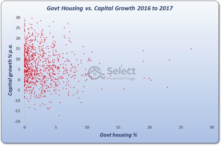
This chart is called a scatter plot. It’s supposed to show the relationship between the level of government housing in a suburb and capital growth from 2016 to 2017. If indeed there is a relationship.
Each red dot is a suburb. Now, I haven’t looked at every suburb in Australia. I’ve eliminated those with unreliable data that might lead to an inaccurate calculation of capital growth.
Let me just explain why the dots are positioned where they are.
The horizontal axis at the bottom of the chart shows the level of government housing. You can see the scale along the bottom ranges from zero on the left to 30 percent on the far right. If a red dot appears on the far left of the chart, it means the level of government housing is very low in that suburb. If a red dot appears on the far right, the level of government housing for that suburb is very high. So, left means low government housing and right means high.
As you can see,
“Most suburbs have a very low percentage of state housing”
That’s why there are so many red dots bunched up over to the left of the chart. The right side on the other hand is quite sparse.
Now, the vertical axis shows the capital growth that occurred in each suburb from 2016 to 2017. The rate of growth is shown in the vertical scale running up the left edge of the chart. At the bottom left the numbers start from minus 20 percent and go all the way up to positive 30 percent which is shown in the top left corner of the chart.
Now, if the experts are right, then a suburb with a high concentration of government housing would appear to the right of the chart and would appear towards the bottom too.
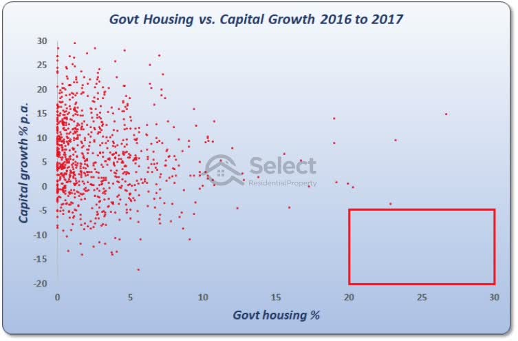
Over to the right means high government housing. Towards the bottom means lower capital growth. But as you can see that area of the chart is empty.
Similarly, if the experts are right, you’d expect to see a lot of suburbs in the top left.
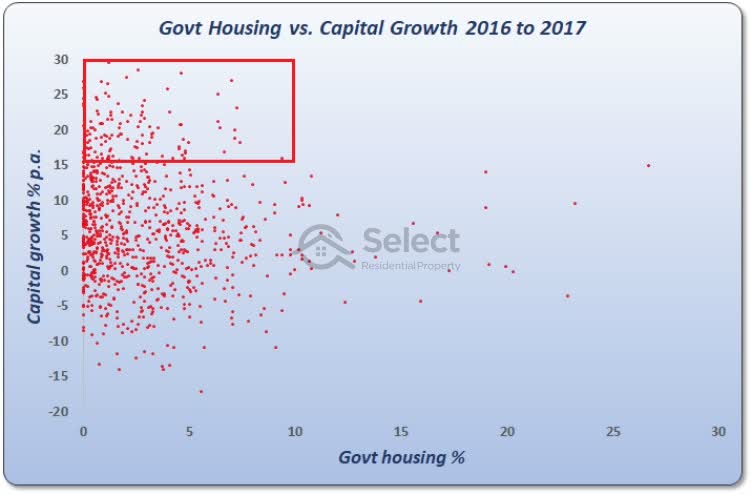
This would mean a very low concentration of public housing should have higher capital growth. And although there are more dots in that corner, it’s not the area in which the chart is most crowded with dots. The crowd of dots is lower down.
Just looking at the dots you can see there’s no real pattern or relationship between government housing concentration and capital growth. If the experts were right about government housing, we should see a spattering of red dots in the top left flowing down to the bottom right in a diagonal line.
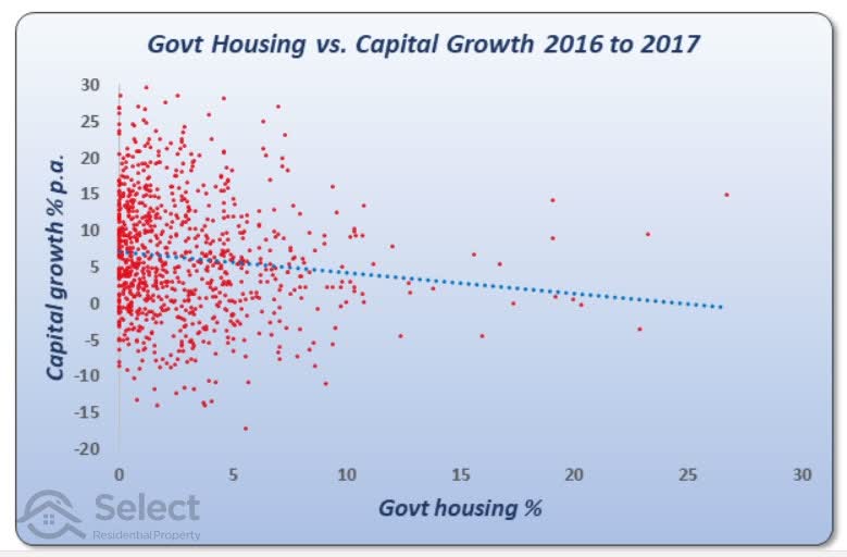
I’ve plotted a line of best fit. The blue dotted line you see on the chart now, is positioned in such a way to minimise the distance between it and all the red dots. If the relationship between state housing and future growth was a strong/strong> one, the line would show a steep descent from the top left of the chart down to the bottom right. And although the blue dotted line does descend from left to right, it’s not a steep descent.
The blue dotted line suggests there might be some relationship between low government housing and high capital growth. Although it’s not a statistically significant relationship, it might help even if only a little bit.
In fact, if you bought in a suburb with a relatively high concentration of government housing, say 5%, which by the way is comfortably above average, then you’d get about 1 percent better capital growth over the next year compared to buying in a suburb with zero state housing. That’s not a lot, but it is something. So, according to this chart, there is an argument for the relationship suggested by the experts. But there’s a problem…
The Problem
This is looking at the capital growth that occurred 1 year after the census date. But:
“It often takes the ABS a year to publish the results”
As investors looking to find ideal suburbs to invest in, we wouldn’t have the data at the census date, we’d have it a year later.
If all that extra 1% growth happens in only the 1st year and never again, we’ll get the data too late and we’ll miss out on all that whopping 1% growth.
2017-2018
So, let’s look at the 1-year capital growth starting a year after the census.
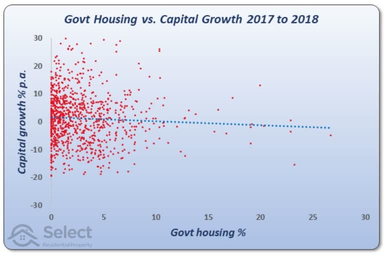
This is what the chart looks like now we’ve modelled the timing more realistically. As you can see the line of best fit is very gradual. In fact, you’d be better off by less than half a percent if you bought in an absolute zero state housing suburb versus one with about average state housing.
Perhaps the impact of higher state housing concentration plays out over a longer time-frame. We should stretch our analysis beyond a 1-year capital growth period.
2011-2014
Let’s look at the capital growth over a 2-year period starting 1 year after census. Now, at the time I’m writing this, we’re just a few months short of 3 years since the last census, so I need to use data from the prior census if we’re going to look at longer time-frames. So, this chart…
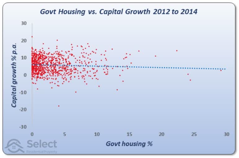
…is using data from the 2011 census.
This chart shows 2 years of capital growth starting 1 year after the 2011 census, that is, from 2012 to 2014. You can actually see that the line of best fit still has a very slight decline. You’ll also notice that the percentage per annum growth rates are spread out over a narrower band. They don’t go all the way to the top and bottom of the chart.
“It’s a lot harder to maintain a cracking rate of growth for a long time. Similarly, disastrous rates of growth don’t last forever either”
So, the longer our timeframe, the narrower that band is likely to become. That’s just an aside. The real point the chart is making is that there’s no reliable correlation between the social housing concentration and capital growth. But again, this is only over 2 years.
2012-2015
Let’s stretch it out by another year.
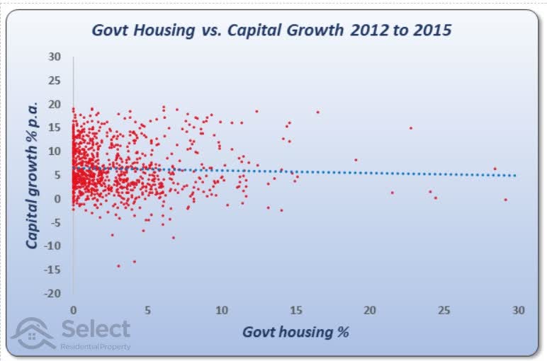
This chart is showing the 3 years of capital growth, again, starting a year after the 2011 census. It’s pretty much the same story as the last chart. The flat line of best fit means this indicator is statistically insignificant.
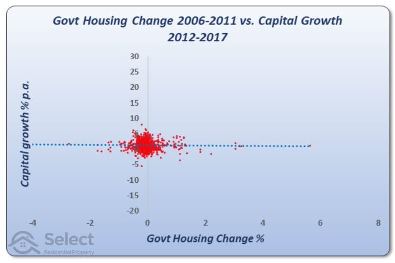
2012-2017
Let’s stretch it out to 5 years.
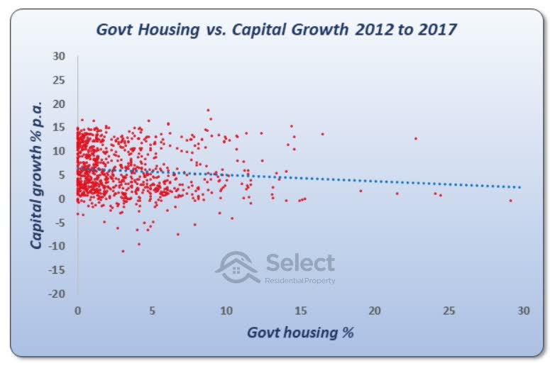
This chart shows the capital growth for the 10 years from 2007 to 2017. Remember, we’re starting the growth calcs a year after the census date to model the time it takes for the ABS to publish the data.
It is very clear from this chart that there is no relationship between high concentration of government housing and future growth over a 10-year period. At least not according to the 2006 census anyway.
The red dots stretch out from left to right in a narrow band rather than slide downwards from left to right diagonally. The blue dotted line is almost flat showing there is no real relationship.
A good relationship
Just to put things in perspective:
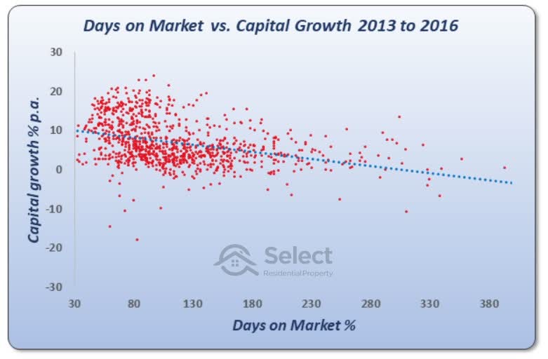
This chart shows the relationship between days on market and capital growth. You’re looking at an entirely different metric now.
The days on market is the average number of days a property spends listed for sale before eventually selling. When demand exceeds supply, the days on market will be a small figure like 30 days. If supply exceeds demand, the days on market figure will get quite large.
Now, straight away you can see that the line of best fit is much steeper for the days on market than it was for the state housing. This confirms there is some relationship between growth and days on market. The spread of red dots has a slight pattern to it – drifting down and to the right.
“Days on market is a statistically significant metric, meaning it does correlate to capital growth”
The average time a property spent on the market for this chart was nearly 4 months. But some suburbs had selling times of only 1 month. The difference in growth rate between a fast selling suburb and an average one was a little more than 3% per annum over the next 3 years. Using the days on market metric to target a suburb to invest in would have pulled in an extra 10% in total over those 3 years.
Days on market for this period was obviously a better metric for investors to research than the percentage of government housing.
Here’s an even better metric than days on market:
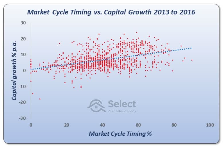
This chart shows the relationship between market cycle timing and capital growth. Market cycle timing, or MCT for short, is a measure of how likely a suburb is about to enter its next growth phase. In this case, the higher the MCT, the better the capital growth. For days on market it was the other way around, the lower the time a property spends listed for sale, the better capital growth.
The average MCT in the case of this chart was 41 out of 100. If you’d picked a market with an average MCT you would have experienced a capital growth rate of about 5.5% per annum for the next 3 years. If, on the other hand, you aimed for a market with a high MCT of around 70, you would have had about 10% capital growth per annum. So, picking high MCT markets would have given you an extra 4.5% p.a. growth which is even more than the days on market.
Multiple variables
Knowing the degree of relevance for each metric you look at is vitally important when doing your research. It’s not a case of finding the single most relevant metric to growth, it’s a case of combining them all together intelligently.
By the way, this chart:
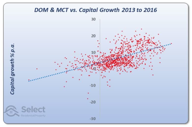
…is a combination of two variables: MCT and days on market. The line of best fit is even steeper now because we’ve combined these two variables.
The performance difference between an average market and a good one in this case is nearly 9% per annum. For a $500,000 property that equates to about $135,000 in just 3 years. This shows how important it is to combine metrics rather than look at one in isolation.
Change in govt housing
Now although we’ve seen that the current percentage of government housing isn’t a reliable indicator, what about monitoring suburbs for the change in percentage. Perhaps if there’s a sudden increase (or decrease), it might impact future growth more significantly than just looking at the current situation.
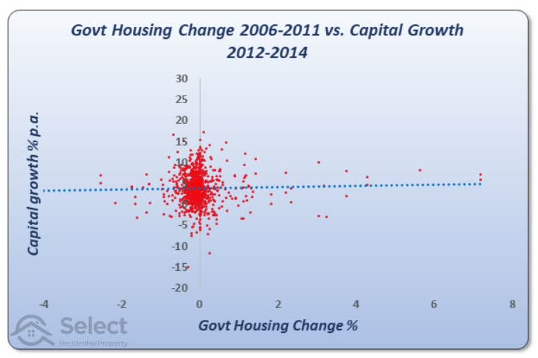
This chart shows the change in government housing from the 2006 census to the 2011 census. And it maps that change against the capital growth from 2012 to 2014. Remember we’re modelling a 1-year delay between the recording of the data and its publishing.
The trend line shows that there is no relationship. Again, it’s a flat line. This is what it looks like over 5 years of capital growth.
Again, there is no relationship.
10- year census gap
OK, perhaps the change over 5 years between censuses is not enough. Perhaps we should examine the change over a 10-year period instead. We can look at the change in government housing for each suburb from 2006 to 2016. And here’s what it looks like.
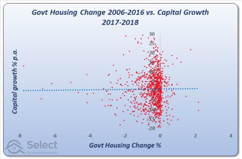
Again, you can see a flat trend line, meaning there is no relationship.
Why?
OK, so why isn’t there a relationship between government housing and future capital growth. Surely, lower socio-economic demographics should be a drain on price growth. Well, I have a few theories:
- Too few “housos”
- Affordability
- BAU
Firstly, the percentage of government housing in the vast majority of suburbs around Australia is a very small percentage. The average is around 3%. That’s simply not enough to radically alter the feel, mood or perception of the suburb to potential home buyers.
Secondly, in some cases, more affordable markets are actually dearly sort after, especially in cities where affordability might be a big issue for the average wage earner. For more detail on that topic, check out these presentations in the same series:
Thirdly, state housing authorities are not in the habit of shuffling their stock frequently. Most of the dwellings they own, they’ve owned for a long time. That means that if there are negatives brought about by social housing, those negatives have been around in the suburb for a long time already and have been well and truly factored into the prices already. So, the growth moving forward is just business as usual.
For a greater understanding of that last point, you should really check out this presentation in the series:
Schools shops transport etc are overrated
Anyway, these are just theories. It doesn’t really matter how sound a theory is if the data doesn’t support it. What matters is what the data says. And the data doesn’t give reasons, it just gives relationships.
Blocks vs suburbs
Now, before finishing up, I just want to address one more issue. The analysis I’ve conducted was at the suburb level. I could’ve shown you aggregated figures grouped to the post code or local government area level. But it tells the same story. Accumulating it over larger geographies doesn’t change the relationship.
Similarly, drilling down to the street level doesn’t change the relationship either. If there is a relationship between government housing concentrations and capital growth, then it should appear at the suburb level. There’s nothing about streets and certain blocks that would obscure that relationship from view.
Conclusion
Neither current levels of government housing, nor changes in levels from census to census, are lead indicators of future capital growth.
Experts who pump up this metric may be pumping something else up too. To arm yourself against them, check out some of the other topics in this series.
Calculations, Assumptions and Filters
Following are filters, assumptions and calculations I used which might be important for those wishing to validate or replicate this study. In summary:
- ABS census data
- 1000+ census respondent
- 50+ sales p.a.
- CG -20 to 30% p.a.
- growth <= 1.75% pa
- <= 3 suburbs per SA2
I eliminated suburbs in which there were too few census results to provide a reliable estimate of the percentage of government housing.
In order to accurately calculate capital growth, I eliminated markets that had less than 50 sales per year.
I filtered out obviously anomalous capital growths like above 30% p.a. and below minus 20% per annum. I know there are some legitimate cases around those values. It is possible. But they are extremely rare and there are lots more anomalous cases in those ranges than there are legitimate ones. So, removing the occasional legitimate case to ensure the majority of phonies are excluded, makes the results a lot more reliable.
One of the biggest phonies of capital growth calculations are the change in medians for suburbs with a lot of heavy developer activity. So, I’ve excluded from consideration any suburb in which the population increased dramatically over the period of capital growth. This would reflect a green-field estate.
The only way the population can grow dramatically is through a lot of additional dwellings being constructed. And that means extra supply, which of course, is a bad thing for capital growth. But the median usually goes up, even if there is no real growth. And that’s because new properties are usually more expensive than old ones. That makes calculations in such areas of heavy developer activity highly anomalous. So, I’ve excluded them. See the following topic for more details:
Avoid high population growth suburbs
And lastly, in order to calculate population growth, I used figures from the ABS which were at the SA2 level. Now some SA2s have only one suburb in them. In these cases, the population growth of the SA2 is the same as that of the suburb. But sometimes an SA2 will have many suburbs in it. In those cases, we can’t reliably estimate population growth. So, I’ve excluded those SA2s with more than 3 suburbs in them.