Introduction
Many professionals in the property investment industry advise investors to buy in suburbs where higher income earners live or to buy in suburbs that have experienced high growth in incomes recently.
But there’s actually very little evidence to support that this theory works in practice. In fact, after seeing what the data has to say, you might even believe the opposite. In this presentation I look at the data from a number of different angles to make certain we’ve got a broad view.
“Warning: some readers may find the following evidence confronting”
Be prepared to let go of long-held beliefs – you can be right or you can be rich.
Original theory
The theory the experts have makes sense at a cursory level. They argue that if people have more money, then they can afford more expensive properties. So, they recommend investors, “follow the money”.
Supply & demand
Property prices rise when demand exceeds supply. It’s a fundamental law of economics. OK, so picture a property being sold at auction…

…with loads of eager buyers aggressively bidding each other up higher and higher until only one has the funds left to make the last bid.
That’s the sort of demand that affects property prices. Obviously, you need a lot of buyers with plenty of money to make that kind of event take place.
Already live there
Now imagine a high-income earner, living in a suburb, along with a bunch of other high-income earners, living out their high-income earner lives in their high income-earner suburb.
Now, there’s an auction this weekend in the suburb of this high-income earner for a property at the end of their street. Is this high-income earner going to push prices up at that auction and create the kind of demand that I’m talking about? What do you think this high-income earner is going to do come auction day?
That’s right; they’re going to go grocery shopping or put a load of washing on or mow the lawn or do whatever it is that people do who already live in that suburb.
Why should they make an offer on that property? Why would they bother? They already have a property, it’s in the same street. They already live there!
“The wages of residents are largely irrelevant to the outcome of auctions occurring in the suburb in which they live”
Wages of buyers
What might help is to know the wages of the potential buyers who place offers on that property going to auction. At least they’d have some influence on its sale price. That’s the data we should be going after. But you’ve got a few problems there if that’s your angle.
Buyers come from anywhere
Firstly, the buyers could be from anywhere.

How do you know where they live, to know what their income is? You can’t assume that the majority of people buying in a suburb are those who already live in that same suburb. Buyers are allowed to buy outside the suburb in which they live.
Have you ever inspected a property that was outside the suburb you live in? If half the potential buyers are from a different suburb, then half the data you’re looking at is irrelevant. And given you don’t know that percentage; you’re taking a risk basing a decision on that data.
How many times have you moved? How many times was it a move within the same suburb? Out of those times, how many involved the purchase of your new home?
Some of the people who want a different home in the same suburb will knock-down and rebuild rather than change streets.
Census
And there’s another problem. The income data you can examine comes from census which is conducted only once every 5 years. Since it can take a year to publish, you could be looking at data that is up to 6 years old. Was that auction bidder a resident of this suburb at the time the last census was conducted?
A typical month will see about 1% of a property market change hands. It’s a lot slower over December and January. Assume 10% change every year to make the numbers easier. That means roughly half a suburb’s property sells between each census, about 50%.
“About 38% of a suburb’s residents weren’t living in that suburb 5 years ago”
As at the end of 2019, 37.5% of the average Australian suburb has “new” residents. Where “new” means, those residents didn’t live there 5 years earlier.
Given 50% stock turnover in 5 years and 38% are new residents; it’s quite likely that the wages of last census don’t accurately reflect the wages of buyers in the typical Australian suburb.
Can’t afford, can’t offer
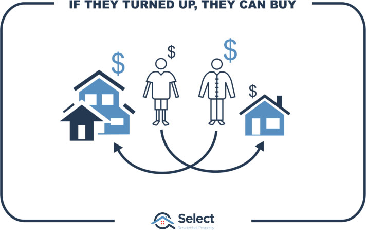
But there’s another big flaw in the logic around the high-income theory. If a potential buyer is inspecting a property, there’s a very high chance they’ve arranged finance and have found out what they can afford to buy or they wouldn’t have even turned up. As a general rule:
“Those that make offers are those that can afford to”
And that’s regardless of where they lived on census night.
And keep in mind where demand is going to come from. The higher the price of property in the location, the fewer people there are in the country that can afford to buy there.
“Buyer demand comes from the combination of wanting to live somewhereandhaving the financial capacity to buy there”
Anyone who turns up to buy has probably already met those criteria, so this sort of suburb level income research is redundant anyway.
Income vs savings
And there’s yet another problem with the theory. The theory assumes that income determines financial capacity to buy. But there are more factors determining buying potential than merely income.
Just because you have a high income doesn’t mean you can afford to make higher offers or buy expensive properties. For example, many high wage earners are terrible at saving because they haven’t typically had to.
Someone on a low income on the other hand who has built up tons of equity over the years, could be in a stronger position to buy than someone on a high income with little savings. There’s an argument that the ability to buy, may be more tightly coupled to equity than to earnings. I don’t have any data to support that, I’m merely posing the question: does a young professional with limited savings yet a high income have more chance of acquiring a property than a retiree with high equity or savings?
“High income might not be the big indicator of future growth the experts think it is”
If equity and savings are playing a significant part, then income has even less of a say than first thought.
Disposable income
Some researchers try to estimate disposable income. They compare the prices of properties in the suburb with wages of residents.
- High wages & high prices àmeh
- High wages & low prices àyey!
- Low wages & low prices àmeh
- Low wages and high prices ànuh
If there are higher wages with respect to property prices, they conclude that people living there have higher disposable incomes.
That’s not always the case, but it’s not a bad conclusion to draw – if you ignore all the other points I just made. Disposable income makes more sense than raw income.
However, you still have the same problems: They already live there so why would they push prices up?
And more to the point: why do they still live there?
“Perhaps higher disposable income means higher likelihood to move elsewhere”
If they have so much disposable income, if they can easily afford to upgrade, why don’t they sell and move somewhere more upmarket, more suitable to their kind of disposable income?
Pay rise
Other researchers look at the change in incomes rather than the current levels.
- Does rising income lead to capital growth?
- Will falling income cause negative growth?
- Should flat income result in no growth?
They want to see that incomes have been growing. Apparently, that is an indicator of future growth.
Well OK, let’s see how that might play out. Imagine a fella comes home from work after receiving news he has a pay rise. He breaks out the champagne and waits for his wife to come home from her work. She bursts in the door saying, “I got a pay rise”! “Me too!” he says. High fives all round. Pop that champagne.
“How does wage growth of the residents in a suburb push up the prices of its property?”
Assuming they both got a 10% pay rise, how much is their property worth now? Did their property suddenly go up by 10%? Or won’t it go up until their 1st pay-cheque arrives? What if they don’t even own the property, what if they’re tenants?
And how do buyers know that residents have received a pay rise so they now have to offer more if they want to buy property in that suburb?
An increase to the wages of a home owner doesn’t automatically push the value of that home up. So it begs the question: “How does wage growth in a suburb push up property values”?
Renovations
How about through renovations? Because the occupants have more disposable income, they can afford to renovate their kitchen and bathroom. Surely, wage growth leads to renos which leads to value growth, right?
Technically, yes. You could go to the bank and possibly borrow against the increased equity after a renovation. But apart from you and the bank, nobody knows the value of your property has gone up. The revaluation hasn’t affected property prices in the suburb. Its only affected the price of your property and only because you spent money on it. It’s not organic growth, it’s a forced value increase by capital injection.
When buyers, real estate agents and valuers try to place a value on a property, they look for recent comparable sales in the vicinity.
If properties don’t sell, they don’t appear in that analysis. So…
“Renovations on their own won’t push prices up, they need to be followed by a sale”
And why would an owner-occupier spend all that money to get their property just the way they like only to sell up and move out?
A lot of ducks need to line up for renovations to have a significant impact on prices.
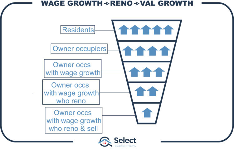
Firstly, if the occupants are tenants, they can’t renovate – it’s not their property. That chops out about a 3rd of a typical suburb’s properties.
Secondly, not all owner-occupiers will get a big income boost. Some might even be retired. That narrows the possible cases even further.
Thirdly, not all owner-occupiers who do get a wage increase will choose to spend their new fortune on a major renovation. They may buy a car or go on holidays instead. That narrows the cases even further.
And finally, not all owner-occupiers, who do get a wage increase, and do choose to renovate, and significantly, will then decide to sell the property soon after renovating. But… if all those ducks are lined up, then yes, the suburb as a whole may increase in value.
However, as I mentioned before that kind of growth is not organic, it’s due to capital injection. If every owner in the suburb renovated their property, but one didn’t, then that one property would not have grown in value like the others. Why not, it’s in the same suburb isn’t it? A valuer would de-value it because it is un-renovated.
“Renovations generally push up the price of the property that was renovated, not the one next door”
But that doesn’t mean a suburb can’t experience organic growth triggered via widespread renovation. But here’s what has to happen…
- External renos
- On many houses
- Improves street appeal
- Many streets
- Improves suburb appeal
- Draws in more buyers
- Some start paying above market value
Renovations need to be external, that is, seen from the street. So, a garden or external paint job lifts the appeal of the street. A new kitchen, bathroom, fresh carpet, etc. can’t be seen from the street.
And why does it need to be seen from the street? Well, over time, potential buyers find these nicer looking properties more appealing and consider moving into the suburb because it has such nice streets, made nice by externally visible renos.
If there are enough of these buyers who like living among nicer properties, then this will increase demand to a point where some of them start to pay above market value. And finally, we get some organic growth.
As you can see, it is an extremely tenuous claim that wage growth leads to property price growth.
But this is all theory. What you’re hanging for is some hard data which proves it. Well hang in there. It will be a lot easier to accept what the data is trying to say when you understand the reasons behind it.
Depreciation
Note that renovations only temporarily increase the value of a property. They start depreciating immediately after the renovation. Renovations are not a cause of genuine capital growth. They’re a fake temporary growth. Holding long-term, the building depreciates while the land appreciates. And for more on that topic see these other presentations in the series:
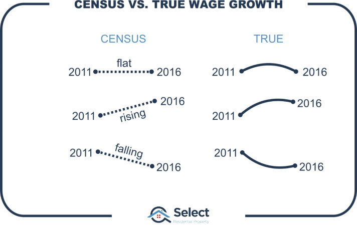
Data publication timing
Another problem with this wage growth idea is to do with timing. Remember that it’s based on census data, so it only comes out once every 5 years.
Now if you’re looking for a change in any metric over time, you really need a much more frequent sampling rate than once every 5 years.
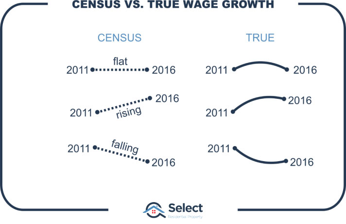
You might conclude incomes have been flat if you’re only seeing them once every 5 years. You might conclude they’re rising, not realising they turned recently and are actually falling.
Streets of wealth
Looking at data at the suburb level can be misleading if the sample size is too small. But looking at the SA1 level is even worse.
- SA1 – Statistical Area level 1
- Defined by the ABS
- Smaller than a suburb
SA1s are smaller than suburbs. They might be only a couple of blocks. They’re often used by researchers to find the streets in which higher income earners live within a suburb.
But how will it help growth. You can’t expect to buy next door to a high-income earner and get better growth. They don’t walk out their back porch and start flicking cash into the air which floats over your fence and your tenant thoughtfully passes that on to you.
So, just as with high-income earner suburbs, high income earner streets have the same problems, but at a smaller geography. And looking at things in the other direction and examining large geographies, we would have to assume that Sydney must have been out-performing the rest of Australia since wages have been higher in Sydney than any other city in Australia for decades.
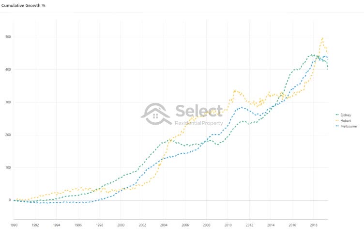
But of course, that’s simply not the case. In fact, at the time of preparing for this presentation, Hobart’s long-term growth was higher than Sydney and Melbourne’s despite wages in Hobart being one of the lowest for any state capital for decades.
And as you can see from this chart, they all trade blows. Each city has it’s turn at the top and then later the other cities catch up again. Long-term, they all grow at about the same rate, but over short periods, it may look like one is better than the other, but it doesn’t last.
Cause and effect
Now there are going to be a lot of naysayers to my arguments. They’ll no doubt quote examples of wage growth and capital growth going hand in hand and site suburb after suburb as examples. But have they analysed thousands of suburbs or only dozens? Have they analysed objectively and numerically, or subjectively with possibly some bias?
It’s quite easy to get the wrong conclusion if you don’t know how to analyse the data correctly. For example, we could end up concluding that heart attacks cause obesity if we didn’t accurately consider the timing of heart attacks and weight gain.
Just because there’s a correlation between wage growth in a suburb and capital growth, doesn’t mean we know which caused the other. Theoretically:
“The only people that will buy in a suburb are those that can afford to”
If the suburb is attracting a lot of interest, then prices will go up. Higher prices mean larger mortgages. So, buyers will typically be those who have the higher incomes to service larger mortgages. Once they move in, there will be another census conducted and the higher incomes will be reported.
But the higher incomes may not have pushed prices up. The higher prices may have pulled incomes up. But not via pay rises, but because the people who can afford to buy there already have high enough incomes.
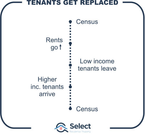
It could be the same for tenants. They might have been pushed out of the suburb because rents went up too high. But they’ll be replaced with tenants who have the incomes sufficient to afford the higher rent. The residents didn’t experience wage growth, the residents merely got replaced with those on higher wages.
Correlation doesn’t equal cause. In fact, it’s one of the reasons so many investors still believe that population growth is a good driver of capital growth. For an eye-opener on that, check out this topic:
“Find high population growth – WRONG!”
Data
OK that’s enough theory, now for the data. Let’s see what historical data has to say about incomes and capital growth. Here was my approach which I’ll embellish in a sec:
- Suburbs in state capitals only – no regional
- Split into 10 groups, (i.e. deciles)
- Each decile has 10% of the suburbs
- Lowest decile is lowest income earning suburbs
- Highest decile is highest income earning suburbs
- Calculate growth for each decile
Let’s start with the median household income published by the Australian Bureau of Statistics from the most recent Australian census in August 2016.
I split all suburbs in all the Australian state capitals into 10 equal groups. Each group represents one tenth of the income earners in the country. Each group is called a decile since there are ten groups.
The first decile is the lowest income earners. These are the suburbs where the median income was in the lowest 10% of all the combined capitals:
- First decile income earners:
- Household income ranges from $572 to $1,116 per week
- Median household income was $1,011 per week
- g. Elizabeth SA, Gagebrook TAS, Logan Central QLD
The highest decile contains the top 10% income earning suburbs:
- Last decile income earners:
- Household income ranges from $2,291 to $3,862 per week
- Median household income was $2,506 per week
- g. Malvern VIC, Cammeray NSW, Grange QLD
If we calculate the average growth for each decile, we can see whether high income earning suburbs outperformed low income earning suburbs.
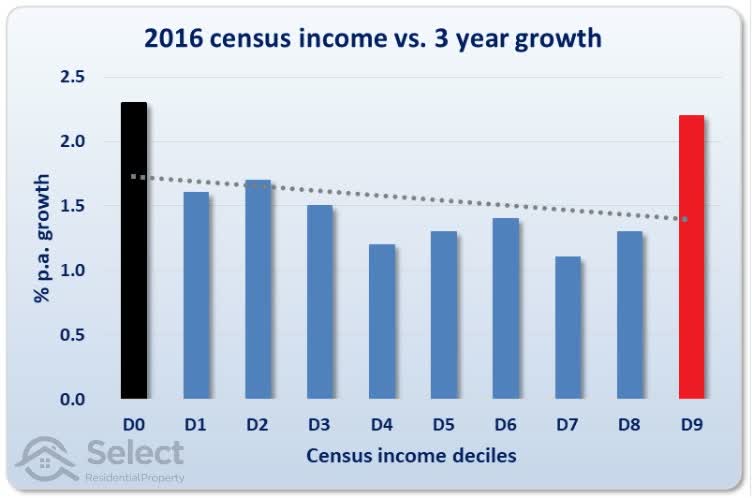
This chart shows the growth over the next 3 years after the 2016 census for each of the income deciles. D0 is the lowest income group and appears to the left of the chart shown in black. These suburbs had the lowest 10% of all incomes from around the country. The combined average growth for all suburbs in this group was 2.3% per annum over the 3 years following the 2016 census.
The suburbs with the highest 10% of income earners were in D9. They appear to the right of the chart and are shown in red. The combined average growth for all suburbs in this group was 2.2% per annum over the same timeframe.
The chart shows that suburbs with the lowest income earners matched the suburbs with the highest income earners for growth over those 3 years.
Line of best fit
The dotted line towards the top of the bars is the line of best fit. It’s positioned mathematically to minimise the gap between the top of the bars and the dotted line. The line of best fit is often referred to as the trend line because it shows the general trend across all the deciles.
In this case the trend line shows the relationship between income and capital growth. And the trend line for this chart suggests that the higher the income, the lower the growth. This is because the trend line slopes downwards from left to right.
But this was only over 3 years from August 2016 when the census was conducted to August 2019. Maybe it takes longer for the higher incomes to start influencing the suburb, pressuring faster price growth. So, let’s go back to past censuses and examine 5-year growth.
Median household income data is available for 6 censuses:
- 1991
- 1996
- 2001
- 2006
- 2011
- 2016 – excluded since 5 years have not yet past since 2016
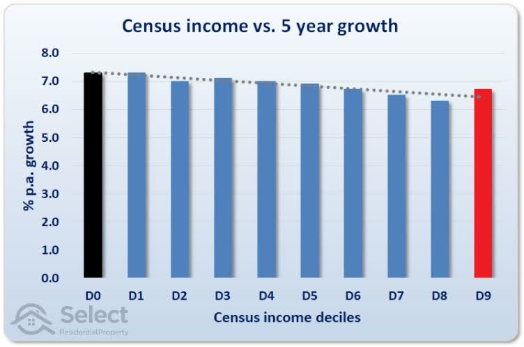
The relationship is clearer now we have a longer timeframe and a larger sample size. There is no question that over a 5-year period, higher income suburbs do NOT outperform lower income suburbs – almost the reverse in fact.
5 years may still not be enough time. Looking at 10 years following each census we can use the following censuses:
- 1991
- 1996
- 2001
- 2006
The following chart shows the relationship between incomes and 10-year growth after a census.
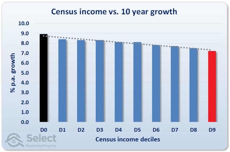
There’s still a clear relationship between inferior growth and higher incomes.
Let’s look at the longest period following a census that we can. This next chart is only using the 1991 census data and the growth is up to August 2019, a period of 28 years.
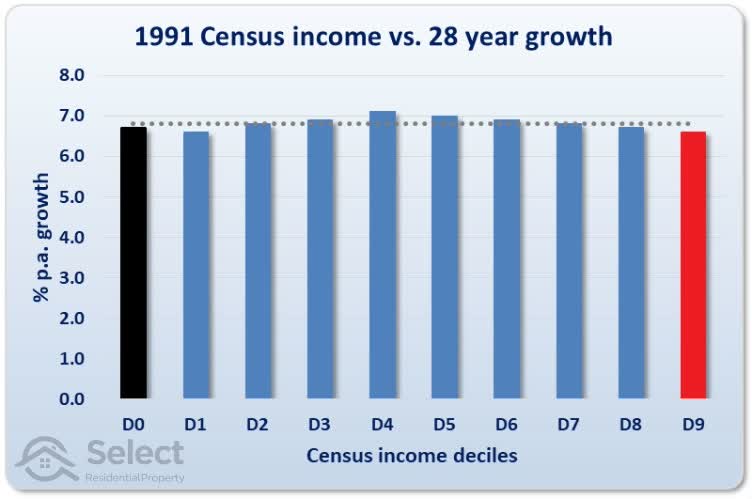
It looks like the best suburbs over the long-term are actually in the middle-income earner range. Decile 4 had growth of 7.1% per annum. The highest income earning suburbs had the lowest growth rate of 6.6% per annum.
Change in incomes
Instead of looking at whether incomes are high or low, let’s look at whether incomes are moving higher or moving lower. The problem with this approach, as I mentioned earlier, is the infrequent sampling rate since censuses are only conducted once every 5 years.
But carrying on regardless, I split the suburbs up once again into deciles. But this time each decile isn’t a “low or high income” suburb, it’s a “low or high growth-in-income” suburb.
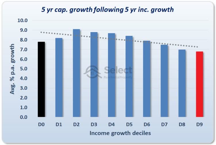
The left side of the chart represents the 10% of suburbs with the lowest growth-in-incomes over a 5-year period between any two censuses:
- 1991 to 1996
- 1996 to 2001
- 2001 to 2006
- 2006 to 2011
The right side of the chart represents the highest 10% of growth-in-incomes.
Theoretically, an investor could look at the income growth of the last 5 years and pick a suburb that has just experienced high income growth as a lead indicator for high capital growth. But as the chart shows, it doesn’t work. On the contrary, according to the line of best fit, there’s more chance of better growth if you pick low income growth suburbs.
Performing the same analysis over longer timeframes doesn’t change anything…
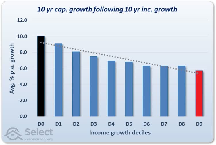
Over ten year periods the reverse relationship is the most pronounced. This is looking at the growth in incomes across two censuses and measuring the capital growth for the following 10 years.
If we want to look at the longest period of income growth, we’d have to compare the incomes of 2016 census to the incomes of the 1991 census. But that only leaves us with 3 years of capital growth with which to compare suburbs, from 2016 to 2019.
So instead, I’ll measure income growth from 1991 to 2011. That’s a 20-year period covering 4 censuses. And I’ll measure capital growth from 2011 to 2019.
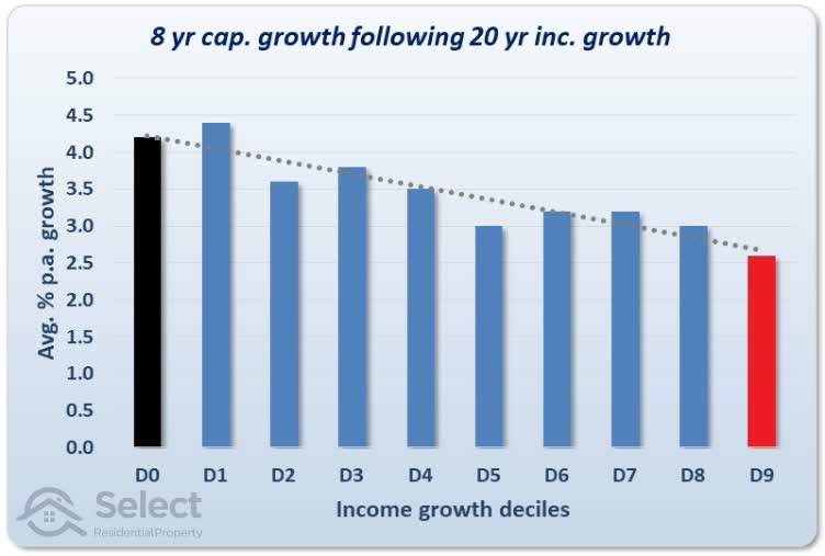
Even examining growth in incomes over 20 years shows no correlation between higher incomes and better capital growth. In fact, for this specific 8-year period, there’s evidence to suggest lower income suburbs are a better option.
This is not for random far-out regional desserts; all data for all these charts is for regular suburbs in state capitals from around the country.
Granger causality test
There’s a test that data scientists use to see if one metric might “cause” another, e.g. whether wage growth causes price growth. It’s called the Granger Causality test. Technically, it’s not “cause” but rather “precedence”. That is, do wages grow first and then prices follow?
I applied the Granger Causality test using census wage data from 1991 to 2016. Then I calculated growth using 12-month median values for the same time-frame. Finally, I eliminated suburbs in which either wage data or median data was unreliable.
Rather than bog you down with the statistical details, the conclusion was that wages do not “Granger-cause” prices. In other words:
“Suburb wages are a very poor forecaster of suburb values”
Suburb income vs state
We’ve looked at current incomes and we’ve looked at change in incomes. Neither have worked according to how the experts suggest. I’m running out of ways to massage the data so these experts can hang on to even a dim hope. But there’s another way in which income can be considered.
Some experts look at the income of a suburb and compare it to the income of the state in which the suburb resides. They claim that investors will be better off choosing suburbs that have a high income relative to the state.
Now I kind of addressed this in the first set of charts using deciles. But they were deciles of suburbs in our major cities. I deliberately ignored the rest of the state aiming at high reliability. So, I guess we have to go to the trouble just to make sure we’re not missing something.
Sorry to bore you with all this, but the proof for this topic has to be comprehensive because there will be objectors who’ll challenge this research. It takes a lot of evidence to overcome a long-held belief.
Alright, let’s examine what the data has to say about the approach of comparing the suburb incomes to the state incomes.
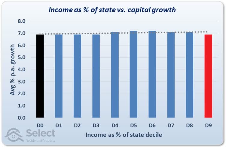
This chart compares suburb income as a percentage of the state’s income with capital growth. The black bar represents the combined average growth rate per annum of suburbs with the lowest income compared to the state median.
Instead of boring you with more and more charts, this one chart combines all cases for all census years and all combinations of growth periods – 5 years, 10 years, 15, etc.
Overall the line of best fit is almost dead flat. This means there is no correlation between suburb income as a percentage of the state’s income. In fact, the suburbs with the lowest income compared to the state median had the same per annum growth rate as suburbs with the highest income compared to the state median.
And since this one chart covers multiple censuses, it shows that there really has never been a correlation between income and growth. So, where did this advice come from in the 1st place?
Perhaps the experts just assumed that higher incomes would result in higher growth and didn’t look for sufficient data to confirm or deny it. Or perhaps their observations were personal and anecdotal rather than widespread across a massive sample size like you’ve seen here.
Filter reference
For my fellow data nerds who’d like to replicate or challenge these results, there’s a list of filters I’ve applied on the data and calcs right at the end of this presentation.
Other data sources
Now some might argue that you can’t really use census incomes, they’d be inaccurate. People could write anything down. And I agree to some extent. I wouldn’t place too much weight on the income for an individual suburb. But remember, I’m not looking at individual suburbs. I’m looking at a general trend across thousands of suburbs to uncover a general relationship.
And if you do think that census incomes are unreliable, then that supports the view that you can’t really use them as lead indicators of capital growth.
But there are some good things about this data set. Firstly, it covers a sufficiently long period of time. And secondly, it has a massive sample size of many thousands of suburbs and literally millions of households. There would have to be a monumental problem with this census data to completely reverse the conclusion. Which is…
Conclusions
Income analysis won’t help investors achieve superior capital growth regardless of whether you look at:
- Current incomes,
- Change in incomes or
- Incomes relative to the state median
“Income analysis is a poor heads-up to future growth prospects”
I hope this analysis helps with your property investing. Make sure more bogus teaching doesn’t muck you up by checking out other topics in this series.
The following section is for the data nerds and potential naysayers.
Filters
OK, here’s the list of filters I’ve applied to come up with these calcs. An explanation follows
- State capitals (ABS SUAs)
- 500 dwellings per suburb min.
- Houses & units
- ABS household family income
- Estimated median
- End to end growth calcs
- 20+ sales in a year
- 12-month median (Core Logic’s)
- <10-year growth between -10 and 30% pa
- 10+ year growth between -5 and 15% pa
- Exclude low income respondent counts
- Exclude high % of unknown incomes:
- Income not fully stated
- Partial income stated
- All incomes not stated
- Not applicable
I’ve excluded suburbs outside the state capitals (except for the last chart which compared suburb income to state income). And I used Significant Urban Areas from the Australian Bureau of Statistics. Which means Canberra actually includes Queanbeyan which is in neighbouring NSW. So, it isn’t strictly only Canberra suburbs. And I’ve excluded small suburbs, those with less than 500 dwellings of each particular type, broadly separated into houses and units.
I’ve included the growth of both houses and units, treating them as separate markets within the same suburb but with no weighting towards any in particular based on their relative sizes. Incidentally, I removed units from consideration to see if it made a significant difference. It didn’t.
I’ve used the ABS census household family income and calculated an approximate median using the wage ranges they supplied for each census and the counts in each group. Which means there may not have been an income at that precise figure, but the figure is a good enough representative for the suburb.
Growth has been calculated using simple end to end figures rather than an exponential line of best fit of the historical growth profile. I’ve excluded markets that had less than 20 sales in the start or end year and used Core Logic’s 12-month median. I’ve also excluded ridiculous and obvious growth outliers. Over the short-term, growth below -10% per annum or over +30% per annum was omitted, assumed to be anomalies. Similarly, suburbs with growth outside the range from -5% to +15% per annum were excluded from consideration for periods of 10 years or more. Again, assumed to be anomalies.
I also excluded suburbs in which median family household income was unreliable e.g. cases where there were too few census respondents or too many incomes not stated or only partial data.