Introduction
How many times have the experts told you to buy an investment property close to:
- Transport
- Shops
- Schools
- Parks
- …and more
I’ve even heard some figures on how much more growth you’ll get buying in the right street versus just any street.
“It might only be 1.7% extra growth, but over 25 years that’s $200,000”
Firstly, although $200,000 sounds like a lot of money right now – in 25 years’ time it might be the average wage.
Secondly, you can’t assume that the suburb won’t change. Some bad streets might come good.
Thirdly, and most importantly,
“Superior growth doesn’t last”
Even if the suburb doesn’t change at all. If the good streets now are still the best streets 25 years from now, you’re still unlikely to have that 1.7% better growth. And to explain why, I need you to view another topic in this series which tells a tale over a hundred years. Relax, it only takes a few minutes. It’s a story about the change in the price of apples and oranges.
Superior growth doesn’t last forever
The apples & oranges analogy makes it clear why superior growth simply can’t last long-term.
The apples and oranges analogy would suggest that properties near shops, schools, transport nodes and parks can’t continue to outperform. And it makes perfect sense too. Especially if those shops, schools, parks, etc. have always been there since as long as you can remember.
Accelerated growth
The introduction of a new amenity could result in an accelerated rate of growth.
But that high growth rate won’t last forever. Each year, the price gap between an underperformer and an outperformer widens. Eventually, buyers consider the price difference too great. At this point, the benefit of proximity to favourable amenities will become fully factored into the price of properties and the accelerated rate of growth stops and reverts back to business-as-usual type growth rates.
The benefit of proximity to a new amenity is eventually factored into prices
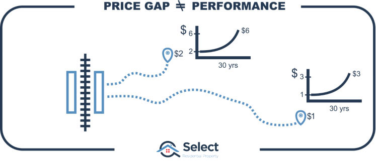
Difference isn’t growth
The silliest reports I see will mention that properties closer to a certain amenity e.g. schools, or train stations, are 12% or $150,000 higher in value than those further away. The implication of such a statement is that you will be better off by 12% or $150k if you buy close to those amenities too.
But that’s the current price difference. It’s not the change in future growth. It’s not a growth rate, it’s a difference in price now. The difference in value may have already been factored into the price for many years.
I’ll show what I mean with a concrete example. Assume property A is within walking distance of the train station and it is 10% more expensive than property B that is several kilometres away from the train station in the same suburb.
- Now:
- Property A
- 800m to station
- $550,000
- Property B
- 3000m to station
- $500,000
- Property A
- After 20 years:
- Property A
- 800m to station
- $1,100,000
- Growth = 100%
- Property B
- 3000m to station
- $1,000,000
- Growth = 100%
- Property A
In 20 years’, if it is still 10% more expensive, then both properties have grown at the same rate – neither outperformed. Even though the difference used to be $50,000 and is now $100,000 both have had the same performance.
A 10% difference in current prices doesn’t mean there’ll be a difference in future growth rates.
And superior historical growth doesn’t mean superior future growth either. For more on that topic check this out:
“High property growth history is a red flag“
Small sample size
Any expert claiming that a property will have superior growth simply because of its proximity to key amenities is not an expert. What makes a real expert is one who considers the age of those amenities.
The worst offenders I see are project marketers trying to flog off a development project. “Look it’s got schools nearby, it’s got units nearby, it’s got shops nearby, it’s got more units nearby, it’s got roads. There’s a bus stop. Here’s a petrol station. Cute dog! You should buy here. Did I mention it’s got units? Please buy one.”
Don’t trust a developer’s growth research. They’re not as interested in future growth as you might think. The bulk of their research during site selection is based on project feasibility, that is, how much money they can make when they sell.
Proximity to amenity is no guarantee of above-average growth even if your property is surrounded by a set of the best amenities a suburb can have.
Period of analysis
I have seen some more professional reports about the benefit of buying property close to a train station or within a top-class school catchment zone. The better reports look at change in values over time, not just the current price difference.
But none of the reports I’ve seen have examined a long enough time-frame – long enough to show that if the amenity isn’t new it has no effect on growth. And ideally, long-enough to show that the effect of a new amenity on growth rate eventually wears off.
So, I thought I’d do some research to set the record straight and prove that proximity to desirable amenities has very little influence on future growth… if those amenities have already been there for a long time.
Train stations
Let’s start off with train stations. Following is a map of the Sydney train network.
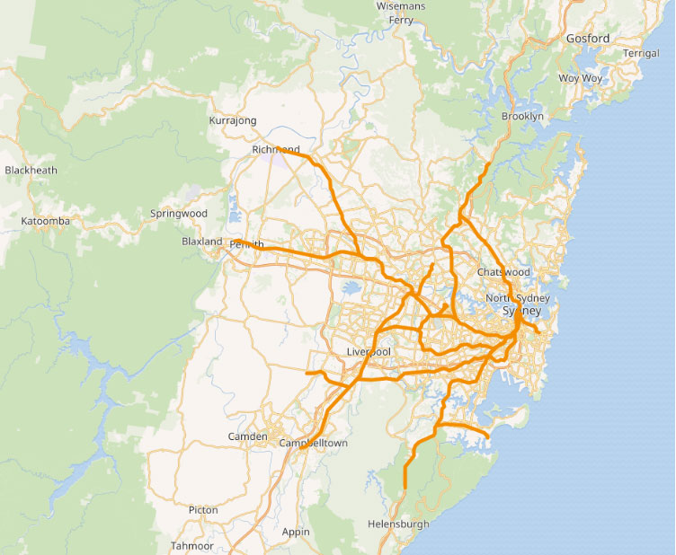
The train lines are shown in thick dark orange. The white areas are residential areas – where people live. As you can see parts of Sydney are well serviced and other parts aren’t.
The majority of train stations in the Sydney network have been around for about a hundred years. This makes it easy to see if they have outperformed long-term. I have property data dating back about 30 years. That means in most cases the train stations have already been there for about 70 years. That’s plenty of time for the benefit of that train station to be well and truly factored into the price of properties in suburbs with train stations.
So, let’s see if the growths of properties in suburbs that have a train station outperform those without.
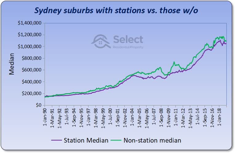
The purple line on this chart shows the change in the combined value of suburbs in Sydney that have a train station and have had one for more than 30 years. I’ve eliminated relatively new train stations.
The green line shows the growth in all the other suburbs in Sydney. As you can see the long-term growth has been pretty much the same for both stationed suburbs and un-stationed suburbs.
This chart goes some way towards validating my argument: that long-term, having a key amenity such as a train station doesn’t really help with capital growth.
Melbourne
Perhaps this phenomenon is unique to Sydney. Let’s examine Melbourne’s rail network.
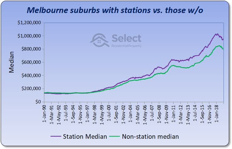
Well this is a little different to the Sydney chart. Here we see that suburbs with stations, the purple line, have outperformed suburbs without stations, the green line, over the long-term. Except for the first 7 years, the difference in growth has been consistent.
The difference in growth rates over this 30 year period works out to be 0.3% per annum. Some might argue this is not statistically significant.
The Sydney train station chart supported my argument. But the Melbourne one opposes it. Why?
It’s possible that traffic congestion in Melbourne has been rising and prompting many Melbournians to switch to public transport. Perhaps the traffic congestion in Sydney was bad enough to trigger this response a decade earlier or perhaps not to the degree as in Melbourne. Who knows? The point is, there’s one data set supporting my argument and one refuting it. Let’s keep researching to see what Brisbane pops up.
Brisbane
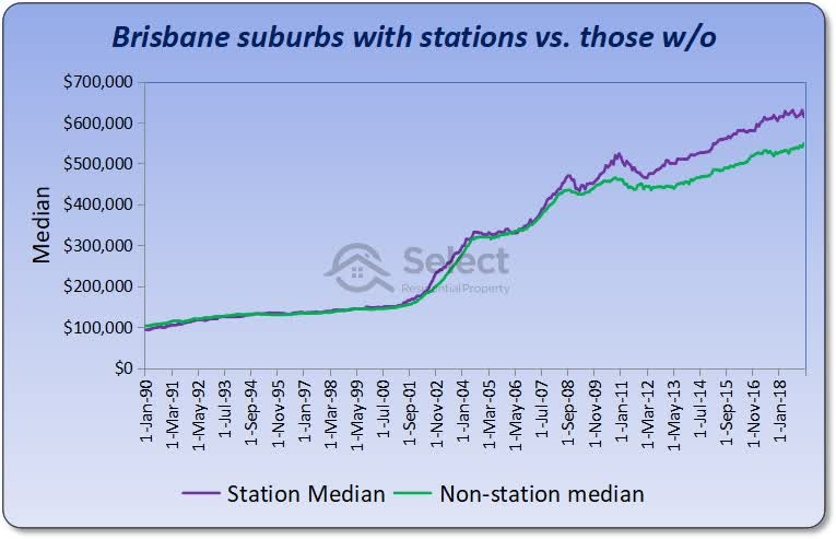
Brisbane’s chart shows the growth in train station suburbs matches the growth rate of suburbs without train stations for all but the last half a dozen years. It’s too early to tell if the last few years have started a trend that is set to continue or whether balance between these two markets will be restored again over coming years.
Note that it’s possible for train stations to become more appealing during certain points in their history. They can get upgrades, improved trains, better parking, lighting, security, etc.
It’s a bit hard to say which way this chart points, so let’s move on to a different type of amenity altogether.
Schools
One thing Melbourne is well known for is the premium commanded by houses in close proximity to good schools. The next chart shows the growth in suburbs with top class schools versus suburbs without good schools.
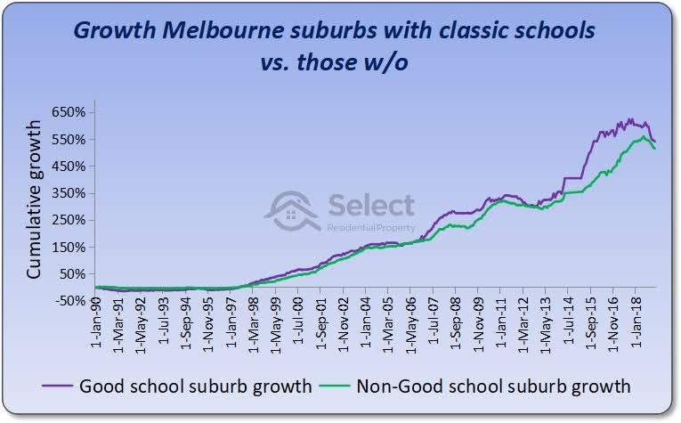
You can see that over 30 years there’s been no difference. Although both lines took different routes to get there, both have performed equally well over the last 30 years.
What’s a “good” school?
Now we could argue about what constitutes a good school. There are a number of opinions on the subject. The schools I picked however, had to be well over 30 years old and at least appeared sometime recently in one of the school ranking websites up towards the top of the rankings. And most of them were in pretty exclusive areas.
Note that this chart will be a little biased in favour of the purple line. This is because I picked “good” schools using recent rankings combined with the age of the school. It’s possible the school only came good recently – like in the last 5 to 10 years. The comparison assumes the school was good 30 years ago and has continued to be good. But the list of good schools I got was biased by those that are good now.
Don’t be fooled by short histories
Also, note that if you only look at a short history, for example, the 5 years from 2012 to 2017, you might think that good school suburbs do outperform others, that they’ll always outperform other suburbs. Imagine only looking at the section I’ve marked in red…
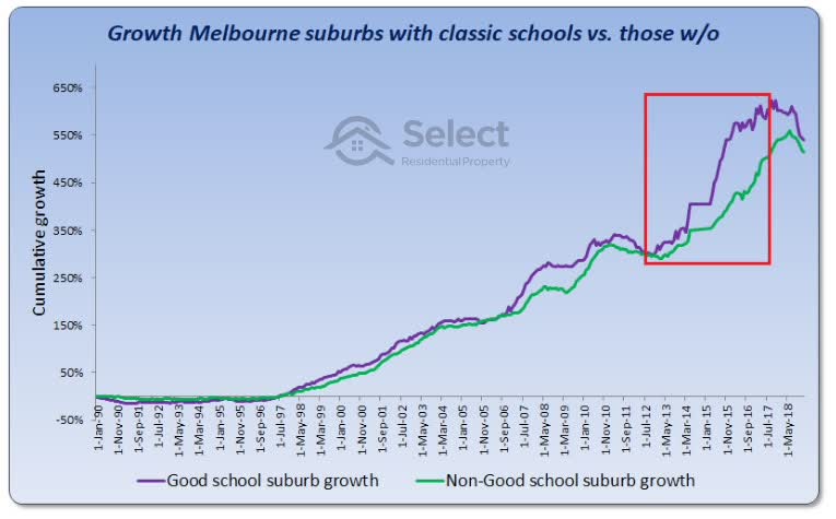
I’ve seen this come up again and again with school research. I saw one recently for Brisbane public secondary schools and it was only covering a 5-year period up to 2018. A narrow view like that can lead to a misunderstanding of how capital growth works and what true impact good schools have on price growth.
The chart clearly shows that long-term there’s no difference. Being close to one of the top schools in the state doesn’t really result in better long-term growth even though it may draw a premium in property prices.
How about we look at yet another amenity, this time one that is believed to drive prices specifically in Sydney.
Beaches
One good thing about analysing beaches is that we know the beach won’t change materially over the long term. It’s not likely to get an extra line, platform or under-cover carpark like train stations might. Sand, waves and ocean views are still pretty much the same as what they used to be 30 years ago.
The purple line in the next chart plots the growth in Sydney suburbs that have beaches. The green line shows the growth of the rest of Sydney.
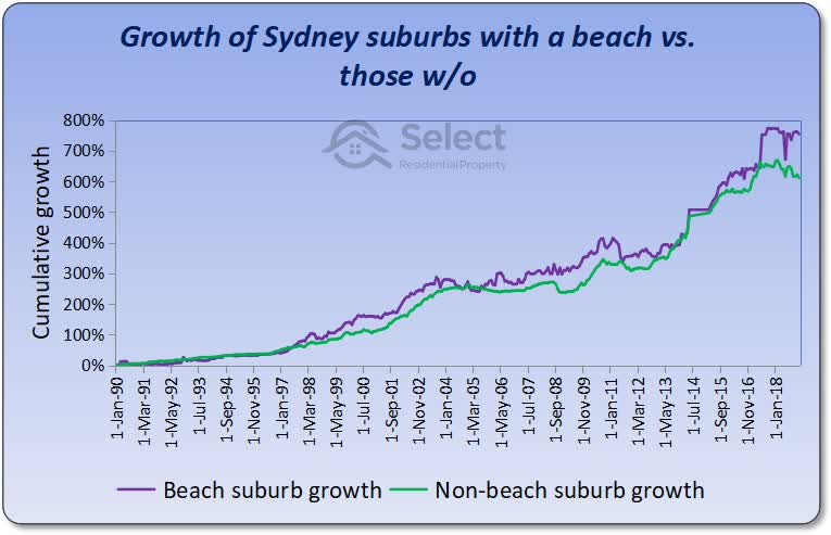
The chart clearly shows that, long-term, neither market outperforms the other. At the top right of the chart you can see that only 2 years ago, suburbs without beaches had matched suburbs with beaches for price growth.
When no-change means above-average growth
Before we move on from beaches, I want to point out that sometimes you can get extended above-average growth rates in suburbs that don’t undergo any change. Without change, there’s no reason for accelerated rates of growth – remember the apples & oranges story.
But sometimes change to the suburb itself isn’t needed. Sometimes it’s a lack of change while other surrounding suburbs do change. For example, an over-crowded over-supplied suburb with no restrictions to development is undergoing lots of change, but the change is over-supply which has a negative effect on price growth. Compare that with a suburb in which council don’t want any developers to touch it. That restriction of supply will assist price growth, but there’s no change.
And this brings me to my point. How many suburbs are there in Sydney that have a beach now compared to 50 years ago. As the city has expanded to the west, north-west and south-west, the number of suburbs has grown significantly, but none of those new suburbs have beaches.
So, there’s an argument to support the theory that beach suburbs of Sydney should outperform over the long-term because of their scarcity. But instead, as you can see from that chart. It hasn’t really happened. At least not over the last 30 years anyway.
Shops
Rather than focus on a particular city for this type of amenity, let’s look at the top 50 shopping centres across all of Australia regardless of where they are.
The purple line on this next chart shows the growth in prices of suburbs within 4km of one of the top 50 shopping centres in Australia as measured by floor space and shop count. The green line shows the growth of all other suburbs.
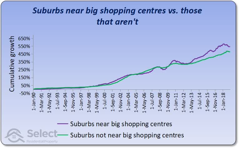
Oh, and BTW the purple line only includes suburbs near shopping centres that are more than 30 years old.
As you can see, the growth rates have been pretty much neck and neck. And the lead has swapped a few times too.
Recent changes
Don’t be fooled by the widest gap being at the end. It looks like there has been a change recently favouring suburbs near shopping centres. But this is a trick with compound growth. The gaps between two markets always look wider at the end. The gap in 2006 is just as significant in percentage terms as the one in 2019.
Also, it’s not clear whether or not the most recent gap was caused by changes in these shopping centres. Because I don’t have historical data for the size of shopping centres, I used the latest data. Much like schools, I had to assume the biggest and best were still the biggest and best 30 years ago. So, the chart may be biased towards the end – in favour of suburbs near shopping centres.
There is no data available from 30 years ago about the relative sizes of these shopping centres. It’s possible that in the last half a dozen years, some of the shopping centres had significant growth in size drawing more people to them and making surrounding suburbs more appealing for home buyers than they have been in decades past.
Walk score
For those of you not familiar with Walk Score, it’s a score out of 100 for the level of walkability to the most popular amenities in a suburb. The Walk Score (WS) covers all sorts of amenities like train stations, schools, shops, beaches, parks, etc. It would be an ideal measure to use. Unfortunately, WSs for Australia only date back to around 2013. This is way too recent to call long-term. We really need data from at least 20 years ago.
There have been plenty of studies conducted in countries that have a WS to determine price difference between high WS houses and low WS houses. Every study I’ve seen confirms there is a correlation in price difference. But again, that’s just a difference in current price. Current price difference is not a gauge of future growth potential.
And none of these studies have shown the long-term impact since the WS hasn’t been around that long. But let’s have a quick look at how high WS suburbs have performed over the short history of the WS.
Sydney
The next chart compares the performance of suburbs within Sydney from late 2014 to early 2019.
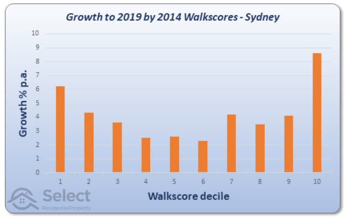
The chart splits suburbs by their WS into 10 equally sized groups called deciles. Suburbs in the top 10% by WS appear on the left of the chart. These are places like Surry Hills & Pyrmont in the Sydney CBD. The suburbs with the lowest WSs are in the tenth decile over to the right of the chart. Some of these suburbs are: Lucas Heights and Berowra Waters.
The chart says that over the short-term, in Sydney, you would have had better capital growth if you had either picked very high WS suburbs or very low ones. That contradicts the theory that proximity to amenities improves growth prospects. But it’s a short period of analysis.
Melbourne
Let’s look at Melbourne.
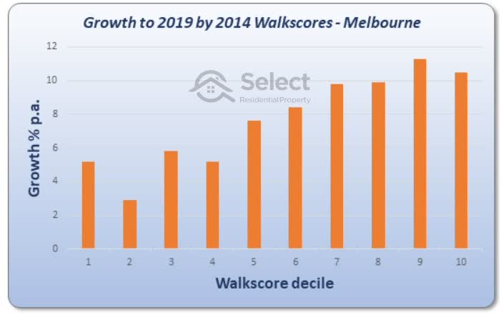
This chart shows a clear counter-correlation. The high WS suburbs are on the left and yet have had lower growth than the suburbs to the right of the chart which had higher WSs. There’s a very clear inverse correlation.
Brisbane
Brisbane is the same…
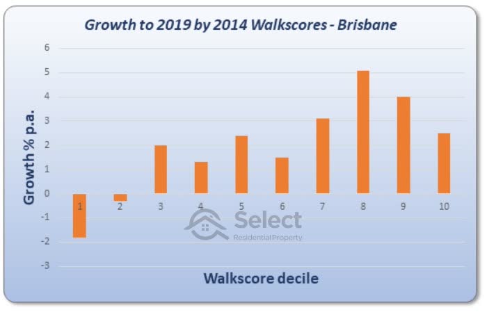
In fact, in Brisbane it looks like over this time-frame, if you had a lot of amenities in your suburb, you actually had negative growth.
Perth
But Perth shows the opposite correlation.
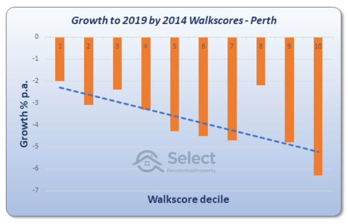
This can be a bit confusing if you follow the slope of the line of best fit. But what this chart is actually saying is that negative growth was not as negative in suburbs with higher WSs. So, this chart actually supports the notion that amenities improve growth prospects.
What about Adelaide?
Adelaide backs up Perth’s correlation, although it’s not at all convincing.
Overall, there is some evidence to suggest that amenities have been a subtractor of growth and some evidence to suggest they add to it.
Airports
Airports are another amenity many point to as drivers of growth.
Brisbane
There was a study performed by Queensland University of Technology and the Air Transport Innovation Centre around 2016 which examined how the opening of Brisbane’s new “international” airport in 1988 affected property prices under the flight path.
Key points:
- Opened 1988
- Suburbs under flight path affected
- Poor growth lasted 4 years
- Prices caught up over next 21 years
Being under the flight path is quite noisy so it’s actually a negative amenity for some Brisbane suburbs. But the report found that price growth suffered for only about 4 years. The 4 years immediately after the opening. But from then on, for the next 20+ years, growth of affected suburbs actually caught up with suburbs that were not affected by aircraft noise.
In other words, the amenity’s introduction only affected growth rates for a short time. Long-term there was no difference in growth rates compared with other suburbs that weren’t affected by aircraft noise.
Sydney
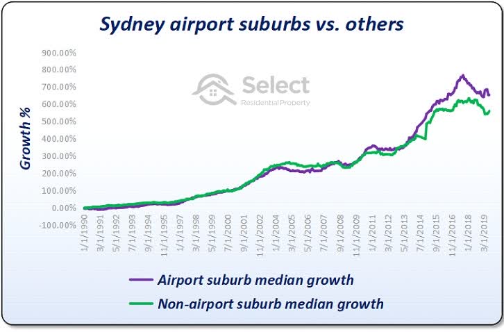
Here is a comparison of the performance of suburbs near Sydney airport versus other Sydney suburbs not near the airport. The purple line follows the growth of suburbs close to the airport from 1990 to near the end of 2019. The green line shows the growth of the rest of Sydney’s suburbs.
The suburbs close to the airport were within about a twenty-minute drive.
At first it might look like proximity to the airport is a long-term growth driver. But the chart shows the lead between both sets of suburbs has changed over the 30 years. They had the same growth 24 years after the start of the comparison. This once again highlights that outperformance doesn’t last long-term.
Melbourne airport
Doing the same analysis for Melbourne airport we get something interesting.
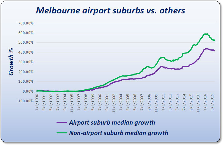
Over the last 23 years this chart suggests that buying close to Melbourne airport may not be the best investment strategy. Keep in mind that Melbourne’s airport is nestled amongst a lot of vacant land which is very different to the case in Brisbane and Sydney.
Interestingly, the new Sydney airport, to be built at Badgerys Creek, is also nestled in amongst a lot of vacant land. If that vacant land is developed to a significant degree, the additional supply will thwart capital growth. Over-supply can easily counter the benefits new infrastructure provides, regardless of how significant they might be.
Price variability
There’s another way we can look at this amenity proximity concept. If certain properties in a suburb regularly outperform other properties in the same suburb because of their proximity to amenities such as schools and shops, then we should see over time an increasing price disparity between well-placed properties and poorly placed properties.
Not only would the dollar gap widen, but the percentage gap in price should widen as well. Over a sufficiently long time-frame, the percentage difference in prices should increase according to the level of outperformance. But it doesn’t.
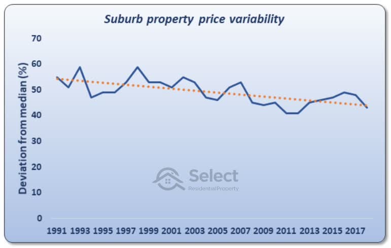
This chart shows the typical percentage price discrepancy between properties in the same suburb across over 10,000 Australian suburbs. The data covers a period of nearly 30 years and nearly a million property sales.
The chart shows that over the last 30 years the deviation in price between properties within the same suburb has actually been narrowing, not widening.
Now, this isn’t the best analysis because it doesn’t consider the changes in amenities for a suburb. But it does suggest that proximity to favourable amenities is not a long-term growth driver.
Conclusion
OK, time to wrap it up. The data shows that although there are exceptions, there’s no reason to believe that simply being near amenities or having them in your suburb is a long-term growth booster.
Now I just want to say, I’m not suggesting proximity to favourable amenities is a bad thing. I’m not for a second suggesting you don’t look for the best streets in a suburb. All I’m saying is:
- Markets with amenities aren’t superior
- Markets w/o amenities aren’t inferior
- Don’t expect superior growth due to amenity proximity
- Superior growth doesn’t last long anyway
For more on similar topics, check out some of those other videos I mentioned earlier. If this video was helpful or you’d like to make a comment, feel free to do so in the section below. Thanks for reading this far.
Calculations & Filters
For those who’d like to verify this data, here are some of the calculations, filters and assumptions I made:
- Growth calcs:
- Core Logic
- 12-mth medians
- Sydney & Melbourne train stations:
- With at least 750 houses
- Minimum of 60 sales/year for start and end years
- Older than 30 years
- Sydney beaches:
- Houses only
- At least 750 in the suburb
- Minimum of 60 sales/year for start and end years
- Melbourne schools:
- Top 100 secondary schools
- Ranked by bettereducation.com.au
- 2018 list
- See website for full list
- Older than 30 years
- Shopping centres:
- Suburbs within 4km
- With at least 750 houses
- Minimum of 60 sales/year for start and end years
- Older than 30 years
- Walk-Score analysis:
- Walks scores from 2014
- Houses & Units
- 100+ dwellings
- 12-mth median
- Core Logic data
- Airport analysis:
- Suburbs within ~10km
- At least 750 houses
- At least 60 sales a year
- Houses only
- Core Logic medians
All suburbs with amenities had to have these amenities for longer than 40 years to see if there was an influence on growth rates over the long term.
That’s it, thanks, see ya.