Introduction
I’ve heard loads of property professionals claim that markets at the upper end, will fare better during tough times than the cheap and nasty markets. They say that properties closer to the CBD in affluent areas. will hold their value better during corrections than cheap suburbs.
This is straight up and down wrong. In fact, it is exactly the other way around:
“Cheaper markets hold their value better when there’s a correction. It’s expensive markets that fall the most.”
In this presentation I’ll show you the evidence and provide the logic behind it.
Evidence
Let’s start with some research to find when there were tough times, that is, when there were corrections in property prices. The following chart shows the percentage growth in Australian property prices from 1994 to 1997.
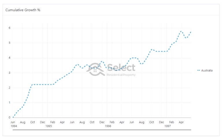
You can see there are small dips for a month here and there, but nothing really serious. The biggest correction was in late 1995. But really, it’s virtually flat.
Technically, prices did go backwards from December 1995 to March 1996. Peak to trough was only 3 months and totalled -0.6%. I know it’s not much. But as you’ll see there aren’t many cases in our last 30 years we can point to where the Australian median dropped. It’s a bit of a stretch to claim this as a correction, but we’ll have a look at it anyway.
The next country-wide correction occurred in 2008 after the GFC.
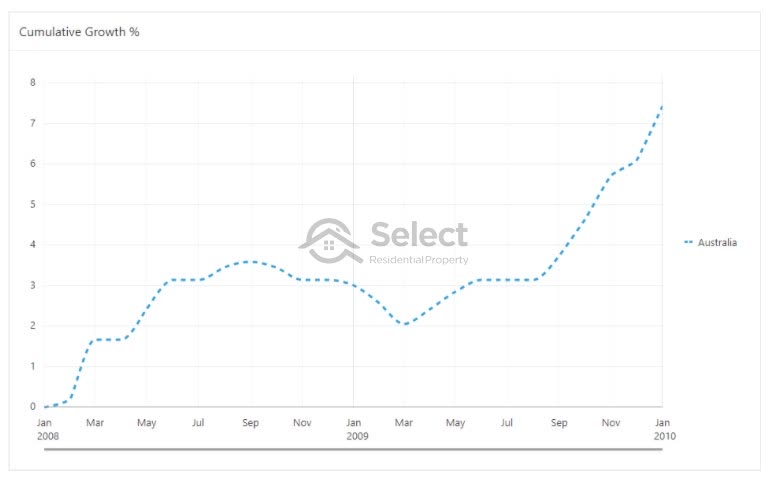
Peak to trough lasted 6 months this time and the total percentage fall was -1.5%. And it took 6 months from the bottom to climb back to where it was. So, we were only without growth for about 12 months.
The next case was 2011.
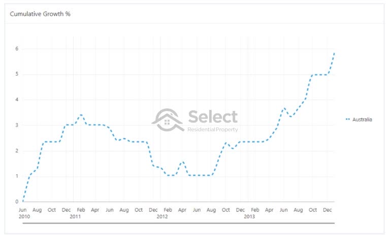
This correction started in February 2011 and bottomed out in Feb 2012. Prices came back a little more than 2% over those 12 months. It took about another 12 months for prices to climb back up to where they were before the correction started.
The degree of correction was a bit more than 2%, so again nothing alarming.
Now we have three country-wide corrections to examine. And at the time of writing we’re in the middle of another correction. It’s mostly being felt in Sydney and Melbourne. So, we’ll have a look at those cities in isolation later. For now, let’s focus on what we have so far.
Let’s examine which end of the market suffered the most during these times, was it the upper end or the lower end?
Best & worst 100 markets
One of the claims made by these wannabe experts is that suburbs closer to the CBD will hold their value better. So, let’s see whether the biggest falls in prices were in markets closer or further from the CBD.
For the 1996 price correction I found that the worst 100 falling markets had a median distance from the CBD of 35 km. And the best 100 rising markets had a median distance from the CBD of 87 km.
- Worst 100 falling mkts – 35 km to CBD
- Best 100 rising mkts – 87 km to CBD
Clearly, some of these rising markets weren’t even in the city, they were in areas nearby.
What about the 2008 price correction?
- Worst 100 falling mkts – 17 km to CBD
- Best 100 rising mkts – 47 km to CBD
Again, not really supporting the experts’ argument is it.
And for the 2011 price correction:
- Worst 100 falling mkts – 24 km to CBD
- Best 100 rising mkts – 33 km to CBD
As you can see, in all 3 correction periods, the top 100 performing property markets were further away from the CBD than the bottom 100 performing mkts.
Closest & furthest markets
Let’s try looking at things another way. Instead of looking for where the best and worst markets were. Let’s look at how the closest and furthest 100 markets from the CBD performed. We’ll see how dramatically their prices changed over the correction periods.
For the 1996 correction, the median growth of the 100 closest markets to the CBD was -3.13%. The median growth of the 100 furthest markets from the CBD was -4.38%.
- 100 closest mkts –3.13%
- 100 furthest mkts –4.38%
OK, that’s one case that supports the experts’ argument. For the 1996 correction, suburbs closest to the CBD held their values better than those furthest away.
What about for the 2008 correction:
- Closest 100 mkts –5.86%
- Furthest 100 mkts –2.62%
Now it’s gone back to how it was – further away fared better in 2008 than closer in.
What about the 2011 correction?
- Closest 100 mkts –5.39%
- Furthest 100 mkts –3.7%
Again, the furthest markets from the CBD didn’t lose as much value as the closest ones.
We’ve applied 6 tests now and in 5 of those 6, the markets further from the CBD have held their values better than those closer.
Most expensive vs. cheapest
Let’s try yet another approach. Instead of looking at distance from the CBD, how about we now look at expensive suburbs and compare them to cheaper suburbs, regardless of where they might be.
Let’s pick the 100 most expensive markets and the 100 cheapest markets and see which group of suburbs had the biggest fall in prices during a correction. And let’s see if breaking things down by property type helps this time.
For the 1996 correction:
- Most expensive 100 city house mkts -2.75%
- Least expensive 100 city house mkts -2.30%
There’s not much in it, but cheaper fared better than expensive for houses. What about for units…
- Most expensive 100 city unit mkts -3.23%
- Least expensive 100 city unit mkts -2.44%
It’s the same story for units, but the gap is a bit bigger. Also, note that in both cases, units dropped more than houses.
Let’s check the 2008 correction:
- Most expensive 100 city house mkts -6.88%
- Least expensive 100 city house mkts 0.13%
It’s a lot clearer in this case. The difference between expensive and cheap was 7%. The more expensive suburbs suffered considerably more than the cheaper ones. In fact, houses in the least expensive markets actually had positive growth in the middle of a country-wide decline!
For units:
- Most expensive 100 city unit mkts -6.84%
- Least expensive 100 city unit mkts -1.37%
Same story for units, the cheapies fared better than the fancy pants in this market correction.
What about the 2011 correction?
- Most expensive 100 city house mkts -6.06%
- Least expensive 100 city house mkts -2.09%
Again, it was the expensive markets that suffered the most. And for units it was about the same.
- Most expensive 100 city unit mkts -5.85%
- Least expensive 100 city unit mkts -1.87%
What we have so far is a fair amount of evidence to refute the claim of the experts that cheap capital city property mkts further from the CBD fall more than expensive capital city markets during national price corrections.
Now let’s look at a specific city. I mentioned earlier that Sydney and Melbourne have recently had some quite significant price corrections. Let’s have a closer look at how that started playing out and which market segments were most badly affected.
Deciles
You might think I’m fudging the data, so let’s hear from Core Logic. They publish a “Decile” report every now and then which tracks the growth of the lower and upper end of the property market. In fact, they split the market up into 10 segments – which is why it’s called a Decile report.
Source: Core Logic
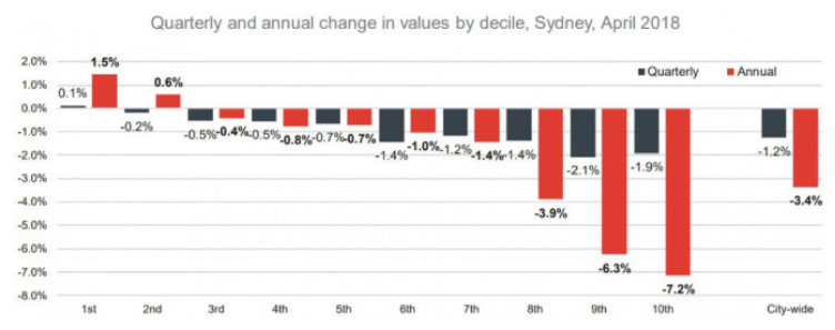
The 1st decile is the cheapest end of the market while the 10th decile is the most expensive.
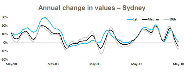
This chart shows the growth for each decile in Sydney from April 2017 to April 2018. Remember that 2018 was when Sydney started to correct after a great bull run from 2012 to 2017.
Over to the left of the chart are the cheaper markets and over to the right are the more expensive markets. The axis on the left is measuring growth.
The black bars show the growth over the 3 months up to April 2018. The red bars show the 12 months growth up to April 2018.
You can see on the left that there was positive growth in the two cheapest deciles over the last year. That’s the red bars. The cheapest market had growth of 1.5%.
On the other side of the chart, you’ll notice that the biggest price falls were in the upper end of the market. The most expensive market slid by over 7% in the year to April 2018.
This chart clearly shows that when Sydney started correcting, not only were the corrections biggest in the more expensive suburbs, but in the cheaper suburbs, there wasn’t a correction, growth was still happening.
But maybe this scenario doesn’t repeat itself. Maybe this was a one-off.
Decile history
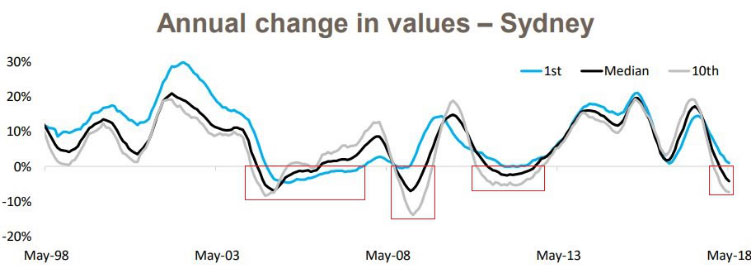
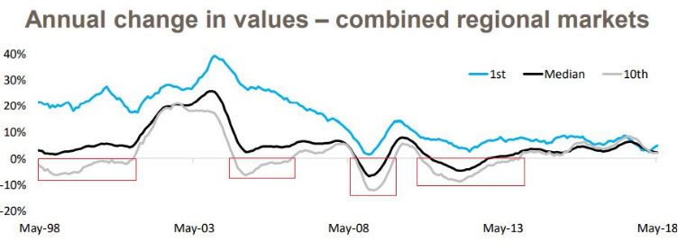
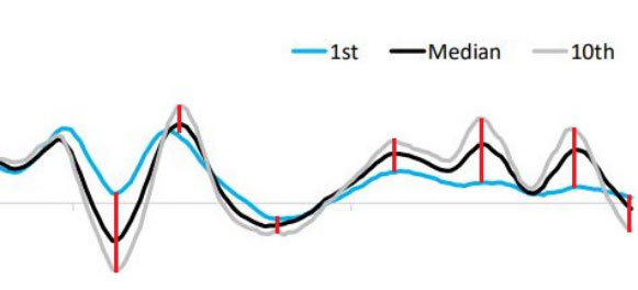
The following chart is also published by Core Logic and shows how Sydney’s upper and lower deciles have performed historically and compares them to the median.
Source: Core Logic
Taking a closer look at Sydney’s history, you’ll see this is actually a common occurrence. In bad times, the lower decile holds its value better than the upper.
This chart shows the growth of the Sydney median as well as the growth of the cheapest 10% of suburbs and the growth of the most expensive 10% of suburbs. The black line is the Sydney median. The blue line shows the cheapies growth rate. And the grey line shows the growth rate for the most expensive property markets in Sydney.
Note that the time-frame covers 20 years. So, we’re now looking at more than just one growth cycle.
You’ll also notice there’s a faint grey line that goes straight across the middle. That is the zero-growth mark. When the curvy lines are above that straight line, the growth is positive. So, we’ll focus our attention on when the curvy lines fall below this – a correction. I’ll mark these periods in red rectangles.
Source: Core Logic
As you can see, in 3 of these 4 cases where growth was negative for Sydney, the expensive markets (the grey line) correct more violently than the cheap markets (the blue line). In fact, in 3 out of the 4 cases where Sydney had negative growth, the cheap markets managed to avoid it almost entirely. What’s more, the grey curve is the lowest in all 4 cases. This shows that expensive markets in Sydney actually perform worse in market corrections than any other market segment.
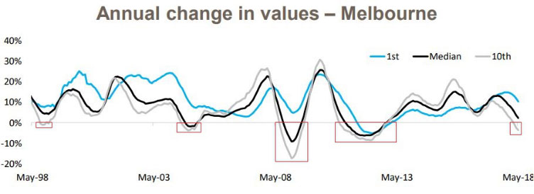
This is not just a Sydney thing. Here is the same kind of chart for Melbourne.
Source: Core Logic
Over the last 20 years, the expensive end of the market has corrected 5 times while the cheaper end corrected only once.
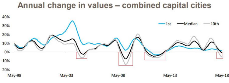
It’s a similar story for all the other state capitals. The following chart shows the combined capitals.
Source: Core Logic
Again, this chart confirms that cheaper markets correct less than expensive ones. The combined capitals had 4 corrections in prices since 1998. That’s 4 cases where there was negative growth. And the expensive markets were the worst in all 4 cases while the cheap markets actually avoided any negative growth at all in 3 out of 4 of those cases.
Interestingly, if you look at regions instead of capitals, the cheaper markets really shine…
Source: Core Logic
There wasn’t a single case in the 20-year period that the cheaper segment of a regional market had negative growth. But there were 4 periods where the expensive part of the market went backwards.
More recently
Here’s a more up to date decile report from Core Logic.
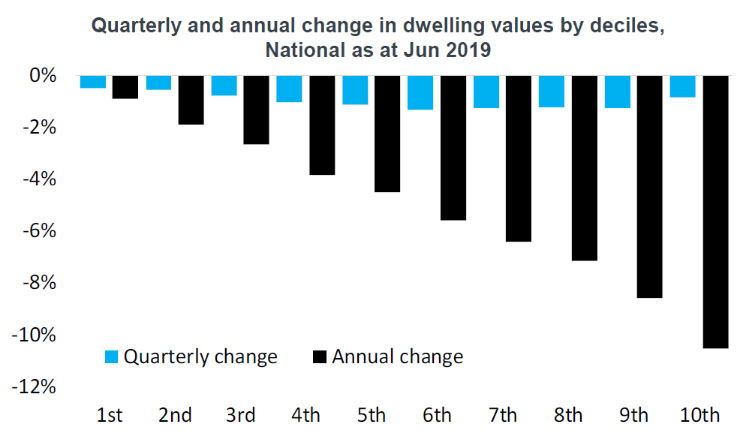
The first decile is the one on the left. It has had less negative growth than the more expensive deciles to the right. The same trend holds true in regional markets as in city markets.
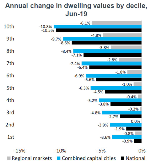
Definitely during the year to June 2019, there is absolutely no doubt that cheaper markets fell the least.
Rising interest rates
One of the other claims made by experts is that when interest rates rise, the cheaper markets suffer the most. The experts’ theory is that cheaper markets are more negatively impacted by mortgage stress than expensive markets.
The following chart shows the change in the Reserve Bank’s cash rate from 1990 to 2018 – a period of nearly 30 years.
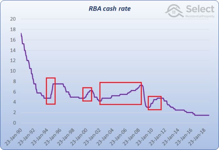
I’ve highlighted 4 periods of rising interest rates.
Note that if rates rise by only 0.25%, it’s unlikely to cause much stress. It’s when rates rise significantly that we’re more likely to see something terrible. So, mortgage stress won’t start from the very first month we see interest rates start to rise.
Also, although the 3rd case has the biggest rise in rates of 3%, it’s over a period of 6 years.
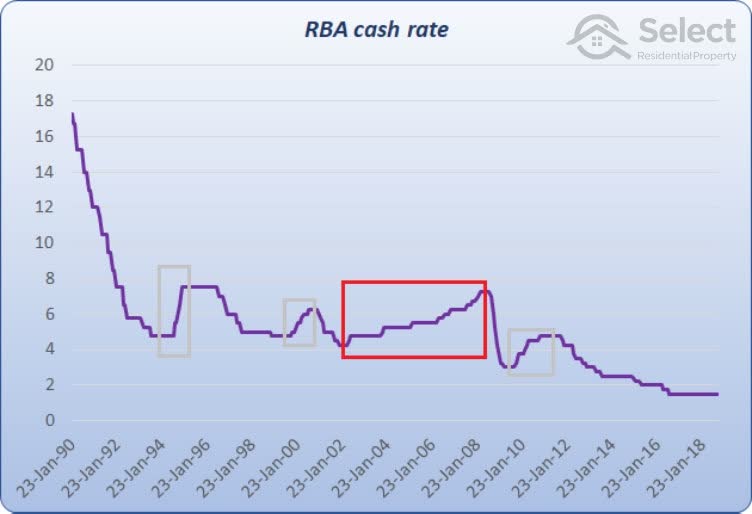
Even if rates rise significantly, if they rise slowly enough, it gives home owners time to pay down the principle before cash-flow becomes unmanageable. Landlords have time to increase the rent. There’s a chance the owner may get a pay rise during the period or put in over-time or find a second part-time job. Rising interest rates are more likely to cause mortgage stress when they happen rapidly.
So, although there are 4 periods of rising rates to examine, there’s an argument the 3rd one is not applicable. We’ll have a look at it anyway.
Another point: when rates start falling, this might not mean the end of mortgage stress. The stress might continue until rates have dropped back down to where they used to be. So, the period of capital growth I’m going to analyse covers the following mortgage stress periods:
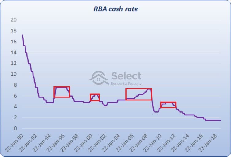
Note that each period doesn’t start or end at the precise point when the direction of interest rates changes. Each red box is meant to cover the period of mortgage stress:
- October 1994 to December 1996
- February 2000 to March 2001
- May 2006 to November 2008
- March 2010 to May 2012
Let’s have a look at how property prices in inner, middle and outer rings performed over these periods.
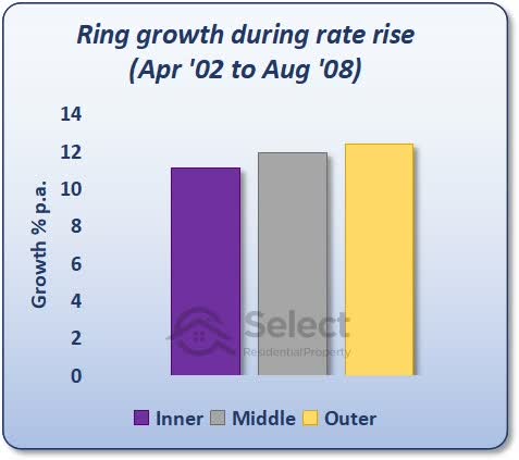
Period 1
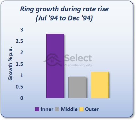
For the rate rise from July 1994 to December 1994, the inner ring did perform the best. However, the middle ring was beaten by the outer ring. What we’d expect to see if this theory was true, is the inner ring beats the middle and the middle ring beats the outer. But it didn’t unfold exactly that way. Nevertheless, credit the experts with 1 point here.
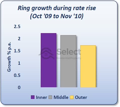
Period 2
Let’s have a look at the 2nd period.
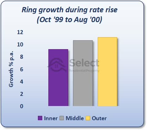
This is the complete reverse of what the theory of the experts suggests. Not only did the outer ring beat the middle ring, but the middle ring beat the inner ring.
Period 3
Period 3 tells a similar story:
Again, the outer ring outperforms the middle ring which outperforms the inner ring. But as I mentioned before, this period of rising rates was so slow, that it might invalidate it as a case worth examining.
Period 4
The last period had these results:
Here’s finally a case where it all makes sense for the experts. The inner ring beats the middle ring which beats the outer ring.
In summary, only 2 of the 4 cases support the experts’ theory – hardly a convincing argument.
Why the theories?
Alright, I think we’ve looked at this from enough angles and seen enough historical evidence to have some grounds to refute the claim that cheaper markets fare worse in tough times. So, why is it that many high-profile industry experts claim that the top end of a market is safer than cheaper areas when there’s evidence to suggest the complete opposite?
Well, I have a few theories:
No research
First of all, it’s a lot easier to come up with a theory than it is to prove a fact.
Make noise
Secondly, I think that from a marketing or promotional perspective, it’s best to have a strong opinion and to state that opinion confidently rather than say nothing. Having a high profile is all about getting attention. And you’re not going to get that by saying, “Gees I dunno”. It’s better to be loud than it is to be correct.
Patch-work
But one of the biggest reasons I suspect is a monetary one. Their office may be close to the CBD. They like their patch. They don’t want to research further afield and they don’t want to have to change their preferred patch in tune with changing market conditions. So, they need to come up with arguments to support the belief that investors should keep buying in the same patch regardless of market conditions.
Stigmas
And lastly, one I can relate to, is stigmas associated with lower socio-economic demographics. It’s hard for property investment professionals to convince their clients that a low-grade location is a good investment. It’s easier to promote the exclusive areas since they look so much nicer.
Fortunately for my business I’m not dependent on people agreeing with me.
Anyway, these are just theories I have as to why experts might promote more expensive markets despite what the data has to say about it all.
Logic
But why is it that the lower end does perform better in tough times? Some more theories:
- Part-time work
- Over-reaction
Part-time work
I reckon it’s a lot easier for lower income earners to do something to make ends meet. If they get a part-time job stacking shelves at Woollies or helping out at Bunnings on the weekend or even running the odd Uber trip, it supplements their income. It might not be in a significant way. But it’s more significant than a sales exec on twice the salary.
The high paid income earner is probably already at full-stick in terms of hours worked per week. And a part-time job stacking shelves isn’t going to make such a big difference for them. So, when times are tough, I suspect it’s more likely that a cheap market will ride it out better than an expensive one because those on lower incomes are more able to supplement their income with odd jobs.
There’s also a possibility that more jobs in “essential services” are lower income jobs. These may have more persistence during tough times than non-essential services. Not being able to hold onto a job is a crucial element to falling prices.
Over-reaction
Secondly, and I suspect more importantly, there’s greater over-reaction in the expensive side of town. Not just when times are tough, but when times are good. It’s usually the business owners who are on cloud nine in a booming economy that pay recklessly to acquire their slice of the top-end.
So, when that top-end corrects, it comes back a long way. They start thinking much more practically and can’t justify spending a couple of mil on a house when they can spend half as much and still survive.
There’s less room to move for lower income earners. They’re forced into more practical thinking regardless of the state of the economy or stage of the market cycle.
Anyway, these are only my theories. They don’t really matter much. What matters is what the evidence dictates.
Are cheap markets better?
No, I’m not saying that cheaper markets are necessarily better investments than affluent markets. In fact, if you had a close look at some of those decile charts, you might have noticed that expensive markets often outperform cheaper markets in the good times.
You can see the grey line poke up above the blue line in the good times and then reverse and go below it in the tough times. These large swings from peak to trough are called “volatility”. Ironically, volatility is often used as a measure of risk. The more volatile a market is, the more it is considered risky. It’s the high end of the market that is the riskiest. The cheap end is actually the safer option despite what you might have heard.
However, the expensive end of town can offer opportunities to investors if they get their timing right and buy there during the good times.
Conclusion
Regardless of the reasons why, the data is clear: cheaper, less desirable markets, further from the CBD suffer less in a correction than exclusive, affluent markets closer to the CBD.
BTW, long-term it won’t really matter much which end of the market you buy in. Cheap and expensive markets will both have their glory years and their boring years. For more detail on that, check out these other presentations in the series: