Introduction
Many experts will try to tell you that a property or suburb has proven itself to be a high performer because it has a history of above average growth. They claim that properties with a high long-term growth rate are “proven performers”.
The ironic thing is that the real proof says the complete opposite.
“Above average historical growth is actually an indicator of below average future growth”
Many professionals in their research will “back-test” a property by looking up its past growth to see if it is one of these so-called proven performers.
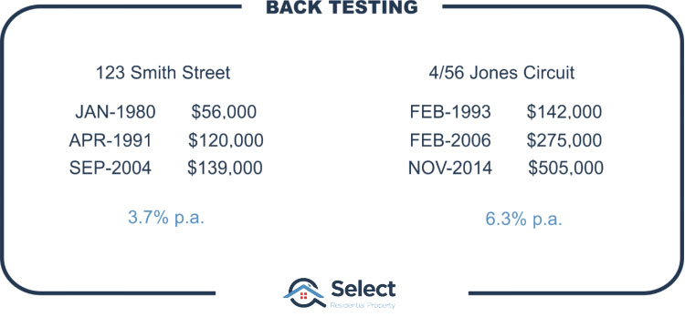
The theory is that there’s something inherently special about this property which explains why it’s had such high historical growth. They may not be able to precisely identify what that thing is, but the theory is, you don’t need to anyway since it’s already proven itself with high long-term historical growth.
The belief is that whatever “special something” the property has, will continue to deliver above average growth. Which is a flawed argument for a number of reasons.
Nothing lasts forever
Take a Polaroid picture of that special “investment grade” property or get your Kodak film processed and send me copies by facsimile. Or if you don’t have a fax yet, send it to me via carrier pigeon or horse-drawn carriage. Or post it on your My-space page. I’ll do an internet search for it using Ask-Jeeves.
Have you been alive long enough to notice that everything changes, nothing stays the same, and nothing lasts forever? What makes someone think that simply because it happened in the past it will continue to happen in the future?
“Every time a trend extends, you’re one step closer to that trend’s end”
Property markets are continually affected by change: new train line, shopping centre, zoning changes, housing commission, bus stops introduced, new school. High interest rates, low interest rates. Gold mines, agricultural age vs. the industrial age, retail, commercial, health, internet, mobile phones, driverless cars, magnetic vacuum levitation tubes, remoting, teleport machines, something I can’t even imagine. Nothing stays the same.
“Every time a trend extends, you’re one step closer to that trend’s end”
Past performance is no guarantee of future performance. Assuming a trend will continue is not only speculative and therefore risky, but it’s also plain lazy research. A closer look at historical data highlights that trends don’t go on forever.
The theory has no basis
There’s absolutely no logical basis to the theory. Look at it from a negative growth perspective.
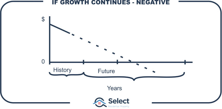
For the theory to hold true, if a property had negative growth in the past, then it must have more negative growth into the future. The longer that future goes on, the lower the property’s value, until eventually it’s worthless. Another year and it will actually have negative value – the seller would pay the buyer.
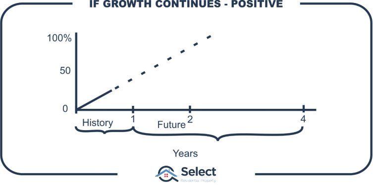
Let’s go the other way and assume a suburb went up in value by 25% last year. Following the theory of past performance, you’d have to assume therefore it must go up by 25% this year. And a year from now you’ll be saying, “This suburb went up 50% in the last 2 years, so it must go up by another 50% in the next 2 years”. Extend that nonsense a little further and you’ll start to see the sheer lunacy in this theory.
Perhaps this sounds silly because the timeframe I’m choosing is too short. OK, how about 5 years of past growth then. From 2012 to 2017 many Sydney suburbs had 70% growth. Some of the better ones had 100% growth. But that growth rate didn’t continue – nothing like it. In fact, there was a correction.
Still not a long enough timeframe? How about 10 years past growth then?
10 years historical vs 20 years future
Here is a chart showing the relationship between past growth over a 10-year period and future growth that followed from then.

This is called a scatter plot. Every purple plus sign represents a suburb. I filtered some suburbs out to improve the reliability of growth calculation. At the end of this presentation I’ll show the filters for the more technically-minded.
I assumed I was an investor back in the year 2000 looking at historical data for all these suburbs over the last 10 years from 1990 to 2000. If I believed in this proven-performer theory, then I’d be looking for suburbs with exceptional past growth.
Chart interpretation
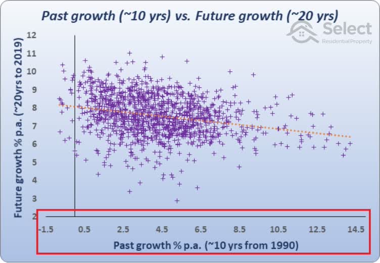
The axis at the bottom, the horizontal axis, shows the past growth as a per annum growth rate for the 10 years from 1990 to the year 2000.
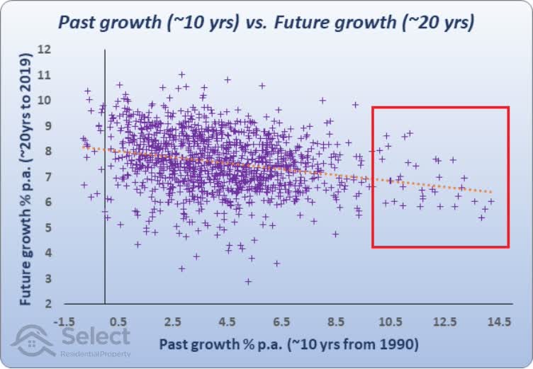
Suburbs that had exceptional past growth from 1990 to 2000 will appear on the right side of the chart. You can see there were a few suburbs on the far right of the chart that had double-digit per annum growth for those 10 years. Some got up to 14% per annum. I’d be targeting those suburbs if I believed in this theory.
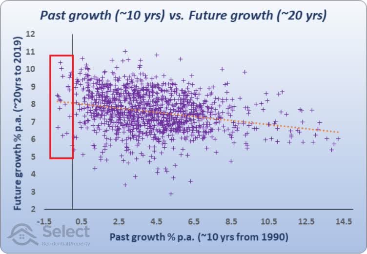
Suburbs with low growth from 1990 to 2000 will appear on the left side of the chart. There are about 20 suburbs to the far left of the chart that actually had negative growth. I’d be avoiding those suburbs if I believed in this theory.
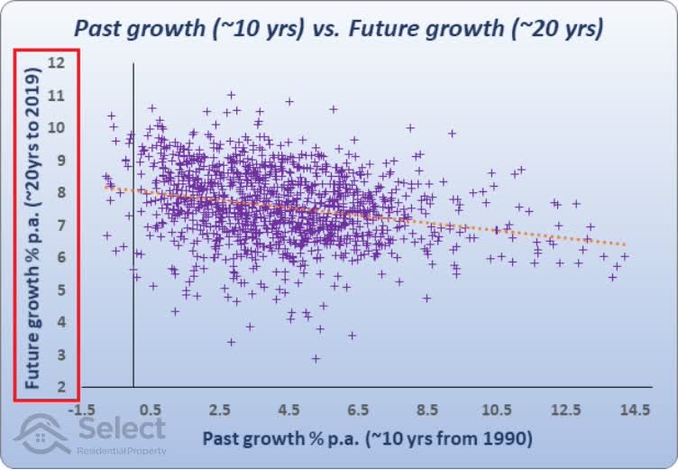
Now, the axis on the left, the vertical axis, shows the per annum growth rate for the 20 years that followed the year 2000.
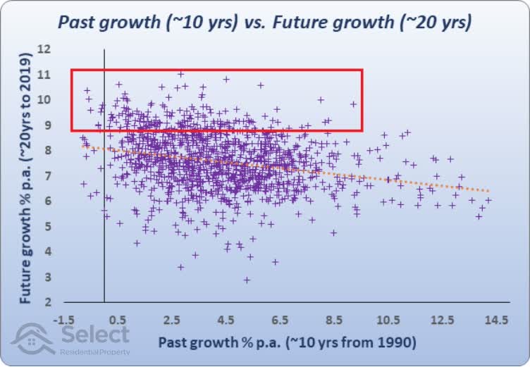
The suburbs at the top of the chart had excellent growth over those years from 2000 to 2019. Their growth ranged from about 8.8% up to 11% p.a.
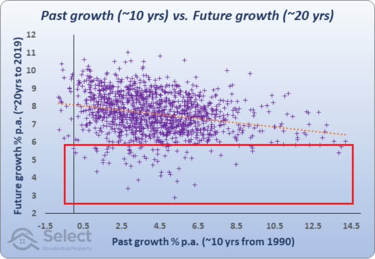
The suburbs at the bottom of the chart had poor growth over those 20 years. One suburb only had about 3% per annum growth.
So, the horizontal axis at the bottom shows past growth and the vertical axis at the left shows future growth.
Analysis
Assuming we were an investor in the year 2000 looking at past data to see where to invest for future growth, we’d pick suburbs to the right of the chart.
But you’ll notice that the suburbs that had excellent past growth on the right aren’t towards the top of the chart. This is because they didn’t have good future growth. They had around 6% to 7% growth.
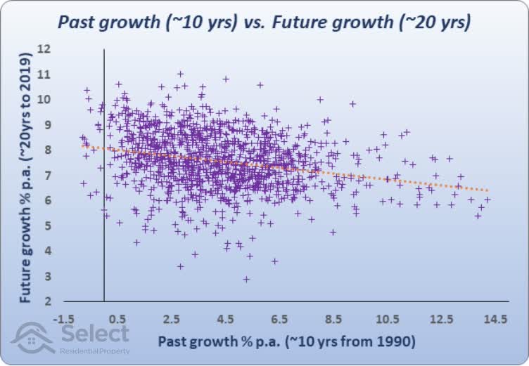
You’ll also notice that the suburbs that had the best future growth towards the top of the chart, had low past growth of around 2% to 4%.
To make it easier to see a general trend here, I’ve plotted a line of best fit – the orange dotted line that runs through the middle of the chart.
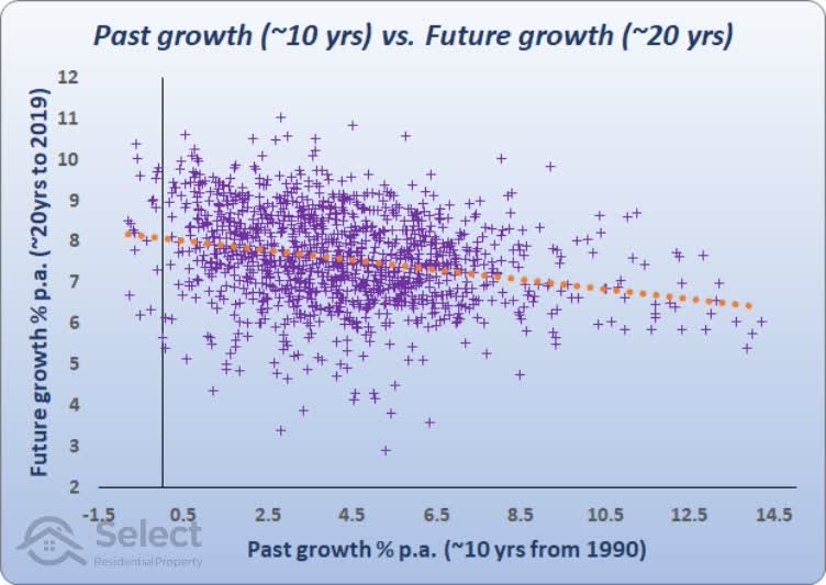
It has been mathematically calculated to be the closest fit of a straight line for this set of points. It’s positioned to minimise the average distance between the line and all the points.
It runs downward at a slight slope from left to right. This orange dotted line represents the relationship between past growth and future growth. It gives us our general rule. The general rule suggests that if there was good growth in the past, you can expect poorer growth in the future. The trend is that the best future growth over a 20-year period is found by targeting suburbs with low past growth over the last 10 years.
15 years historical vs 15 years future
Here’s a similar chart with an even longer past growth of 15 years…
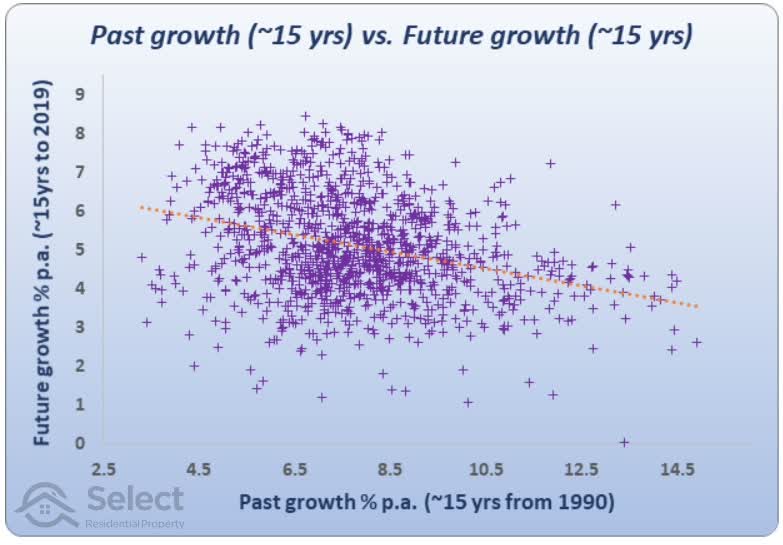
It’s the same kind of chart, but in this case, we’re splitting the 30-year period up into two equal chunks of 15 years. 15 years of past growth and 15 years of future growth. The prior chart had 10 years of past growth and 20 years of future growth.
Again, you can see the same general relationship between past and future growth as plotted by the orange dotted line through the middle of all the points. The best growth of the future is generally found with poor growth in the past. In other words, past performance reverses.
For example, if you look at the suburb on the far right,
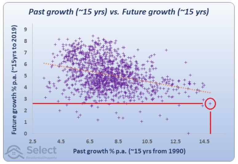
it had nearly 15% growth per annum for the first 15 years from 1990 to 2005. But then it only had about 2.5% growth per annum for the next 15 years.
If you picked the lowest past growth market, which is on the far left, you would have been better off.
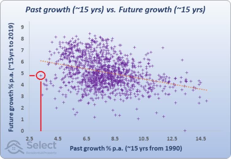
The lowest growth of the 1st 15 years up to 2005 was a suburb with only about 3% growth per annum. But over the next 15 years it had nearly 5% growth per annum – nearly double that of the best performing market for the 1st 15 years.
20 years historical vs 10 years future
Here’s an even longer history – 20 years…
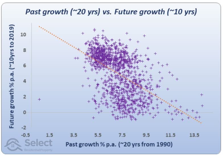
The relationship between past and future growth is even clearer now. The orange dotted line is quite steeply running down from left to right. It plots an approximate relationship between past growth and future growth.
If we were to look at the last 20 years of growth and if we were able to find a property market that had 14% growth per annum over the last 20 years, looking at the orange dotted line, we would be in the bottom right corner.
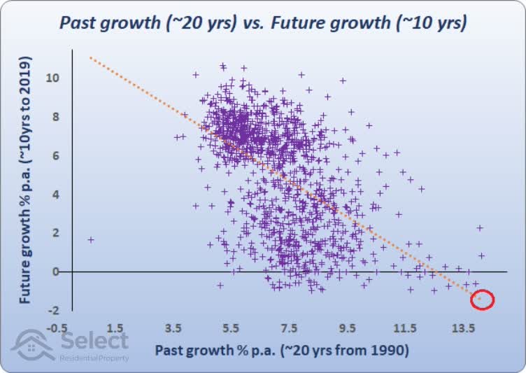
According to the orange line we should expect growth over the next 10 years to be negative.
If instead we picked a market with only 1.5% growth per annum over the last 20 years, we would be looking on the orange dotted line at the top left.
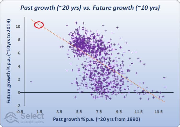
1.5% per annum historical growth over 20 years relates to about 10% growth per annum over the next 10 years into the future.
These 3 scatter plots show that if you’re after superior growth into the future you should target suburbs that have had poor growth in the past. This is the complete opposite of what many experts tell you.
Errors
But as you can see, there are an enormous number of suburbs that don’t sit close to the orange line. This means the relationship between long-term past growth and future long-term growth is a tenuous one – it’s very inaccurate. The error rate is quite high. You should never look at a single statistic such as prior growth to make a decision on where to invest.
“You need a wide array of variables pointing in the same direction to be confident of growth”
What past data says
The charts suggest that low past performance is a better indicator of high future performance – not the other way around as many experts have taught. There’s no logical basis to their theory. On the contrary, there is convincing evidence to support the opposite.
The following chart shows the relationship between the past 10 years of growth and the 10 years that followed. The results were averaged over thousands of Australian property markets covering the last 30 years.
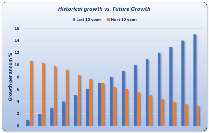
Every property market was measured to see how much it grew over a 10-year period. Then that market was followed over the next 10 years to see how much it grew by. Lots of these 2 x 10-year segments were examined and averaged. There’s a clear inverse relationship between past growth and future growth over a 10-year period.
“For every year of above average growth in the past, there’s more likelihood of below average growth into the future and vice-versa”
No property can continue to outperform the average growth rate truly long-term. What happens is the property eventually becomes so unaffordable compared to other properties nearby that it experiences a prolonged period of underperformance to bring it back in line.
And there’s a very logical reason why above average past performance simply cannot continue…
Apples and oranges
For those of you who haven’t heard it before, check out the Apples and Oranges presentation in this series. It will make the concept a lot clearer.
The forces of supply & demand are in a continual tog-o-war keeping growth relatively even. After a period of above average growth, higher prices subdue demand and from then on, its business as usual. For short periods it gets out of whack, but long-term it all evens out.
If there is a change in the nature of a property market, perhaps some positive infrastructure project for example, that market will experience above average growth until the benefit of the infrastructure project has been fully factored into the price of property there. After that, it’s business as usual.
There’s nothing about a strong history of above average growth that makes any sense to predicting future above average growth. And there are plenty of cases where prior rapid growth is actually a clear indicator of reduced growth rates in the immediate future.
Capital growth race
The following animation shows a race between the state capitals. Each bar in the chart represents a state capital. The length of the bar reflects that city’s long-term capital growth rate. The animation plays out from 1990 to 2020. The bottom left corner shows the year.
Note that data was unavailable for some cities in earlier years. But those cities appear later on in the movie.
As a city has different periods of growth, its long-term capital growth rate changes and this is reflected in the length of its bar. If a city’s bar length exceeds the city above it, they change places on the leader-board.
If long-term historical growth led to long-term future growth, you would expect to see one city climb to the top of the leader-board. Then as time passed on, you’d expect that city to extend it’s lead further and further ahead of the rest. You’d also expect to see one city fall to the bottom of the board, stay there and continue to fall further and further behind the rest.
Instead, you see a continual shuffling between cities. They fall behind and then they catch up. One gets ahead and then it runs out of puff and is caught by the rest. The leader-board never completely settles down. The last 10 years should be a fairly boring race – if there was any evidence behind the historical outperformance theory.
And this is just what the Apples & Oranges analogy suggested:
“Long-term, and I mean really long-term, there is a tendency for all property markets to end up with pretty much the same growth rate”
What’s the point?
So, right now you might be thinking, well what’s the point then in picking where to invest or what property to buy if they all grow at the same rate?
Because they don’t grow at the same rate over the short-term. As investors we want to capitalise on that period when oranges are in high demand. Then we want to switch assets to apples when the demand shifts.
For more on the importance of this check out my other presentation in this series titled,
You shouldn’t focus on long-term growth
More issues
There are some more issues with this approach of examining the history, specifically in regards to the history of individual properties as opposed to whole suburbs.
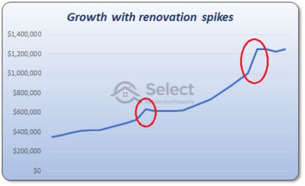
What if a property was renovated recently? It will show a higher value and therefore appear to have better historical growth. But the increase in value was because of the renovation, not because of natural growth. You can’t keep renovating it every year to keep those growth rates coming.
How do you know the growth you’ve measured for a property was caused by something inherent in the nature of the property or just a series of improvements to the dwelling like an extension out the back or a second storey or even a total knock-down and rebuild?
Sub-divisions
What about a property you discredit because it has terrible historical growth? How do you know it wasn’t sub-divided?

Some properties are sub-divided but maintain the same address.
When a property is sub-divided it loses some land, so it makes sense that it wouldn’t be as valuable. Next time it sells, that sale will look like the property has underperformed compared to other properties in the same suburb.
You can’t know the history of the property’s performance simply by checking a chart of its sale prices.
More anomalies
The historical growth of a property can be misleadingly high with:
- Renovations
- Extensions
- Rebuilds
- Advertising
- Staging
And the growth can be misleadingly low in the case of:
- Mortgagee repossessions
- Distressed sellers
- Deceased estates
Why the interest in long-term growth anyway?
As you can see there are plenty of problems with this approach, but why the interest in long-term growth anyway? The last 100 years of growth is likely to be completely overwhelmed by the next 10 years of growth. That’s the whole thing about exponential growth – the majority of it happened just recently.
There’s no point banging on about a long history of past performance when it will be completely overridden by the short term. For more insights on why long-term growth focus is misdirected, check out another topic in this series titled,
You shouldn’t focus on long-term growth
Timing entry
Another thing that should trigger alarm bells that there’s something fundamentally wrong with this back-tested, proven performer approach is that the timing is all wrong. Investors are far more likely to buy at the peak with this approach. And they’re far more likely to ignore good opportunities at the bottom of the cycle. Following is an example.
Sydney
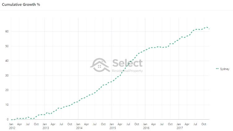
In late 2012 a boom started in Sydney property prices after a long drought. Prices had been relatively flat for around 9 years by 2012.
But by the end of 2017, just 5 years later, Sydney property prices had risen by around 60%.
- Sydney
- 200+ years – 40% of value
- 5 years – 60% of value
The last 200 years of historical growth prior to 2012 accounted for only 40% of Sydney’s value. More than half of the city’s value came in the last 2.5% of its history.
“Compound growth is like creating more than half the wealth you’re going to live on in retirement, in the last year of your working life”
Almost every Sydney property had a poor history of long-term growth by 2012 because of the flat market of the past. The average growth rate for the 10 years prior was around 2.5% per annum.
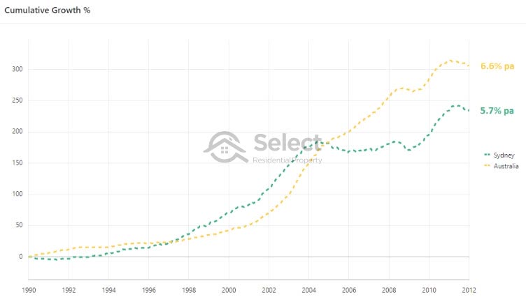
Using a back-testing proven performer approach, Sydney had 5.7% per annum growth since 1990. But the average across all of Australia was 6.6% per annum. As a result, most properties in Sydney should have been discredited using this back-testing proven performer approach. But 2012 was actually the perfect time to enter the Sydney market.
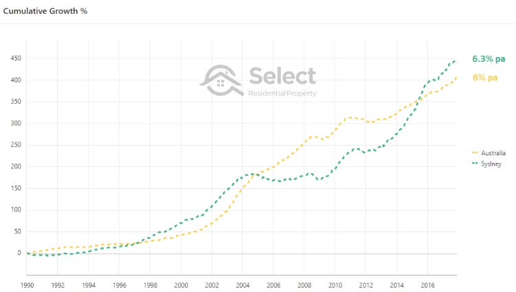
Conversely, by the end of 2017 almost every Sydney property had excellent long-term growth because of the boom that had just passed in the last 5 years. The Sydney back-tested proven performer figure by December 2017 had climbed to 6.3%. It was now above the national average long-term growth rate. And it did that in just 5 years. It completely reversed its 20-year long term history in just 5 years.
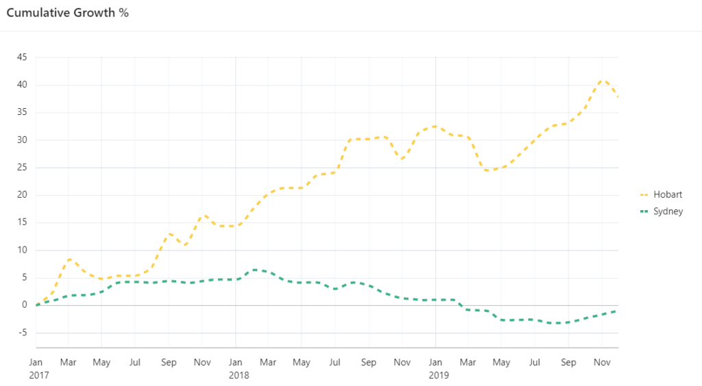
From here if you were using the proven-performer back-test approach, you would have bought in Sydney and discredited other markets around Australia like Hobart.
Hobart
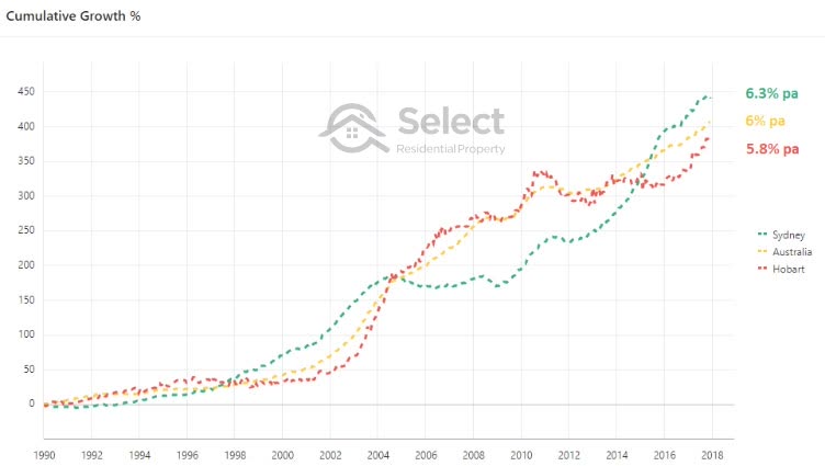
By the end of 2017 Hobart had 5.8% growth per annum since 1990. This was less than the national average growth rate of 6%. So, why would you pick Hobart using this proven-performer method? Instead you would have picked Sydney, which only 5 years earlier would have been a poor choice.
But fast-forward to the end of 2018 and look how the lead has changed.
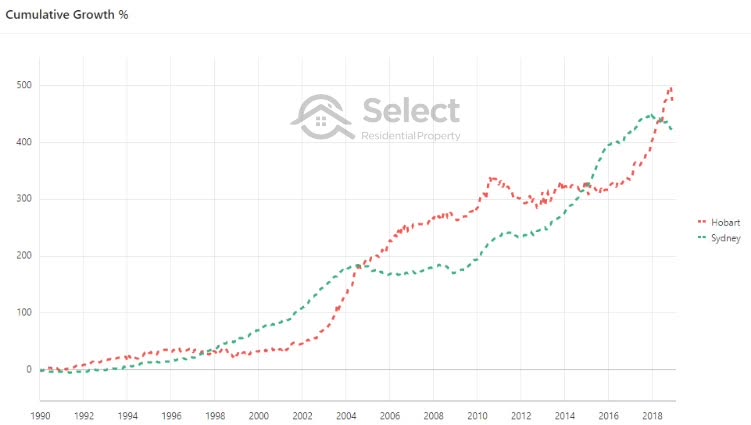
Hobart actually had better long-term growth than Sydney by the end of 2018.
“How can we choose the best long-term performer when it keeps changing?”
From 2017, the difference in growth between Hobart and Sydney was around 40%, a complete reversal of the 3 years prior.
How many mistakes?
When we’re talking about half-million-dollar assets, you can’t afford to make many more mistakes than two – it’s very hard to recover from such costly mistakes. But using this proven performer approach investors would have ignored Sydney in 2012 (mistake 1) and jumped in at the end of 2017 (mistake 2) and missed Hobart (mistake 3).
- Mistakes:
- 2012 ignore Sydney
- 2017 buy in Sydney
- 2017 ignore Hobart
You can see how costly bad advice can be. And many experts and professionals in the industry still use this proven-performer approach and advise investors to do the same. The proof is the opposite – a costly opposite.
Filters
Before I conclude, I mentioned earlier that I’d provide the filtering details I used to come up with those scatter plots. This is for the die-hard researchers and data fanatics.
- Houses only
- With 500+ dwellings
- Use 12-month medians to calculate capital growth
- Medians from Core Logic
- Must have at least 24 sales in the year
- Growth must be reasonable i.e. lie between -1 and 15 % p.a.
- SUAs of 100k+ population
I ignored unit markets and focussed on houses only since many suburbs don’t have a significantly sized unit market. However, if I added units to the mix, the conclusion was the same. Different numbers, but the same general trend – past growth reverses.
I excluded suburbs with less than 500 houses and calculated growth using the change in 12-month medians as published by Core Logic. I also ignored those suburbs that had less than 24 sales in the three 12-month periods of interest: 1990, 2019 and whatever the invest date was, which varied across the three charts from 2000, 2005 and 2010.
And I removed any suburb that showed ridiculous per annum growth like less than -1% per annum or more than 15% p.a. Although there may have been some legitimate cases, they were few and far between and so had very little influence on the end result. But they made it harder to view the scatter plot, so I eliminated them.
I also only used the suburbs within the top 18 significant urban areas. Each had a population of 100,000+ people. Smaller towns may be riskier for some investors, have lower transaction volumes and often anomalous median data. The top SUAs contain more than 80% of Australia’s population anyway.
Conclusion – is it useless?
Is a property’s history useless then? Not entirely. If you can guarantee its growth history has not been influenced by anomalies like subdivisions and renovations and if you find the growth history is low, then you could assume its growth into the short-term will be above average. This will work in more cases than it fails.
If, however, it has had strong recent growth, you should be cautious since there’s more chance of it having a quiet break from growth for a while. You can still use the history to help you, but what you want to do is interpret that history in the opposite way to how some industry professionals have been telling you.


