In this month’s #InDataWeTrust newsletter, we wanted to explore the diversity of capital growth potential in our 3 biggest cities (Sydney, Melbourne & Brisbane), highlighting how important it is to choose the right suburb, even if you’ve picked the right city.
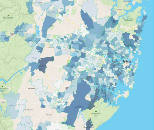
Sydney Heat Map
We use heat maps at Select Residential Property to visualise clusters/areas where demand is high relative to supply. The following Sydney heat map shades suburbs with a darker colour if the demand to supply ratio (DSR+) score is higher, indication more demand than supply, potentially pushing prices higher in that location.
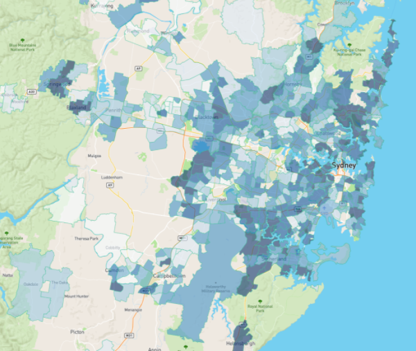
August 2020 DSR+
August 2017 DSR+
Turning to Melbourne, even though the city has been impacted greater by Covid-19 outbreaks you can still notice how there were still areas showing enough heat to continue growth for a little while longer, even though the overall city was flattening out
East and North East look pretty good. It was a very different story 3 years ago.
Notice how wide-spread the heat was back in 2017. Many outer areas went on to experience excellent growth.
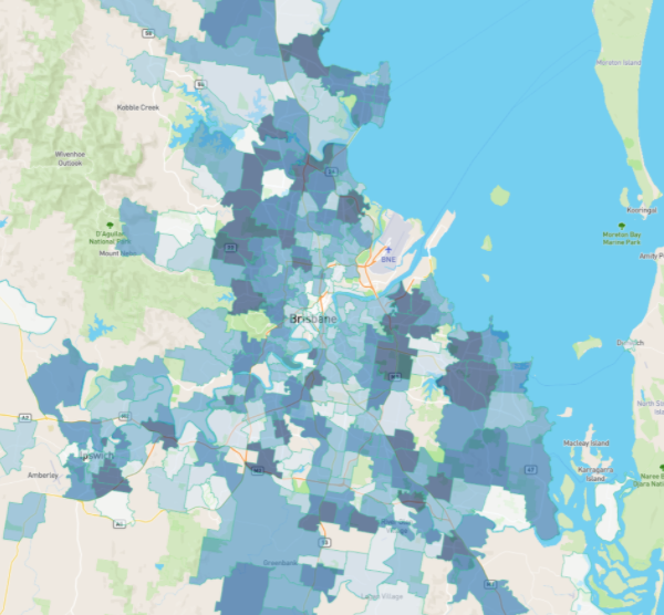
Brisbane Heat Map
Back to 2020 and Brisbane is showing great density of demand relative to supply and some very clear clusters too.
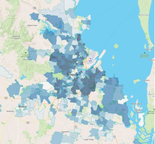
August 2020 DSR+
August 2017 DSR+
Although a couple of suburbs are close to the CBD, most are in middle ring suburbs. Three years ago, these suburbs had some heat, but the heat was more widespread across the city
Sydney Scatter Plot
Another way to look at the diversity of growth potential is via scatter plots. This next one is for Sydney houses.
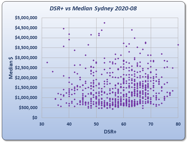
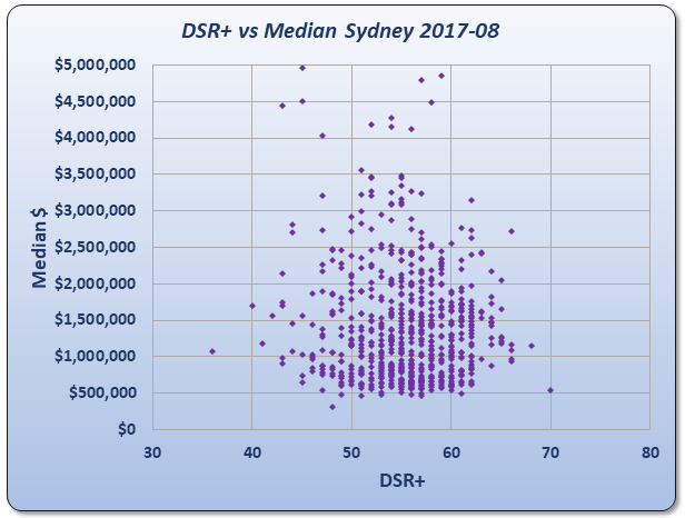
Across the bottom axis you’ll see a range of DSR+ values from 30 to 80. The higher the DSR+, the more demand relative to supply and therefore the higher the likelihood of growth.
Up the left vertical axis is a list of price ranges. Some Sydney suburbs had a median house price under $500,000.
Each suburb is represented by a dot on the chart. If the dot appears to the right, that suburb has high demand relative to supply. If a suburb appears to the left, it has low demand to supply.
The height of a dot reflects the median of that suburb. The higher the dot, the more expensive properties are in that suburb.
As you can see, there’s no real relationship between price and potential for growth right now. And the range of potential growth is well spread out. But 3 years ago, it was a lot tighter.
Around this time back in 2017 most suburbs in Sydney were coming back into balance. There were fewer hot areas and fewer trouble spots too.
Melbourne Scatter Plot
Right now, Melbourne suburbs have pretty diverse growth potential.
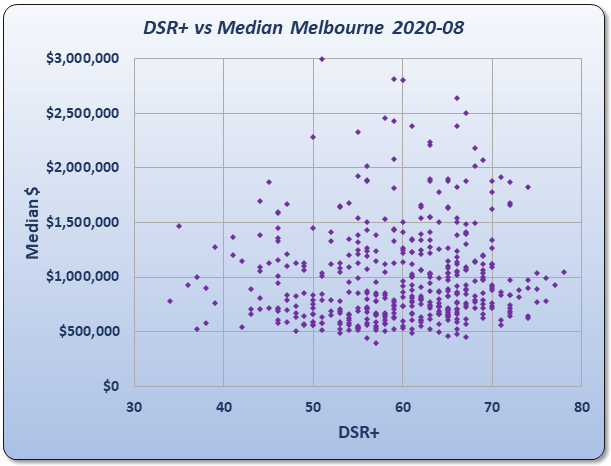
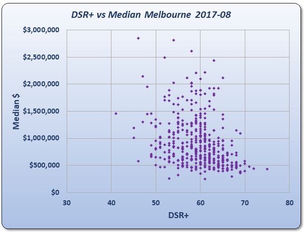
You can see that some suburbs over the next few years will have excellent growth while others are likely to decline. There’s a faint hint in the splattering of more growth potential amongst expensive areas.
Three years ago, there was a bit more of a trend towards cheaper areas having more potential.
You’ll notice that the dots form a bit of a tail towards the bottom right.
Brisbane Scatter Plot
Brisbane’s scatter plot is also wide-spread right now.
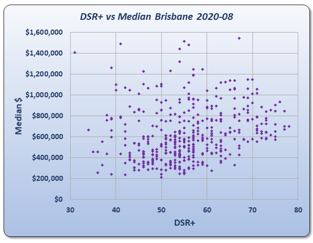
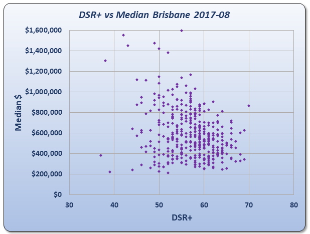
The trend slightly favours more expensive markets which is common at the start of a boom.
But again, it was a different story 3 years ago – a different trend and tighter opportunity range.
This suggests that cheaper markets had better growth potential back in 2017.
Conclusion
Some of our major markets are still deciding which way they want to grow. But amongst our biggest 3 cities individual suburbs will have varied fortunes over coming years.
It’s the same as always – always not the same.
Commentary by
JEREMY SHEPPARD
Director of Select Residential Property
Founder of DSR Data
“Capital growth is the ants pants of property investing.”


