Introduction
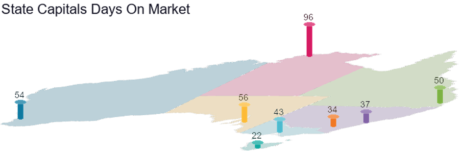
If there are too many buyers and not enough properties for sale, some buyers will miss out. They may have been a bit tardy with the first property they showed interest in. They’ll be quicker with the next one. The lower the DOM, the more likely that demand exceeds supply.
Darwin has the slowest-selling times at 96 days, which historically, is not a bad selling speed. But the rest of the country’s buyers are on a mission.
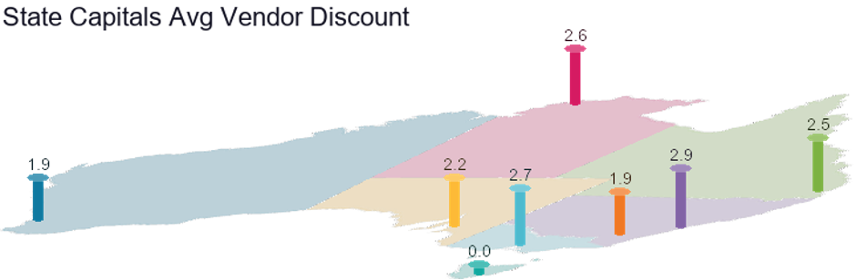
The vendor discount is the percentage difference between the original price that a property was advertised for sale and the eventual price it sold for.
In “sellers” markets, where demand exceeds supply, the vendor doesn’t have to be negotiable. In such markets, the discount is usually very small because buyers come up instead of sellers going down. In extreme cases, the discount can be negative.

The number of properties currently available for rent gives a snapshot of demand vs. supply for rental properties. Rentals are in very short supply in a lot of locations around the country. That usually leads to rising rents.
It’s a widely held belief that 3% is the sign of a balanced market. However, there’s no historical evidence to support that guess. Check out some analysis I did for a more accurate long-term estimate…
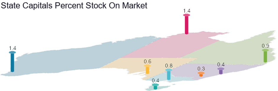
The percentage of stock on market is similar to vacancy rate. It’s an indicator of supply. For maximum capital growth, we want the lowest figure. Canberra has the best SOM% at the moment. Perth and Darwin are still a bit oversupplied. Anything below 1% is good. Anything above 2% is bad.

The lowest yields are in Sydney and Melbourne. The highest are in Darwin. But cashflow positive properties abound in most of the regional markets given such low interest rates.
One thing Darwin seems to have maintained during its slide in values, is the rental rates. It’s pretty easy to find a cash-flow positive property up the top end.

Market Cycle Timing (MCT) is a score out of 100 for the likelihood that a property market is entering its next phase of growth. Given all the high price growth recently, it’s no surprise most state capitals have a figure below 50.
Hobart has the lowest MCT of 24. That’s because it’s had the biggest run-up of price growth over the last few years.
Given all these metrics, which is the best city for capital growth? Well, we’ve only scratched the surface. There is a total of 17 metrics considered in the Demand to Supply Ratio (DSR+). An easier way to assess a city is therefore by examining its DSR+…
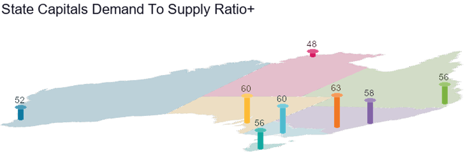
The DSR+ combines 17 variables to come up with an overall score out of 100 for the growth potential of a property market over the next few years. It’s rare to see an entire city get scores in the 60’s, but there are actually a few. A score of 50 is the theoretical balance point.
Don’t be put off by Brisbane’s score of only 56. There are many suburbs in Brisbane that have DSR+ scores much higher than that. But plenty that are ordinary too.
Part of the problem of aggregating to a median is that it smooths over extremes. What we want to do as investors, is fossick out those extremes and capitalise on them. So, rather than focus on the best city, seek out the best suburb.
Good growth hunting,

Commentary by
JEREMY SHEPPARD
Director of Select Residential Property
Founder of DSR Data