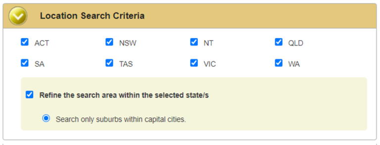

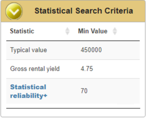
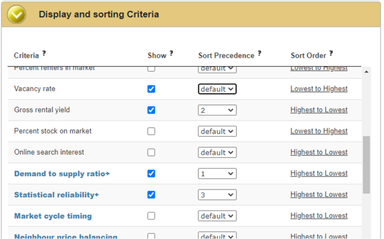
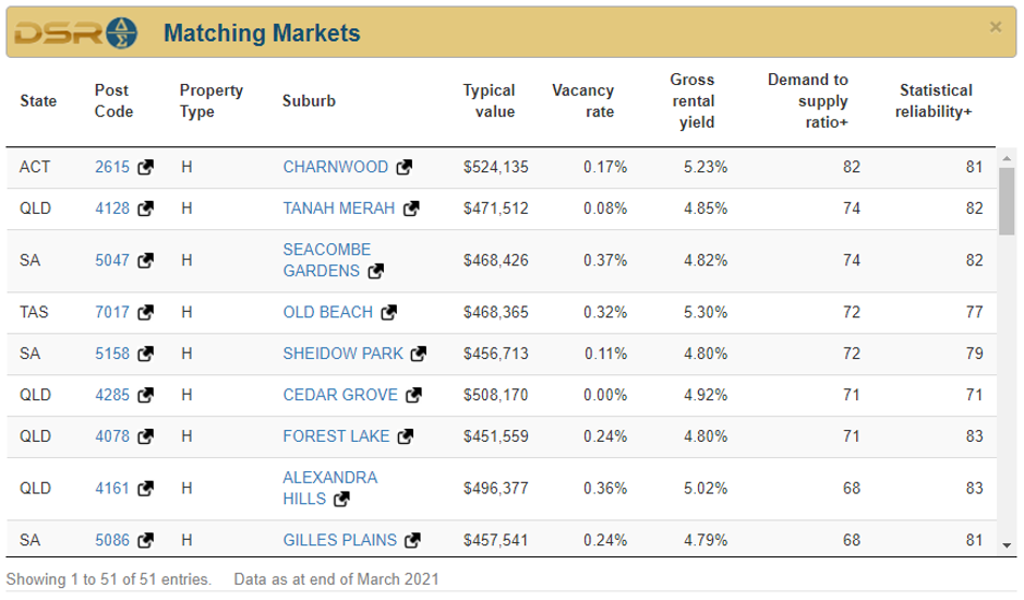
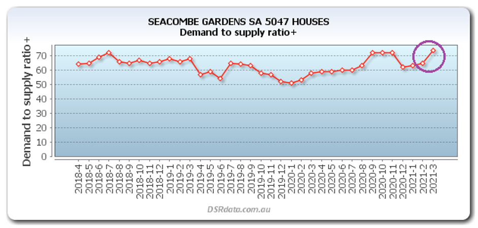
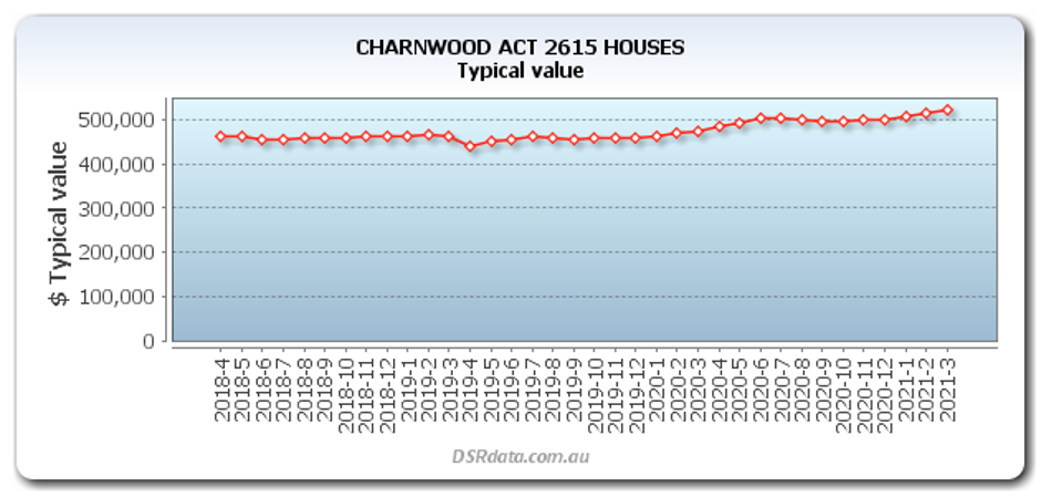
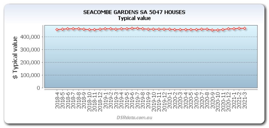
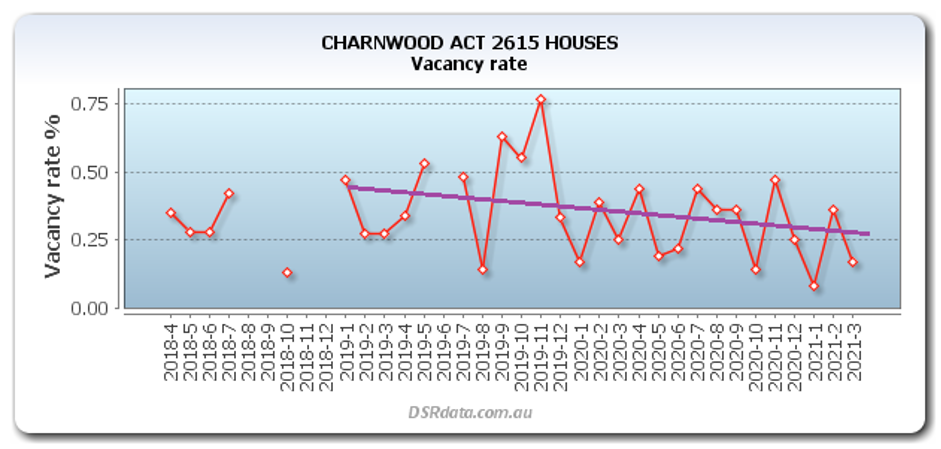


We all know that growth is the ant’s pants of property investing and yield plays 2nd fiddle. But how easy is it to get both high yield AND high growth?
We all know that growth is the ant’s pants of property investing and yield plays 2nd fiddle. But how easy is it to get both high yield AND high growth?

We all know that growth is the ant’s pants of property investing and yield plays 2nd fiddle. But how easy is it to get both high yield AND high growth?