Introduction
NSW
The following 5-year growth chart shows the top 4 significant urban areas in NSW. Sydney is at the bottom in crimson.
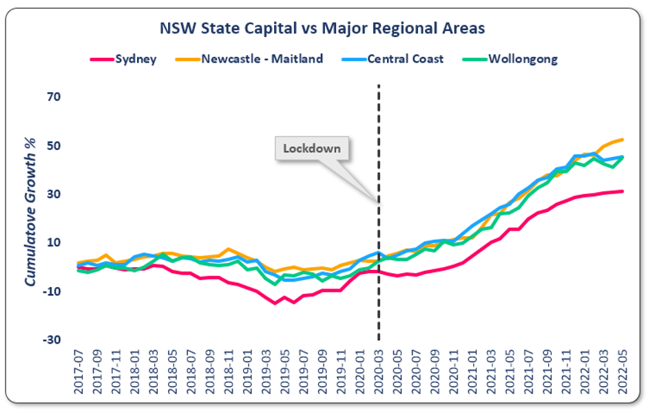
You can see that the regional markets followed a very similar growth path. And they all comfortably outperformed Sydney.
BTW, these growth curves are growth in house prices only – excluding units.
The dotted black vertical line represents when COVID started making things difficult in real estate. Sydney’s growth profile was more heavily impacted by COVID than the regions.
Notice how all 4 NSW cities bottomed about 9 months before COVID. But Sydney had an extra dip after COVID commenced.
VIC
The same kind of chart for Victoria shows the same kind of thing.
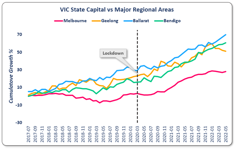
Geelong, Ballarat and Bendigo started their growth run well before Melbourne’s COVID lock-downs. The black dotted line didn’t really thwart the regions’ growth and only held back Melbourne for about 9 months.
QLD
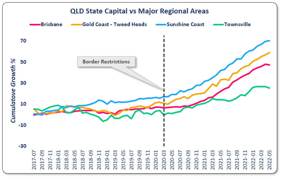
In the QLD chart, it looks like prices took off in response to COVID. There are certainly no signs of a negative impact. But closer inspection shows that the Gold Coast and the Sunshine Coast started their upward move before COVID struck.
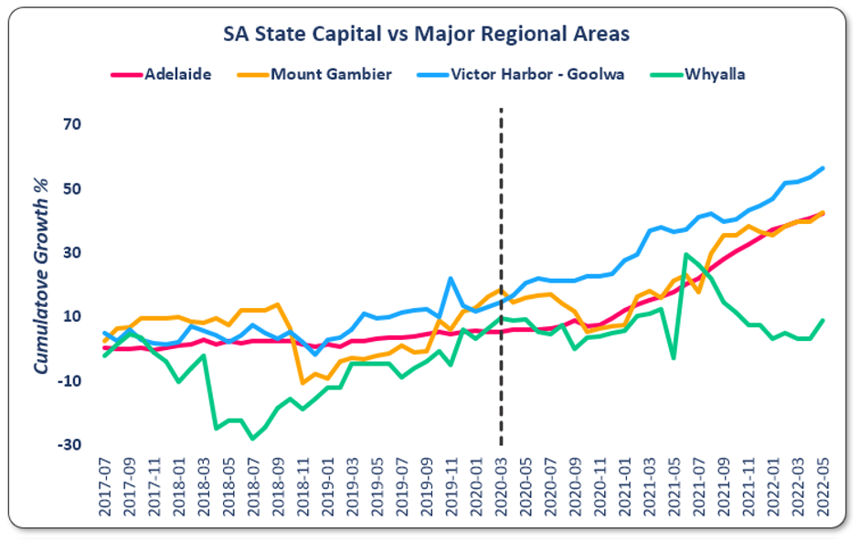
SA
WA
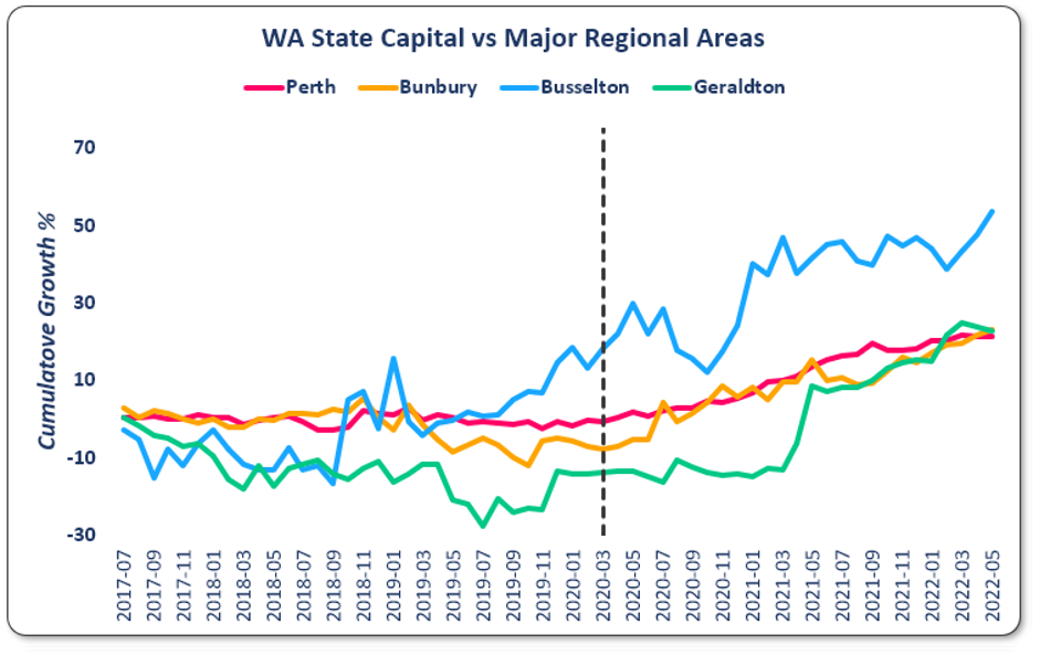
Notice how 3 of these 4 cities started the upward growth move well before we even knew what COVID was.
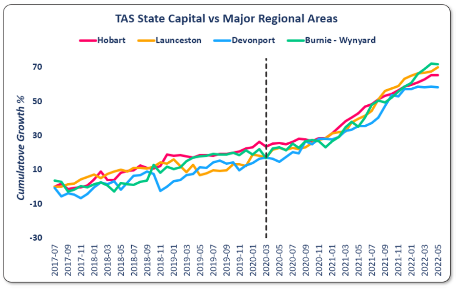
TAS
Observations
- Relative affordability of regional markets compared to expensive state capitals
- Regional cities reaching a certain “critical mass” of economic diversity/job security
- Natural growth in work-from-home opportunities or home-businesses
- Increased pursuit of lifestyle ahead of career
- Pandemic making crowded cities less safe
All Regions VS All State Capitals
Here’s something that shocks a lot of investors. This next chart combines all the significant urban areas that were shown in the prior charts into 2 groups.
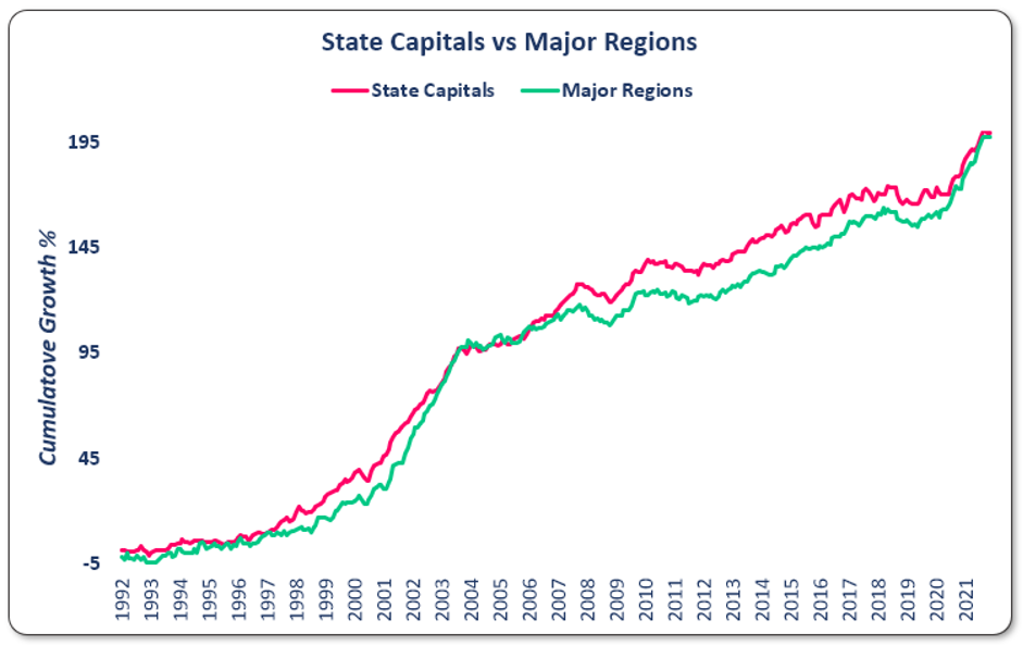
I’ve also stretched the timeframe out to 30 years.
The state capitals have often broken away from the regions. But then the regions catch up. I’ve seen this phenomenon again and again almost every time I compare the growth of 2 property markets over a long enough period of time.
Conclusion

Commentary by
JEREMY SHEPPARD
Director of Select Residential Property
Founder of DSR Data