Introduction
Some high-profile experts have touted that cheap markets are cheap for a reason, that investors should actually target the high end of town. That might be good advice if you’re investing for status. But if you’re investing for performance, they’re completely wrong. I’ll show you just how wrong they are and offer some reasons why they might mouth off like they do.
Research methodology
Here’s what I did to find out if cheaper markets underperform expensive markets. I went back to a point in history and split all the suburbs around Australia into 2 groups:
- Those that had a median below the national median – Cheaper
- Those that had a median above the national median – Dearer
Then I tracked the performance of both groups over the next:
- 3 years
- 4 years
- 5 years
- 10 years
- 20 years
Discovery
Here’s what I discovered:
| Growth | Growth %pa | Growth %pa | Growth %tot. |
|---|---|---|---|
| period years | Cheaper | Dearer | Cheaper better by |
| 3 | 9.1% | 6.7% | 8.2% |
| 4 | 8.6% | 6.7% | 9.6% |
| 5 | 8.3% | 6.6% | 11.1% |
| 10 | 7.8% | 6.8% | 19.2% |
| 20 | 7.3% | 7.1% | 16.6% |
The 1st row in the table compares the growth over 3 years. The cheaper markets outperformed the dearer markets by 2.4% for each year. This resulted in a total of 8.2% more growth by the end of 3 years on average. So, if you had bought $500,000 worth of property in cheaper markets, you would have been better off by $41,208 after 3 years – on average.
This average was calculated by looking at thousands of markets over many 3 year periods across nearly a 30 year time span.
Over a 4 year period, the second row, the per annum growth rate difference was not as dramatic, 8.6 versus 6.7 percent. But because it was over a slightly longer time-frame, the end result was a larger total growth difference of 9.6% which equates to a dollar figure difference of nearly $48k.
Over 5 years, row 3, the per annum growth rate difference is even tighter. But the total difference over the timeframe is even larger.
And look what happens over 20 years, the bottom row. This is a much longer time-frame. This is into what you’d call long-term now. There’s very little difference between the cheap markets’ long-term growth rate and the expensive markets’.
This makes perfect sense. The longer the time-frame the more likely all property markets will perform the same. This is the basis of the ripple effect and is best explained in my Apples & Oranges presentation:
Initial Insights
- Cheaper markets appear to outperform expensive markets
- The per annum growth rate difference is more pronounced over shorter timeframes
- The total long-term difference is more pronounced over longer timeframes
Smaller geographies
Now this is all great data. But imagine trying to buy below the Australian median in Sydney. Does this mean you shouldn’t buy in Sydney at all? Perhaps we should buy in suburbs of Sydney that are below the Sydney median.
How about instead of using the national median as a comparison, we instead compare a suburb’s median to the median of the area it is in? So, I decided to use a set of areas that the Australian Bureau of Statistics defined in order to provide more consistent data across similar sized areas.
ABS Statistical Areas
The ABS breaks the country up into a set of geographical areas called Statistical Areas. There are four levels of these areas. Level one is called SA1 and is smaller than a suburb. SA1s are chosen by the ABS with the aim of having about 400 people in each. Some SA1s are large, like in sparsely populated regional areas. Other SA1s may only be a couple of blocks in dense inner city suburbs.
- SA1s contain approx. 400 people
- SA2s contain SA1s and are roughly size of a suburb
- SA3s contain SA2s and are roughly size of an LGA
- SA4s contain SA3s and are closely related to what we call regions
Instead of comparing a suburb’s median to the national median, I figured out which SA4 the suburb was in and compared the suburb’s median to the median of the SA4. This makes it easier to find a suburb in Sydney that is cheaper than other suburbs in the same region.
SA4
Here are the results using the median of the surrounding SA4.
| Growth | Growth %pa | Growth %p.a. | Growth %tot. |
|---|---|---|---|
| period years | Cheaper | Dearer | Cheaper better by |
| 3 | 8.8% | 6.7% | 7.4% |
| 4 | 8.4% | 6.7% | 8.5% |
| 5 | 8.1% | 6.6% | 9.7% |
| 10 | 7.7% | 6.7% | 18.2% |
| 20 | 7.6% | 6.9% | 55.9% |
It’s still telling the same story: cheaper markets perform better than expensive markets over virtually any time frame. However, the performance improvement diminishes, the longer the time-frame is.
What this means is that you can buy in cheaper suburbs of Sydney. So, you don’t need to buy in Hobart and Adelaide to take advantage of the insights we’ve gained so for.
SA3
Let’s zoom in even further to SA3 level now.
| Growth | Growth %pa | Growth %pa | Growth %tot. |
|---|---|---|---|
| period years | Cheaper | Dearer | Cheaper better by |
| 3 | 9.1% | 6.7% | 8.3% |
| 4 | 8.6% | 6.7% | 9.6% |
| 5 | 8.2% | 6.6% | 10.9% |
| 10 | 7.8% | 6.8% | 19.2% |
| 20 | 7.7% | 6.9% | 63.1% |
This data is for the median of a suburb compared to the median of that suburb’s SA3. Within the SA3, if the suburb’s median was less than the median of the SA3, it was considered cheap. Otherwise, it was considered expensive.
Again, it’s the same story. If you target suburbs that are cheaper within the same SA3, you’ll have better growth than if you chose in more expensive suburbs in the same area. However, over the long-term, the edge you’ll have will start to diminish.
Quartiles
Perhaps breaking the suburbs into two groups is a little blunt. So, I thought it might be better if we break them into 4 groups called quartiles:
- Cheapest – 1stquartile
- Cheaper – 2ndquartile
- Dearer – 3rdquartile
- Dearest – 4thquartile
Each quartile has 25% of the national property market. That means the 1st quartile contains the cheapest 25% of suburbs. And the 4th quartile contains the 25% most expensive suburbs. Here are the growth measurements:
| Growth | Growth | % p.a. | Tot growth % | ||
|---|---|---|---|---|---|
| period years | Cheapest | Cheaper | Dearer | Dearest | Cheapest vs Dearest |
| 3 | 10.2% | 7.4% | 7.1% | 6.3% | 13.8% |
| 4 | 9.5% | 7.2% | 7.0% | 6.3% | 15.9% |
| 5 | 9.0% | 7.1% | 6.9% | 6.3% | 18.3% |
| 10 | 8.3% | 7.1% | 7.0% | 6.5% | 33.8% |
| 20 | 7.9% | 7.2% | 7.0% | 6.7% | 95.1% |
You can see there are extra columns now. Instead of only 2 columns for cheap and expensive, there are 4 columns, one for each quartile.Using quartiles didn’t really change the story. You can see that the cheapest markets outperform cheaper markets, which outperform dearer markets, which outperform the dearest markets.
In fact, splitting by quartiles showed an even bigger gap between the cheapest and the most expensive markets. Over 20 years, the bottom row, the per annum growth rate of the cheapest markets was 7.9% while it was 6.7% for the dearest markets.
Weed out regional suburbs
I wondered if regional markets might be skewing the figures in some weird kind of way. So, I restricted the suburbs to those within significant urban areas. In fact, I restricted to only the biggest 4 significant urban areas:
- Sydney
- Melbourne
- Brisbane
- Perth
Here are the results when comparing suburb medians to their SA3 median but only using SA3s within one of these 4 cities:
| Growth | Growth | % p.a. | Tot growth % | ||
|---|---|---|---|---|---|
| period years | Cheapest | Cheaper | Dearer | Dearest | Cheapest vs Dearest |
| 3 | 10.2% | 7.6% | 7.2% | 6.4% | 13.2% |
| 4 | 9.6% | 7.5% | 7.2% | 6.6% | 15.1% |
| 5 | 9.2% | 7.4% | 7.2% | 6.7% | 17.5% |
| 10 | 8.6% | 7.5% | 7.4% | 7.0% | 31.7% |
| 20 | 8.3% | 7.6% | 7.5% | 7.2% | 90.5% |
As you can see, it didn’t change the overall story at all. It’s still the same concepts again: cheaper is better than expensive, however, less and less so, the longer the time-frame.
Suburb size
In all my calculations so far I have been eliminating markets from consideration if they were too small or had too few transactions. Thinly traded markets have notoriously unreliable medians. So, I excluded suburbs with less than 1000 dwellings and less than 120 sales over a year.
Perhaps these constraints have been too strict. I’ll relax these constraints in the hope that median growth calculations don’t go funny. I’ll allow suburbs with as little as 500 dwellings and only 60 sales per year. That’s only 5 sales per month.
| Growth | Growth | % p.a. | Tot growth % | ||
|---|---|---|---|---|---|
| period years | Cheapest | Cheaper | Dearer | Dearest | Cheapest vs Dearest |
| 3 | 9.9% | 7.5% | 7.0% | 6.6% | 11.7% |
| 4 | 9.5% | 7.5% | 7.1% | 6.4% | 15.6% |
| 5 | 9.1% | 7.4% | 7.1% | 6.5% | 18.0% |
| 10 | 8.8% | 7.7% | 7.4% | 7.0% | 36.0% |
| 20 | 8.3% | 7.6% | 7.5% | 7.1% | 96.4% |
As you can see from the results, that didn’t really change much. Once again, it’s the same story.
Deciles
Let’s see if breaking markets into smaller groups than quartiles changes anything. I’ll use 10 groups called deciles. Each decile contains 10% of the suburbs from around the country.
Decile number:
- 1 – extremely cheap
- 2 – very cheap
- 3 – cheap
- 4 – moderately cheap
- 5 – not that cheap really
- 6 – not that expensive really
- 7 – moderately expensive
- 8 – expensive
- 9 – very expensive
- 10 – extremely expensive
Deciles vs Growth
| Growth | Growth | % p.a. | Tot growth % | ||||||||
|---|---|---|---|---|---|---|---|---|---|---|---|
| period years | D1 | D2 | D3 | D4 | D5 | D6 | D7 | D8 | D9 | D10 | Cheapest vs Dearest |
| 3 | 12.0% | 8.8% | 8.1% | 7.7% | 7.3% | 7.2 | 7.0% | 6.9% | 6.5% | 5.3% | 23.7% |
| 4 | 11.2% | 8.5% | 7.9% | 7.6% | 7.2% | 7.2 | 7.0% | 7.0% | 6.7% | 5.8% | 27.6% |
| 5 | 10.6% | 8.3% | 7.8% | 7.5% | 7.2% | 7.2 | 7.1% | 7.0% | 6.8% | 6.0% | 32.1% |
| 10 | 9.8% | 8.3% | 7.9% | 7.7% | 7.5% | 7.4% | 7.4% | 7.4% | 7.2% | 6.7% | 64.7% |
| 20 | 8.9% | 8.0% | 7.8% | 7.7% | 7.5% | 7.6% | 7.5% | 7.4% | 7.3% | 6.9% | 171.3% |
| 28 | 7.3% | 6.8% | 6.7% | 6.7% | 6.4% | 6.6% | 6.5% | 6.3% | 6.3% | 6.0% | 197.8% |
It’s a lot to take in. A couple of quick points though. Firstly, notice that I’ve added an extra row at the bottom. This is for a 28 year period. This is the longest for the data set I had available.
Secondly, notice that as you go from left to right across a row, the per annum growth rate decreases. This shows a clear relationship between increasing price range and decreasing future growth rates. In over 80% of the cases, the cheaper decile outperformed the next more expensive decile.
Thirdly, looking at the top row, the difference in growth rates between the lowest decile to the left and the highest decile to the right was a “whopping” 6.7% per annum over 3 years. Literally more than double the growth rate over the short-term. But even over the 28 year period, there’s a 1.3% per annum growth difference.
And lastly, the difference over 28 years in dollar terms would have been close to a $1mil more equity buying in the cheapest market than buying in the most expensive if you started with $500k 28 years earlier.
Visualising decile growths
It’s a bit easier to see the relationship between growth rates and deciles using a chart.
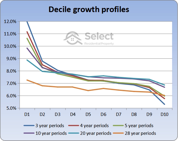
The line at the top left of the chart is the 3 year growth period. That line starts at the very top left and goes to the very bottom right. This means that the biggest per annum growth rate variation was over the shortest timeframe. In other words, the biggest difference between the performance of cheap and expensive markets is likely to occur over short timeframes.
The chart not only shows that cheaper markets in the 1st and second deciles outperform the more expensive markets in higher deciles, but it also shows that if you’re after staggering returns, you’re more likely to get them over shorter timeframes.
It also shows that there’s not a lot of difference between the growth rates of neighbouring deciles. The growth rates become most widely spread at the extreme upper end or at the extreme lower end of the market.
Lastly, notice how flat the bottom line is. This is the 28 year growth period. This means that the degree by which cheaper markets outperform expensive ones is more pronounced over shorter timeframes. Over longer timeframes, there’s not such a significant difference between growth rates.
Valuer General VIC
I have one last data set to analyse, it’s only for Victoria. It’s “Valuer General” data dating back to 1974. This allows us to analyse a genuinely long-term case of 40 years. Once again I’ve split the suburbs up into ten groups.
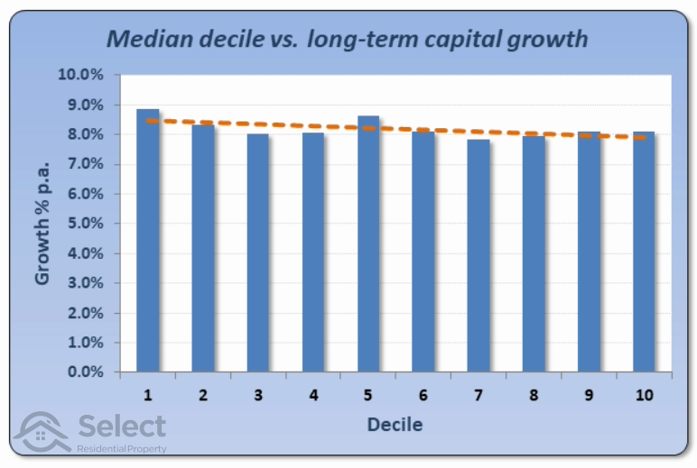
The chart shows 10 bars for each decile. The cheapest 10% of suburbs are in the first decile on the far left. The most expensive decile is the tenth, to the far right.
Now keep in mind that this is a much smaller data set than all of Australia and it is over a period of 40 years. So, we’d expect things to balance out anyway. Also, I didn’t have monthly data, only yearly data, so there were a lot fewer cases to compare.
But you can still see that there’s the same story being told. It’s just a bit patchy in parts.
And notice how the difference between best and worst is even less over 40 years than it was over 28 years. This makes perfect sense according to Apples and Oranges. The longer the timeframe, the less it matters when and where you bought. Long-term all markets should have pretty much the same rate of growth.
The dotted orange line across the top of the bars is the line of best fit or trend line. It shows the general trend between median value deciles and capital growth over 40 years. The trend line suggests that cheaper is better because it slopes down from left to right. But it’s not much of a slope.
Calculation caveats
Now before you go out looking for the cheapest suburb you can find, I need to point out a few things.
Firstly, this is a general rule. It doesn’t hold true in all cases. I calculated averages over many years. That doesn’t mean there is never a time when expensive markets outperform cheaper ones. There are always exceptions.
This highlights a good overall policy in property investing: it’s about making a lot of the right decisions. It’s not one decision or strategy in isolation. It’s about combining all the things you know. One of these is that cheaper markets in far-flung suburbs may have a large amount of vacant land nearby. There’s a risk of oversupply if that land is developed. You can see, that it’s not until you apply all these general rules that you’ll find the best markets for capital growth. So, don’t take this one rule in isolation.
Secondly, I calculated growth using a change in medians. This isn’t the best method for small sample sizes, but works very well across a large number of suburbs, like all of Australia. But by breaking down into SA3s and suburbs within SA3s, the results could be misleading for one-off cases. The large number of SA3s considered should cover that problem though.
I calculated the medians using sales over a 3 month period rather than over a single month to improve reliability. Except in the last case where I used an annual median – one derived from all sales over the year.
Misleading growth figures
Another thing worth mentioning is that in city fringe suburbs, that’s suburbs on the outskirts of a city; there are large tracts of vacant land that sometimes get cleared and subdivided. New house and land packages are built there.
These areas often have misleading growth figures. The median growth is usually higher than the true growth. This is because the new houses are more expensive than the old ones in the same suburb. This can skew the growth figures to appear higher than what they really are.
It’s possible these areas actually have negative capital growth due to the extra supply. But the change in medians hides this fact because the newer properties are sold for higher prices than existing properties. The growth isn’t real growth. It’s median growth, not capital growth.
However, this anomaly in growth calculations is not a huge problem in assessing the performance of cheaper markets vs. more expensive ones because only a small portion of a city has these types of house and land package markets that might stuff up figures.
And remember that I compared cheaper suburbs within the same SA3 from all over the city. There are plenty of SA3s in inner and middle rings to help average figures out.
Data set timeframe
The data set I used was from Core Logic and went back to January 1990. By the way, I did notice that there were eras where expensive markets outperformed cheaper ones.
For example, if you looked at the last 5 years of data in isolation, you’d think that expensive markets outperform cheaper ones. This is simply because of where we are in the property growth cycle. In a few years the lower end of the market will catch up by having superior growth rates again.
Yield
Another side to performance not yet considered is yield.
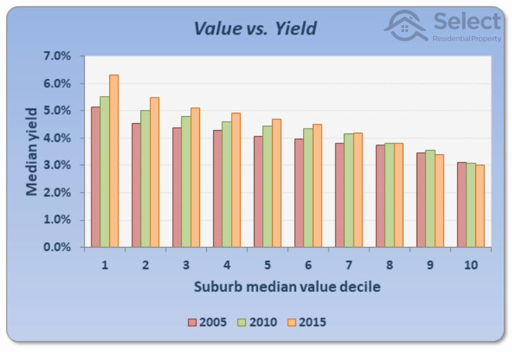
The chart shows the relationship between median yield and median values. The median yield for all suburbs in 2005, 2010 and 2015 were calculated. These yields were then split into 10 groups for each year. Each of those groups was based on the 12-month median value as at July in that year. So, if the suburb’s median was in the cheapest 10% of the country, it appeared in the 1st group on the left of the chart. This means the most expensive suburbs in the country were in the 10th decile to the right of the chart.
You’ll notice that the bars in the chart all get shorter as we move to the right. In other words, the more expensive a suburb is, the more likely it will have a lower yield.
Why cheap outperform?
Alright, so we have enough evidence to pretty confidently say that cheaper property markets outperform more expensive ones, especially over the short-term, but why? I have a couple of theories.
Firstly, I suspect the major reason is affordability. For the last few decades, the period of analysis, affordability has been a huge issue for many home buyers. The number of buyers looking for genuinely cheaper accommodation has exceeded the supply of accommodation at that end of the market. As a result, prices for cheaper properties have outperformed those in more expensive areas because of higher demand compared to supply.
Secondly, cheaper markets start off cheaper because they have fewer of the desirable amenities that the more expensive markets have. Expensive markets have everything and therefore no room to improve. Whereas cheaper markets can obtain a new shopping centre or school and suddenly appear a lot more attractive. In other words they have more opportunity to improve.
But these are just theories, there’s no audit trail linking cause and effect.
Why experts say to buy expensive
With so much contrary evidence to the advice of the experts, it begs the question: how come so many got it wrong? I have a few theories.
Firstly, I don’t think they could be bothered. It’s more important for an expert to have an opinion and to confidently spread it than it is for them to be right.
Secondly, a lot of them plagiarise each other’s work. So, the first one to get it wrong is copied by the rest and they propagate the same mistruth unknowingly.
Thirdly, they have offices close to the CBD if not right in the middle of it. They know their patch inside out and don’t want to spread their research too thin by searching further afield.
Fourthly, in some cases they get paid based on the value of the property they’re buying for their client. So, a cheaper one is not a better one to them.
Anyway, these are just my theories, there could be other reasons. I don’t really know.
Conclusion
One thing is for sure though: cheaper suburbs within the same area perform better than more expensive ones as a general rule. But don’t take this one rule in isolation. Combine it with all the others and you’re much more likely to have better capital growth and successful investing.