Introduction
I’m not suggesting the market is peaking, but I am getting asked more often now days, “Am I too late”?
My answer is always “No, you’re not too late, there’s always a good place to invest”.
Hmm… maybe there isn’t always a good place to invest. But I wonder how likely that is.
Last Peak
The following chart shows the combined growth of all suburbs in the 8 state capitals from April 2017 to April 2019

The peak of this “broad” market was reached in June 2018 – the worst time to buy, right?
The next chart shows the capital growth that various suburbs experienced over the 3 years following on from that peak.
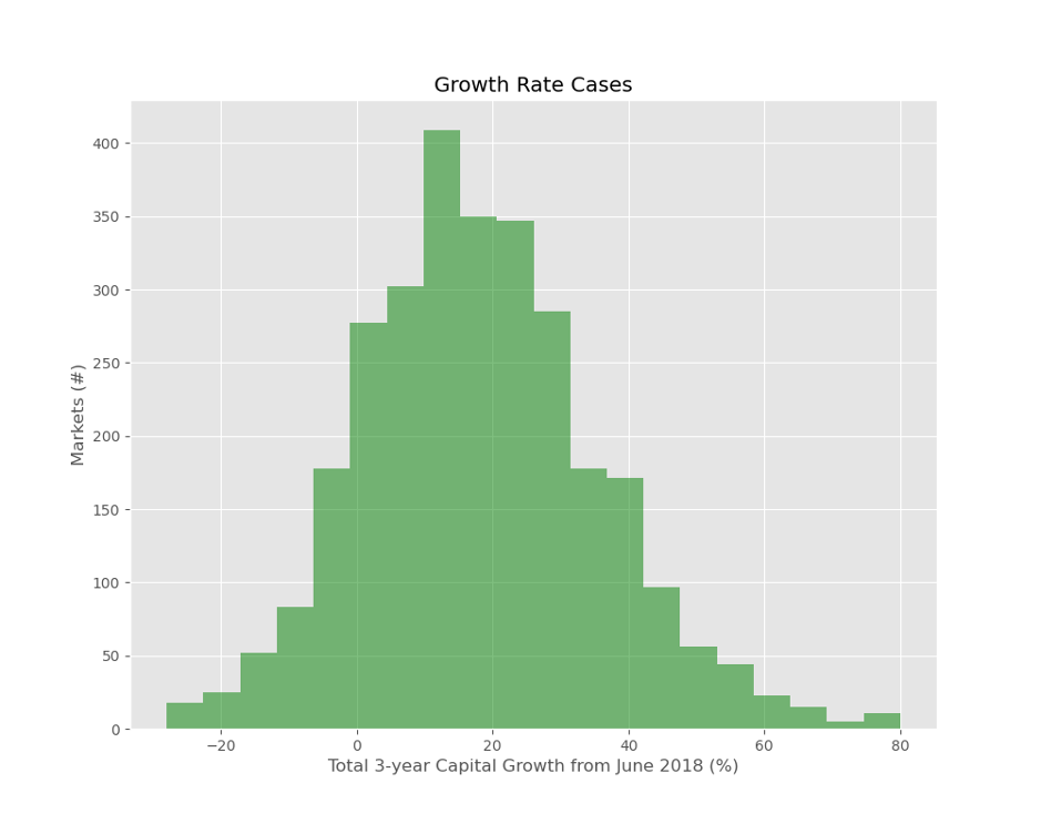
The horizontal axis shows a range of capital growth outcomes from -30% on the far left (ouch), up to +80% on the far right (dang).
The vertical axis is the count of suburbs that corresponds to each growth outcome.
On the left, you can see that some suburbs had declines worse than -20%. But not many did, around a couple of dozen.
And equally as unlikely were the suburbs with upwards of 70% capital growth. They’re on the far right. Looks like there were only about a dozen.
The tallest bar near the middle shows that after 3 years, more than 400 suburbs had accumulated about 15% growth. Remember, this is in total over 3 years, so 15% is not flash – about 5% each year.
Negative Growth
I’ve marked a section of the chart in red below…
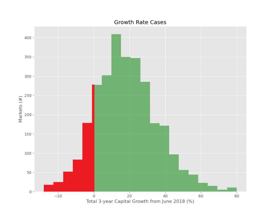
The red area represents the suburbs that had negative growth. As you can see only a small fraction of the total set of suburbs had negative growth. Hundreds, but not thousands
Randomly Picking a Winner
So, how likely would it have been to pick a suburb at random that had double digit growth per annum over the next 3 years? I’ve marked these in blue below
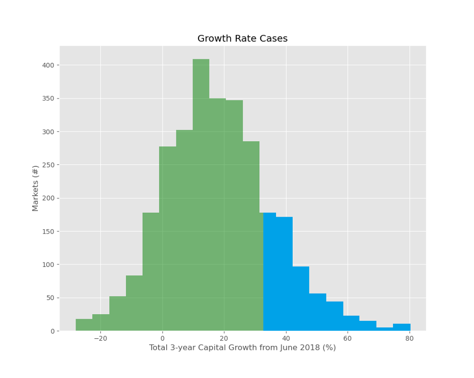
Note that 10% pa equates to a total growth of more than 33% over 3 years. So the left edge of the blue section starts at 33%.
If you randomly picked a suburb, you’d have about a 1 in 4 chance of having double-digit growth over the next 3 years, or 33% in total. That’s enough equity to draw on to buy another property of similar value.
That blue section is not a bad proportion of the total market. These would qualify as “great” suburbs since they had double-digit growth. And there are a few hundred of them. Remember, this is buying at the peak of the market.
But we don’t buy at random do we…
Demand VS. Supply
The following chart shows the breakdown of suburbs at June 2018 by demand to supply ratio (DSR+).
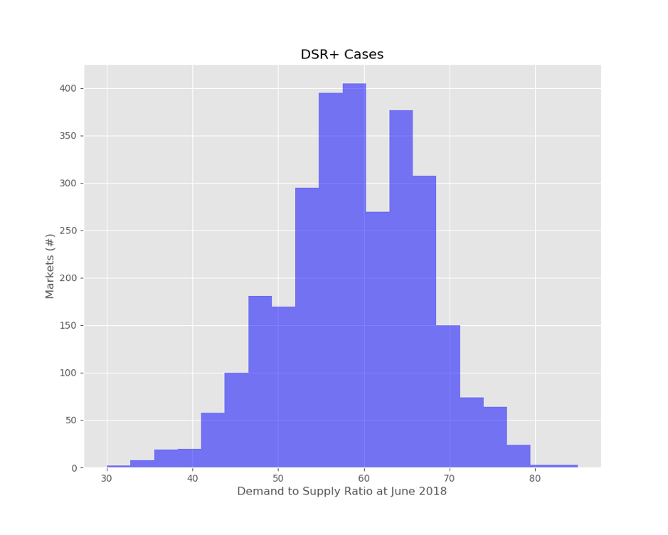
The Demand to Supply Ratio is a measure of demand relative to supply. It’s a score out of 100. The higher the DSR+, the more demand exceeds supply. Prices rise if demand exceeds supply, so the higher the DSR+, the more likely the capital growth to follow.
The horizontal axis at the bottom shows the demand to supply ratio from very low on the left to very high on the right.
The vertical axis is the count of suburbs that had a DSR+ matching that mentioned along the bottom axis. Very few suburbs had a DSR+ below 40 (see left). And even less had a DSR+ of 80 or more (see right).
Although the chart shows a lot of suburbs looking kind of ordinary (in the middle), there were still plenty of excellent candidates over to the right. Remember, this is at the peak of the broader market.
Then VS. Now
The next chart shows the DSR+ cases for June 2021.
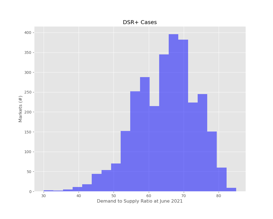
Note that the distribution is skewed to the right now, where there are larger DSR+ values
Conclusion
We’re nowhere near the peak of this cycle. Demand still outstrips supply in the vast majority of locations around the country.
There are plenty of suburbs right now, that have an exceptional DSR+ (70 or higher). That’s a tremendous number of “great” options.
It’s unlikely even when the broader market is correcting that you won’t be able to find a terrific suburb that’s bucking the national trend.

Commentary by
JEREMY SHEPPARD
Director of Select Residential Property
Founder of DSR Data