Introduction
This month I’m going to look at the last 5 years. You might be surprised at how supply and demand has shifted across various cities, what impact the pandemic had in that time and a few more things the data shows that go against what you may have heard recently.
Brisbane
The following heat map shows how Brisbane’s heat is currently spread at the time of writing (March 2022).
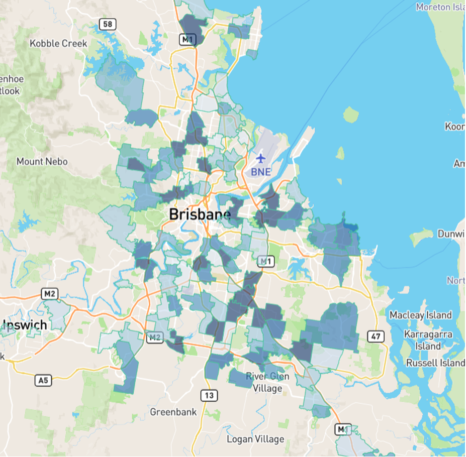
The shading is darker if there is more heat. By that, I mean, more demand relative to supply. You can see a cluster of heat to the south-east.
Each shaded shape represents a suburb that meets minimum criteria for investment. I’ve chosen the following:
· Statistical reliability of 70 or higher out of 100
· A demand to supply ratio (DSR+) of at least 65 out of 100
· Only houses
Here’s the same heat map from five years ago.
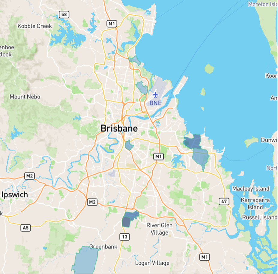
How much of an influence do you think the pandemic had? Did it trigger a mass exodus from southern states pushing up demand for Brisbane property?
Well, here’s the heat map in March 2020 just before things started getting ugly in southern state capitals.
Clearly, heat was already in the Brisbane market before we had any inkling of how the pandemic might change our lives
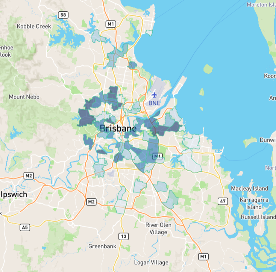
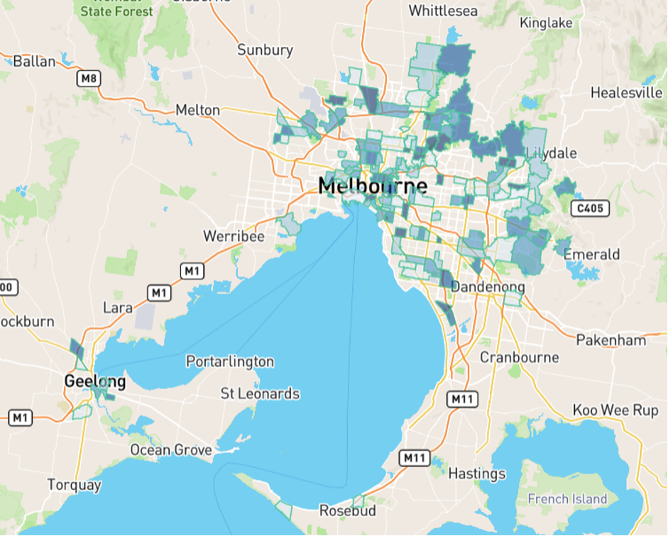
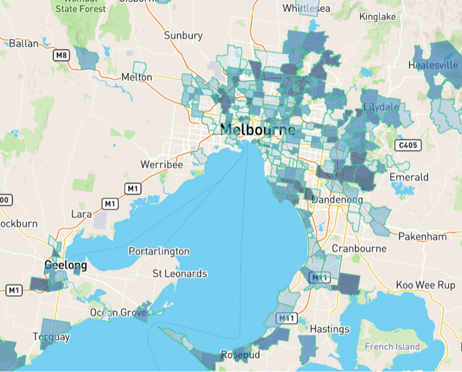
Melbourne
Here is how Melbourne looked five years ago, back in March 2017.
Slim pickings for investors, especially around the CBD and inner areas.
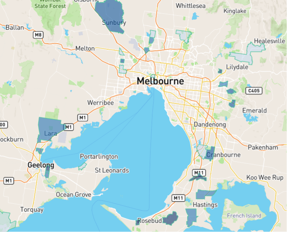
But here’s how Melbourne looked around 2 years ago, March 2020 just as the pandemic was unfolding.
The pandemic may have had some negative influence on the market, but it was only mild.
And one year ago, in March 2021, the Melbourne heat map looked like this…
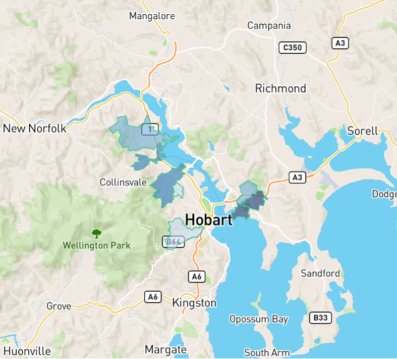
Hobart
Another thing that started about 5 years ago was the Hobart boom. I remember suggesting a few suburbs of Hobart to professional buyers in early 2017.
Although there were only half a dozen suburbs worth investing in, some of them had great growth potential metrics, as well as affordable entry prices and cracking yields.
But my intel fell on deaf ears. And they didn’t change their tune next year when it was obvious Hobart was on the move. This next chart is from March 2018.
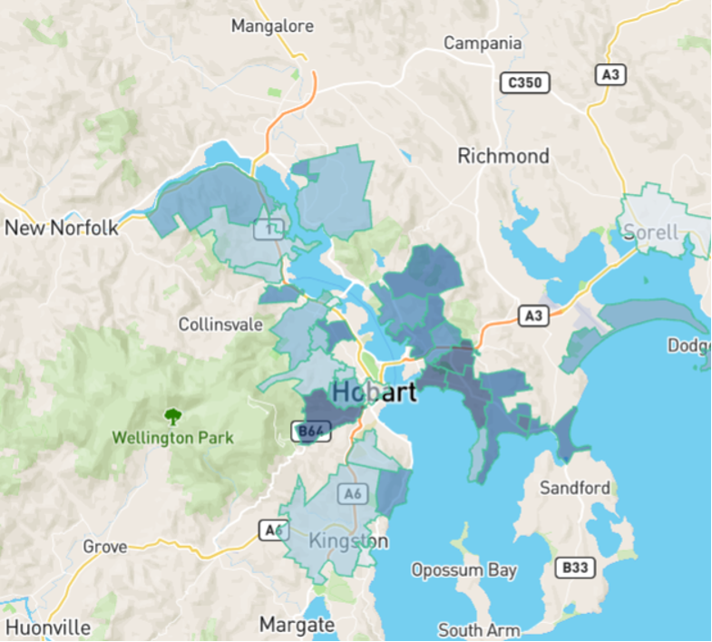
For a relatively small city, that’s a large number of growth markets.
Over the last 5 years from early 2017, Hobart median house prices (green line) have risen over 80%.
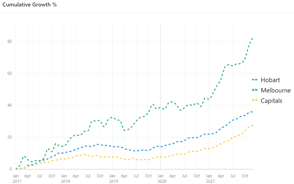
Melbourne, by contrast, had 36% growth (blue line), which was better than the average of all state capitals (yellow line).
Comparing a purchase in Melbourne in early 2017 with one in Hobart around the same time:
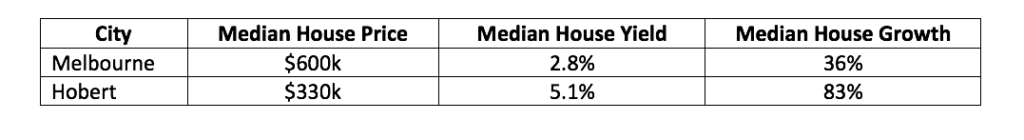
Look at the massive difference in yield. For a $400,000 property, over 5 years, that’s about $46,000 extra rent compared to Melbourne investors – before tax of course.
But that’s nothing compared to the difference in growth. For a $400,000 property there was a difference of $176,000 in equity gain between the two cities over those 5 years.
It shows two things:
· How important growth is compared to yield
· How important picking the right location can be
Rise of the Regions
Another interesting phenomenon of the last 5 years, was the rise of regional markets.
The following table shows the largest change in median values in percentage terms over the last 5 years for any statistical area level 4 with at least 100 suburbs…
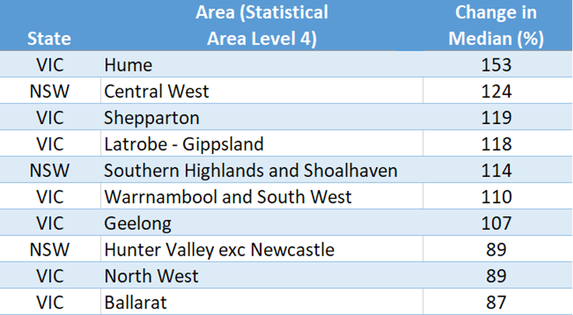
Many of these capital growth calculations could be median anomalies. Old houses may have been replaced with new, more expensive ones skewing the median up. But this at least shows the favour buyers had with moving regionally. Notice how popular Victorian regions were in the top 10.
The following heat map from March 2021 shows the heat in the NSW south coast responsible for the rapid rise in prices in the south coast and Southern Highlands.
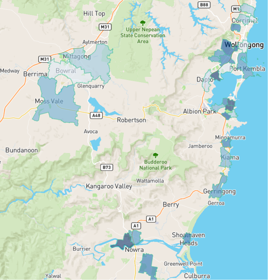
Was it caused by a flight to affordable housing, or a flight from pandemic and work-from-home, or a flight to lifestyle? Perhaps a combination.
Vacancy Rates
Low vacancy rates are another phenomenon of the last 5 years. For a long time, the belief has been that a 3% vacancy rate is the sign of a market in balance. Historical evidence suggests it’s actually 2% as you can see in this article…
Is 3% vacancy really a balanced market?
But even 2% became irrelevant in the last five years.
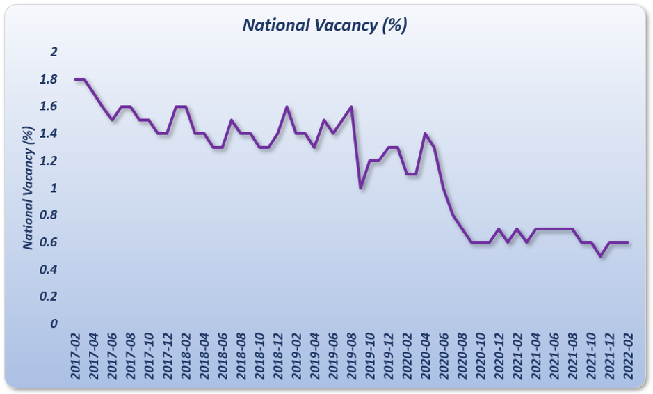
Less than 1% is now the new normal vacancy rate.
Houses VS Units
There’s also been a growing separation between the relative value of houses and units. You may have seen a chart similar to this one…
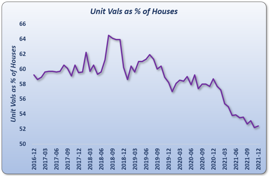
This shows the growing disparity between the value of houses and units over the last 5 years. Units are now close to 50% of the price of houses in the same suburb.
Some might think that sooner or later this trend will correct – units might become good value compared to houses. And I agree, since…
Every step a trend extends, we’re one step closer to that trend’s end
However, here’s the big picture.
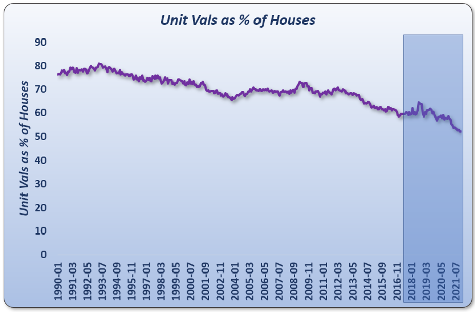
Note the time-span along the bottom. We were only looking at the last 5 years. Looking at the last 30 years, tells an interesting story.
This growing disparity is actually an ongoing long-term trend, nothing extraordinary. It would be a brave investor to bet against such a long-term trend. To be safe, best to keep buying houses not units.
Conclusion

Commentary by
JEREMY SHEPPARD
Director of Select Residential Property
Founder of DSR Data