Introduction
This month’s insights come from a comparison of the last 2 quarters – late last year vs. this year so far. I’ll look at changes in a number of metrics across significant urban areas from around the country to see what might be coming.
Change in Demand
The following table shows the change in the demand to supply ratio (DSR+) from the quarter ending 2021 to the quarter starting 2022.
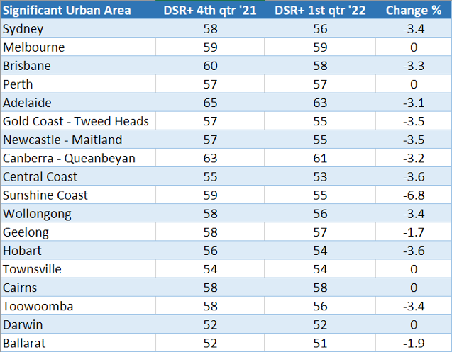
The DSR is a measure of how much demand outweighs supply and therefore what potential there is for price change. A DSR of 50 reflects balance. A high DSR means more growth to come.
Notice that not a single market has a DSR below 50. They all decreased from the prior quarter, not by much though. So, there’s still more growth to come, but that rate of growth is slowing – and slowing slowly.
Change in Value
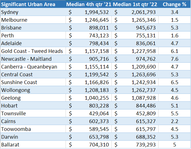
Every significant urban area had price growth. The largest gains were in Newcastle – Maitland, 7.6%. SEQ was very good too.
Change in Vacancy
There’s been a fair bit of talk about tight vacancy. The following table shows how true it is.
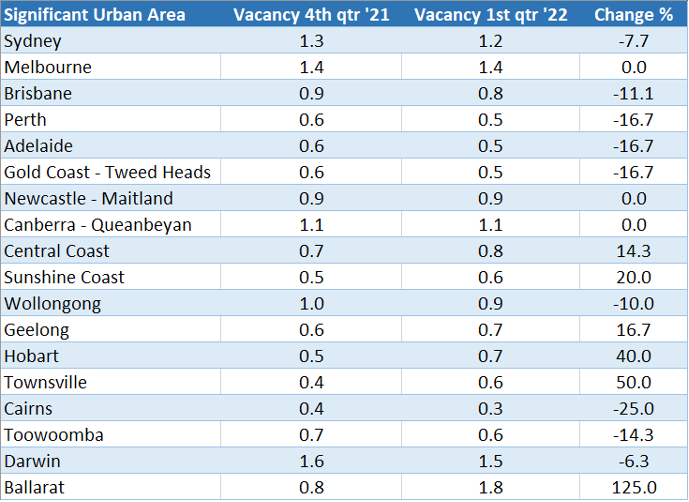
Nothing over 2% last quarter or the quarter before. But while some markets are tightening further, others are becoming more relaxed.
Ballarat looks like a lot of investors have bought there – the vacancy rate has climbed by over 100%. Either that, or tenants are leaving the area. But there’s nothing to worry about, the vacancy rate is still a little lower than what is considered a balanced rental market.
Change in Yield
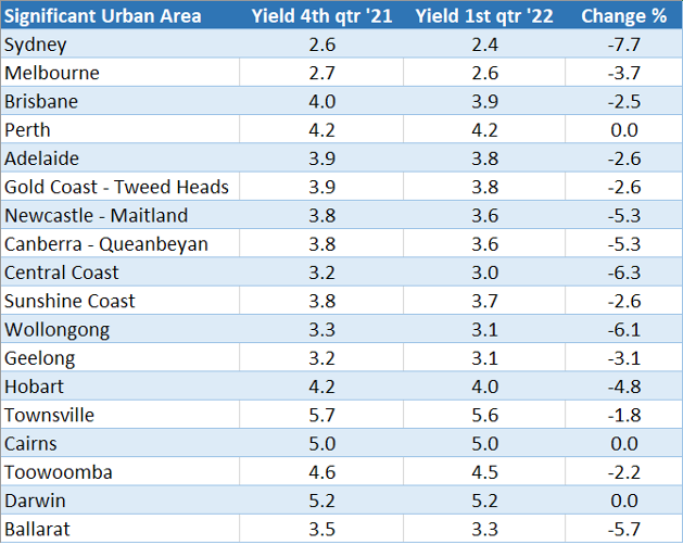
Tenants are usually on leases that get reviewed annually. But buyers have been updating their price expectations almost fortnightly. So, rent growth is inevitable. Very good news for investors and tough times for renters.
Change on Stock Market
Low supply has had some influence in driving high price growth, but not in a huge way. The percentage stock on market for a balanced market is usually around 1%.
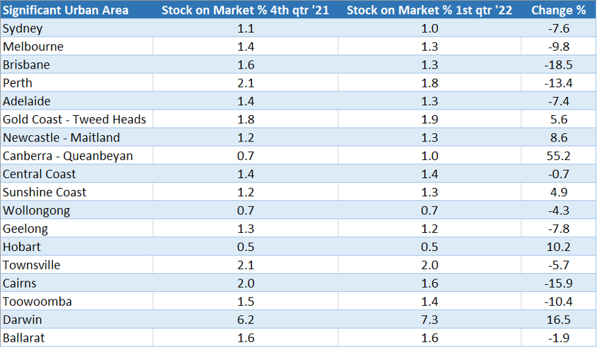
None of these markets are chronically short on supply, except maybe Hobart and Wollongong.
Darwin is noticeably different to the rest; it has a very high % SOM of over 7%. Not good for Darwin investors.
Market Cycle Timing
Market Cycle Timing (MCT) is a measure of the likelihood that a suburb is about to enter its next phase of growth. It’s a score out of 100. The lower the score, the more likely we’ve hit the peak.
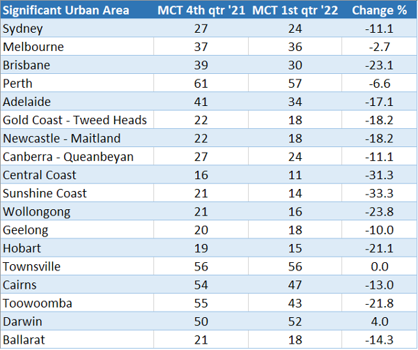
Low figures like these become more common the closer we get to the end of a boom. Any area with an MCT below 20 must be very close to its peak. For example, Central Coast, Sunshine Coast and Hobart.
MCTs of 50 mean the area is somewhere between its last trough and its next peak. Perth, Townsville and Darwin are good examples.
Interesting Changes
- – Townsville selling times dropped from 71 days to 55 days
- The areas in which auction clearance rates rose: Perth, Darwin and Townsville
- The Sunshine Coast had the biggest drop in % of properties sold at auction 23% down to 17%
- Melbourne had the biggest climb in open inspections 30% to 60%
- Toowoomba had the biggest acceleration in rent growth, 10%pa to 13%pa
Conclusion
Data suggests the tide is turning. But as some markets cool over 2022, others are heating up. Always the same, always changing.

Commentary by
JEREMY SHEPPARD
Director of Select Residential Property
Founder of DSR Data