Introduction
Many investment experts will claim there is a certain mix of renters to owner-occupiers that make a suburb better for investment than others. Here’s an example I found on one website…
“…if the market is made up of 65%-70% owner-occupiers then this is the ideal market to attract when it comes time to sell.”
There’s never been any data provided to back-up the claims. Everyone seems happy to voice their opinion without any need for evidence. In this presentation I’ll lay out what the data has to say about an objective precise and ideal ratio so you can lean more towards these suburbs.
Defining terms
Let’s precisely define what these terms are so there’s no confusion. Renters or tenants are people living in a property owned by a landlord. Owner-occupiers on the other hand, own the property they are currently living in.
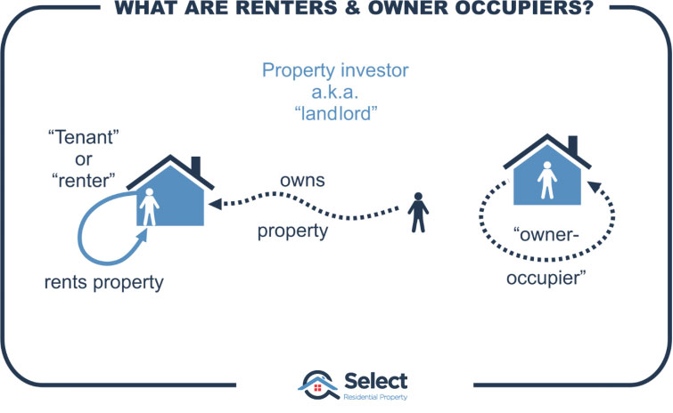
Assume there are 400 renters in a suburb and 600 owner-occupiers. In this case, there would be 1,000 residents in the suburb and 40% of them would be renters.
There’s a metric that can be derived from this census data. It’s calculated by comparing the number of renters living in a suburb with the number of owner-occupiers living in a suburb.
A lot of experts believe you shouldn’t be buying into markets where there is a high proportion of renters to owner-occupiers. I agree. But where I differ from them is what the ideal mix or ratio should be.
- What is the ideal mix?
- Some say 25% renters
- Some say 30% renters
I say the ideal proportion is zero. And it’s not that I hate tenants, I just love capital growth.
Supply & demand
OK, so why do I want the ratio to be zero? It’s simple: it all comes down to supply and demand.
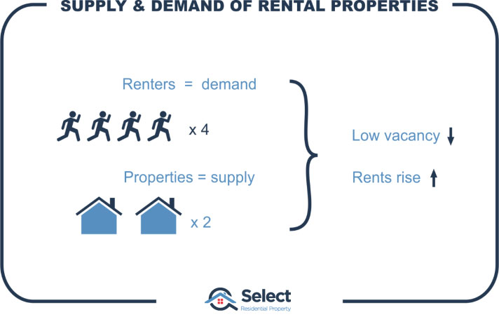
If there are very few rental properties yet loads of would-be renters looking for a place to rent, then you’d expect vacancies to be low and rents should rise.
It’s the same when looking for capital growth. If there is more demand from buyers than there is supply of properties, then you’d expect the price for properties to rise.
It’s a pretty simple concept. And it’s an extremely important one to grasp when researching your next investment location.
“If you don’t research supply & demand, your results will definitely suffer”
Now, imagine interpreting the data incorrectly and getting supply and demand completely the wrong way around? That is, imagine thinking of supply as if it was demand or vice-versa.
This is exactly what some investment professionals have done with their interpretation of the proportion of renters to owner-occupiers. Some of them think that the percentage of renters indicates how attractive the suburb is to tenants. They think that if the percentage of renters is low, it means renters don’t like the suburb. In other words, they interpret the percentage of renters as a demand indicator.
It’s not. It’s actually a supply indicator.
“The proportion of renters to owner-occupiers indicates how many rental properties have been supplied to the suburb”
I don’t want to compete with any other landlord. Ideally, I’d like to be the only landlord that owns a rental in the suburb. I want tenants scrambling over one another to get into my property at the open inspection. I want my property manager to have a large wad of applications to examine to find the best tenant for my property. That means I want the proportion of renters to owner-occupiers to be as low as possible.
The arguments
Now admittedly, there aren’t many experts who want the proportion of renters to be as high as possible. Most get confused about what this metric means. They think it somehow means a bit of both supply AND demand. So, they end up coming to the conclusion that there’s some ideal mix of tenants to owner-occupiers.
They say, “You don’t want too many renters since they don’t take as good care of the property as owner-occupiers would”. There’s nothing wrong with this part of the experts’ argument. Where it goes funny though is when they start saying that they want to know if the suburb is attractive to tenants. And that’s when they quote some mix, or ratio, of tenants as being ideal.
They say they want to see some tenants in the suburb. They think that the lower the number of tenants, the less attractive the suburb is to tenants. As if zero tenants would suggest there is something wrong with the suburb that won’t attract tenants.
The correction
Just to be clear, there’s nothing wrong with a suburb full of owner-occupiers, even 100%. Tenants and owner-occupiers are both humans, they both want pretty much the same thing:
- Shops
- Parks
- Schools
- Peace and quiet
- Safety
- Proximity to jobs
- Proximity to transport hubs
- And so-on
None of the features in this list are exclusively of interest to owner-occupiers and not of interest to tenants as well. If owner-occupiers want to live in the suburb, then renters will too.
“Zero renters doesn’t mean zero demand from tenants. It means zero supply of rentals”
The proportion of renters is not a demand indicator, it is a supply indicator. It doesn’t show how badly renters want to live there. In other words, it doesn’t show the demand for rental properties. Instead, it shows how many rental properties are there already, it shows the supply of rental property.
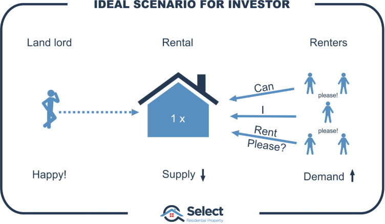
I could be the only landlord supplying that market. Every tenant that wanted to rent there would be coming to me. Just because there were no tenants in that suburb already, doesn’t mean there aren’t some that want to be. It’s far more likely to mean there’s an amazing undersupply of rental properties. Obviously, it’s a nice place to live or there wouldn’t be owner-occupiers.
Supporting data
We’ve got a pretty good argument for believing that the best ratio of tenants to owner-occupiers is actually zero, but what about some data to back up the theory with practise. Is there an ideal mix, or is it a case of the lower the better?
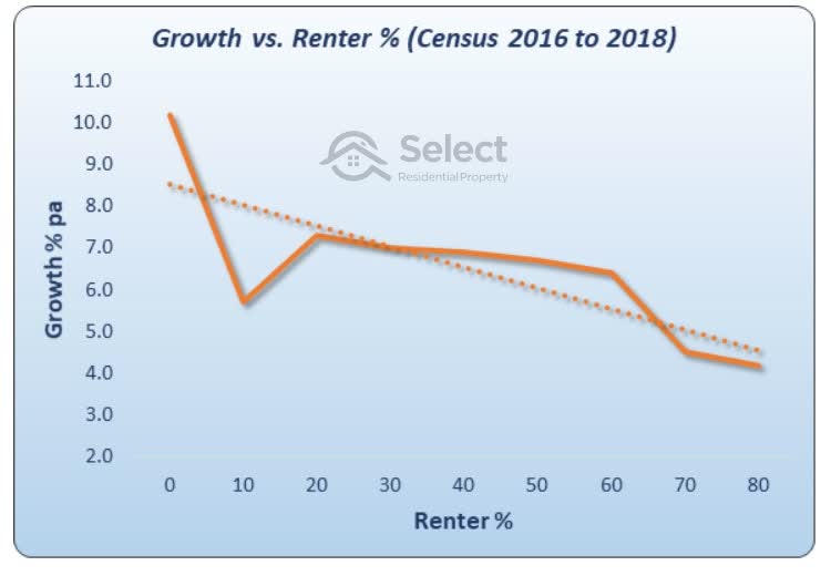
This chart shows the relationship between the proportion of renters and the per annum growth rate. You can see the proportion of renters along the bottom horizontal axis. It ranges from zero at the left to 80% at the right. The growth per annum is then plotted using the left vertical axis.
I grouped all suburbs into renter groups by 10% ranges from zero up to 80%. I ignored suburbs in which there were too few properties or too few transactions to make a reliable capital growth calculation.
As you can see, if the proportion of renters is lower, the growth over the following years is higher. If you choose markets with a high proportion of renters, you’re more likely to get poor growth over the coming years.
The dotted line is called the line of best fit. It’s a line positioned so that there is the smallest gap between it and the real data. It shows a trend. And the trend proves that the lower the proportion of renters, the better the capital growth.
This chart was comprised using census data from 2016. So, there’s only a couple of years of growth data. We need to look at more censuses.
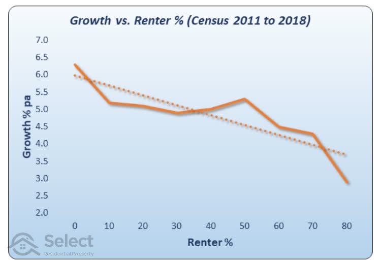
This next chart shows 7 years of growth data. And it’s still telling pretty much the same story. There doesn’t appear to be any “sweet-spot” where growth is better for a certain percentage of renters. It’s still suggesting that the lower the proportion of renters, the better.
Let’s go back to the census of 2006.
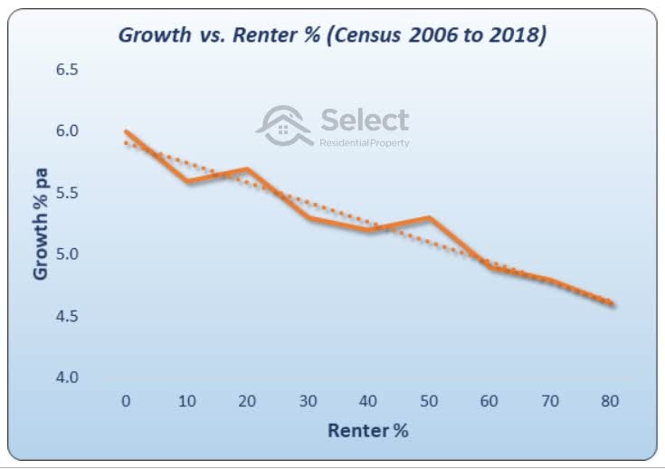
Now we’re covering a period of 12 years since the census was conducted. And the gap between the real data and the line of best fit is getting smaller. The trend line has a tighter fit to the data. This means the correlation between the proportion of renters and growth is getting closer. Again, there is no sweet-spot showing up.
So, for the last 3 censuses, covering 2, 7- and 12-year growth periods, there is ample evidence to support the argument that the lower the proportion of renters, the better the future growth is likely to be.
You’ll notice that the benefit of investing in owner-occupier dominated suburbs is not a huge benefit. Check the vertical scale on the last chart. There’s only about a half a percent per annum improvement between zero renters and the average of about 30% renters. So, it’s not a tremendously exciting metric. But the good thing about it is that the superior growth of lower renter markets lasts for more than just a few years. And the relationship to growth is relatively consistent across the full range of possible values.
Conclusion
It’s not only clear from logic, it’s clear from supporting data too. There is no sweet-spot of renters, the lower, the better.
- No sweet-spot
- Lower renter count is better
- Renters = rentals
- Rentals = supply
- Supply = bad
If there are no rentals, it’s more than likely a shortage of supply than a shortage of demand. Its more likely tenants can’t get in rather than don’t want in.
In other words, instead of interpreting this metric as the demand for rental accommodation, it’s actually the other way around – it’s a supply indicator. Don’t get supply and demand round the wrong way or your investment’s performance will be round the wrong way too.
There are more presentations in this series that blow the lid on commonly misunderstood metrics. You might like to check out this one on population growth for a bit of an eye-opener: