Introduction
Some experts believe that suburbs with a high concentration of a certain age range will deliver better growth than others. For example, people in the 20-44 age bracket or 70+. These are known as “Newly-weds or Nearly-deads”.
An analysis of the data suggests this age bracket is actually NOT the lead indicator of capital growth that some experts think it is.
Theory
The theory is that those over 70 will downsize, selling off their homes to developers who would build townhouses to sell to the younger age bracket that would pay a premium for them. Rather than argue about that logic, let’s just see what the data has to say.
Data
I read a blog on this exact topic. It was published in 2016, based on data from the 2011 census. So, I replicated the results (close enough) as seen in the following chart.
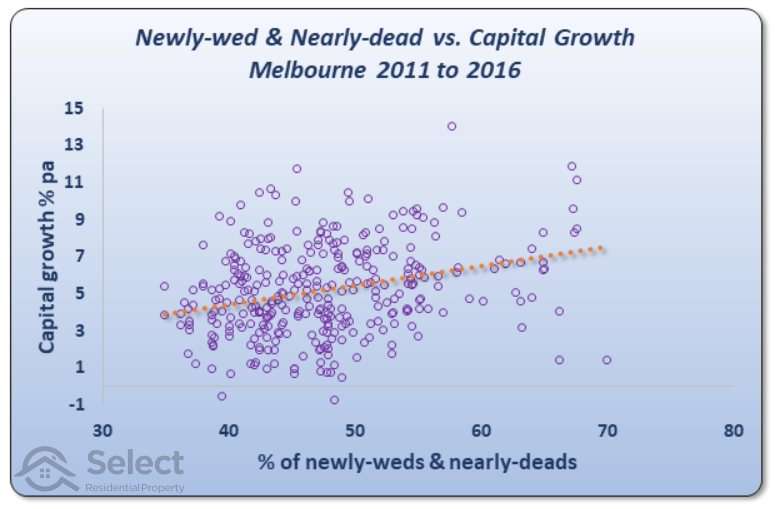
Chart explanation
Every purple circle on the chart represents a suburb in Melbourne. You’ll see a range from 30% to 80% along the axis at the bottom. This is the percentage of residents in each suburb that fit into one of those two age brackets: 20-44 or 70+. Over the right of the chart are suburbs with a high proportion of Newly-Weds or Nearly-Deads (NWNDs). Some suburbs have nearly 70% NWNDs. Over to the left are suburbs with a low proportion – less than 40% NWNDs in some cases.
The vertical axis on the left shows the percentage capital growth per annum for each suburb from 2011 to 2016. At the bottom of the chart are suburbs that had very low growth. Two of them had negative growth. At the top of the chart are suburbs that had excellent growth. A few of them had double-digit growth. One looks like it had about 14% growth.
Chart interpretation
The orange dotted line is the line of best fit. It’s been mathematically plotted to minimise the distance between itself and all the circles. The general relationship between NWND and future growth is shown by the line of best fit.
As you can see, there isn’t a very accurate relationship – i.e. there are many circles that are a long way from the orange dotted line. But there is an upward trend in the line. What this means is that as a general rule, suburbs with higher concentrations of NWNDs (right) outperformed suburbs with lower concentrations (left).
The suburb with the lowest proportion of NWNDs coincidentally sits right on the start of the orange line. It had about 4% capital growth each year for the 5 years from 2011 to 2016. At the other end of the dotted line, there are a couple of suburbs that had about 8% growth per annum. These suburbs had around 68% NWNDs.
At this point we could say there is an argument for the theory. However,
“It’s only one city and only one time-frame”
Using the tactic
Let’s say we believed in this theory and decided to target suburbs in Melbourne that had high concentrations of NWNDs as at 2016. If you followed this advice, the following chart shows how things would have played out for you.
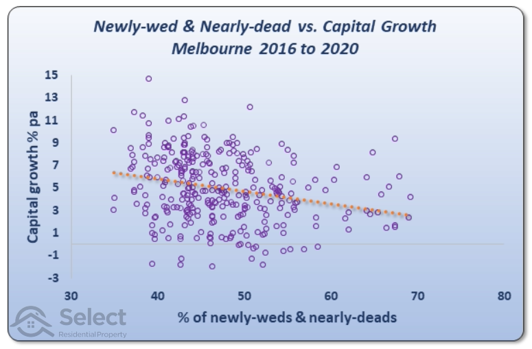
The dotted line shows that you would have been worse off over the next 4 years. The trend line has switched direction. Over this period, the high NWND suburbs underperformed those with lower NWNDs.
Other cities
The prior chart was for Melbourne. But there’s no reason to believe the theory wouldn’t apply to other cities, ones that also have downsizers and also have younger people wishing to pay a premium for new townhouses. So, here’s the same chart except for Sydney suburbs.
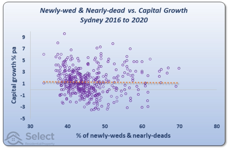
If you had applied the tactic to Sydney from 2016, you would have been no worse off. The horizontal dotted line shows that there was no relationship between NWND and capital growth for the 4 years from 2016 to 2020.
What about Brisbane?
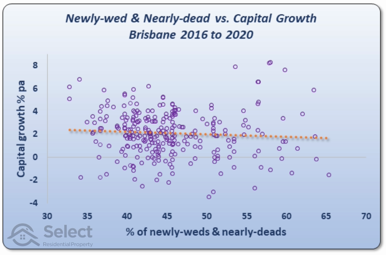
As with the prior chart, this chart also suggests there’s either no relationship between NWND and growth, or there’s a reverse one. So, applying the tactic would have failed to deliver a desirable result.
The story got a little worse for Perth…
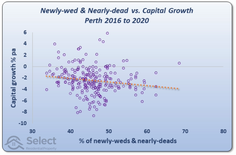
In the case of Perth, you would have been better off targeting suburbs with lower proportions of NWNDs.
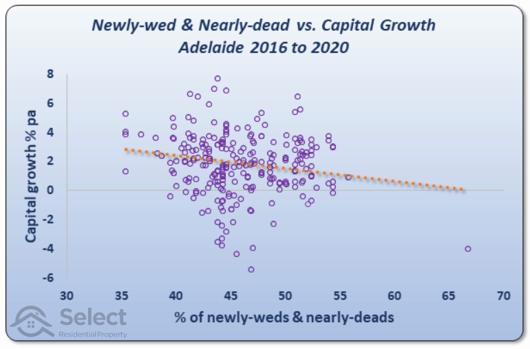
And it was the same story for Adelaide…
Conclusion
The NWND age bracket is NOT a lead indicator of above average capital growth. And this was confirmed by further analysis over different time-frames, e.g. 2006-2011. These cases also showed unreliable results.