Summary
There’s been a long-held belief among many experts in property investment that the closer a property is to the CBD, the better the growth over the long-term. But the data suggests the benefits might be BS. And there are plenty more problems investors need to be aware of.
In this presentation I’ll reveal flaws with prior research on this tactic. And I’ll highlight a few extra considerations which might have you wondering how it ever became a commonly held belief. It’s certainly not a consideration that investors need to bother with.
Poor past research
Let me start by addressing some of the past research I’ve seen published in this area. In extreme cases it’s been biased in some kind of way by picking specific periods or suburbs that support a conclusion that wants to be drawn. But even in unbiased studies there’s been:
- Short time-frames
- Small sample sizes
AHURI
The Australian Housing and Urban Research Institute (AHURI) published a report back in 2010 which contained a section that I regularly see quoted by property investment professionals. The report suggested that owners of property further from the CBD might be severely disadvantaged in years to come because of much lower capital growth rates. Many experts may have based their “proximity to the CBD” strategy on this report.
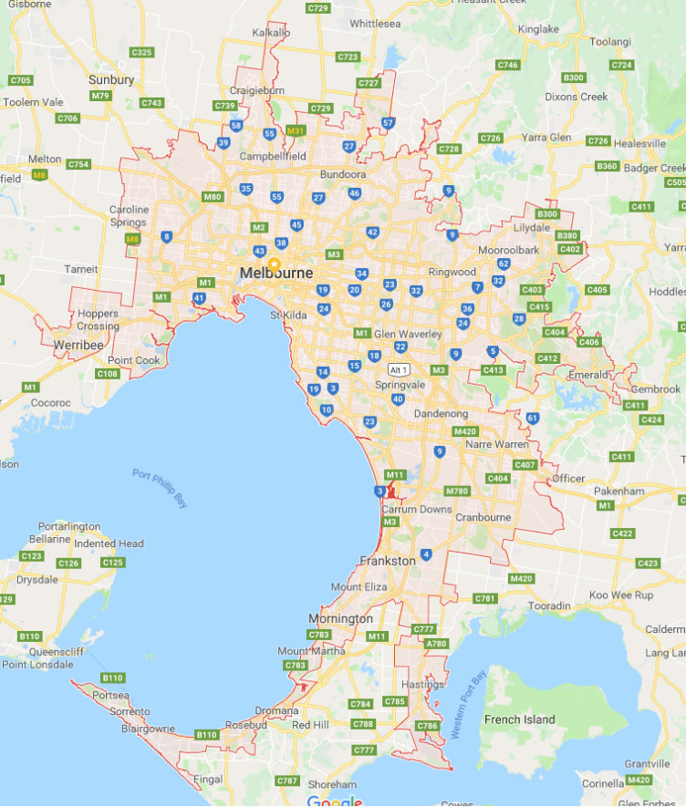
AHURI broke Melbourne up into 5 distinct corridors as you can see on the map following.
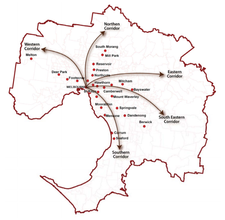
Source: ahuri.edu.au
The report was flawed by a few simplifications:
- The capital growth was examined in an end to end manner;
- Over a single period;
- And only examined a handful of suburbs;
- And only involved one CBD (Melbourne).
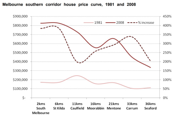
West
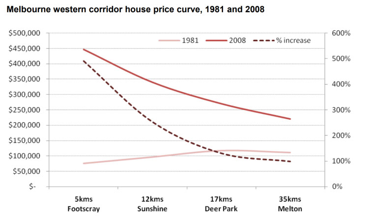
Here’s one of their charts…
Source: ahuri.edu.au
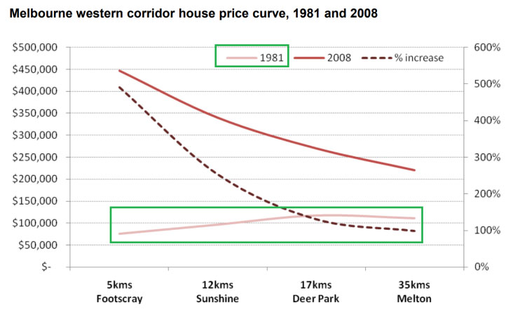
The pale pinkish looking line at the bottom of the chart is for data observed in 1981. It shows the different median values for 4 specific suburbs as you head west further away from the Melbourne CBD. Following is a copy of the same chart but with green rectangles highlighting what I’m referring to.
Back in 1981, the further away from the CBD the higher prices were. This is somewhat at odds with their argument. But it’s a mostly flat line anyway.
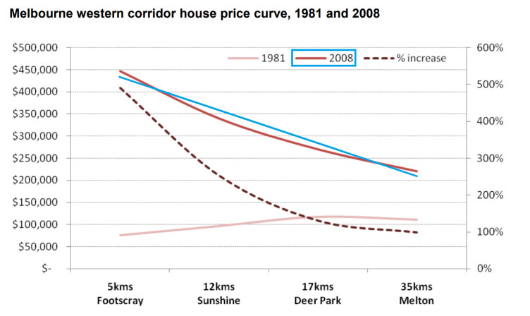
The top curve is showing the same thing, that is, how the median differs the further you move away from the CBD. However, this was for 2008. I’ve highlighted this in blue…
The top curve is for medians twenty-seven years later. Footscray house prices have moved from about $75,000 in 1981 to $450,000 in 2008.
But on the right of the chart you can see that Melton house prices only moved from about $110,000 in 1981 up to $220,000 in 2008. See the purple rectangle…
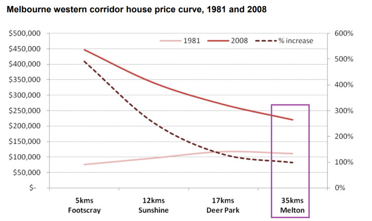
The dotted line is the whole point to their argument. It’s the capital growth in percentage terms over the 27-year period. The dotted line’s axis is over to the right of the chart.
The dotted line shows the percentage increase in values for each of the 4 suburbs. Melton only had 100% capital growth in that 27-year period while Footscray had nearly 500% growth.
The dotted line shows that the capital growth over those 27 years was greatest the closer you were to the CBD. And that’s their point: the closer you are to the CBD, the more capital growth you’ll get.
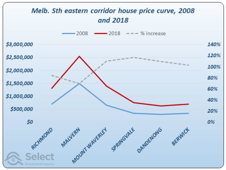
Using this Intel
Now imagine an investor, saw this report back in 2008 and decided to invest in Footscray on the belief that it would outperform Sunshine, Deer Park and Melton because Footscray is closer to the CBD. Well, here’s what happened over the next 10 years…
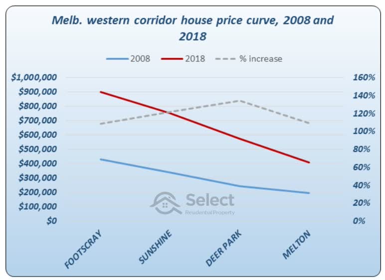
Source: SelectResidentialProperty.com.au
This chart shows the same 4 suburbs as the AHURI report. It has the same 3 lines on it. Except we’re now looking at 2008 and comparing it with 2018. The blue line at the bottom shows the 2008 medians. The red line shows the 2018 medians. And the grey dotted line shows their performance.
The grey dotted line shows the percentage growth for each suburb over the 10-year period. Out of the 4 suburbs, Footscray performed the worst. Melton was not much better. But Deer Park won the race and Sunshine beat Footscray.
If an investor had used this strategy and bought in Footscray, they would have been quite disappointed. Even waiting a decade hasn’t produced superior returns.
Let’s quickly examine the other corridors of AHURI’s report.
North
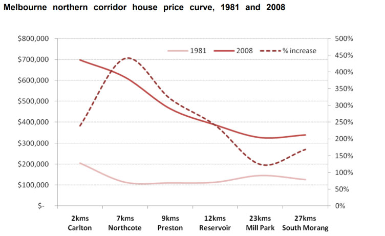
Source: ahuri.edu.au
This is the northern corridor. Apart from Carlton, there is the same trend where suburbs closer to the CBD had better growth (look at the dotted line). The worst performer was Mill Park. But again, this is only a handful of suburbs.
Using this Intel
If you had used this knowledge in 2008, you would have steered clear of Mill Park. But here’s what happened in the following 10 years.
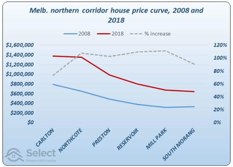
Source: SelectResidentialProperty.com.au
The grey dotted line is highest for Mill Park. The grey dotted line suggests that the further you were away from the CBD, the better the growth over that 10-year period.
East
Here’s the eastern corridor.
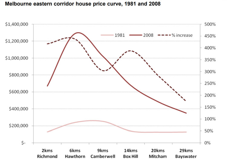
Source: ahuri.edu.au
Again, the dotted line suggests proximity to the CBD is a good strategy.
Using this Intel
But if you had applied that strategy in 2008, here’s what would have happened.
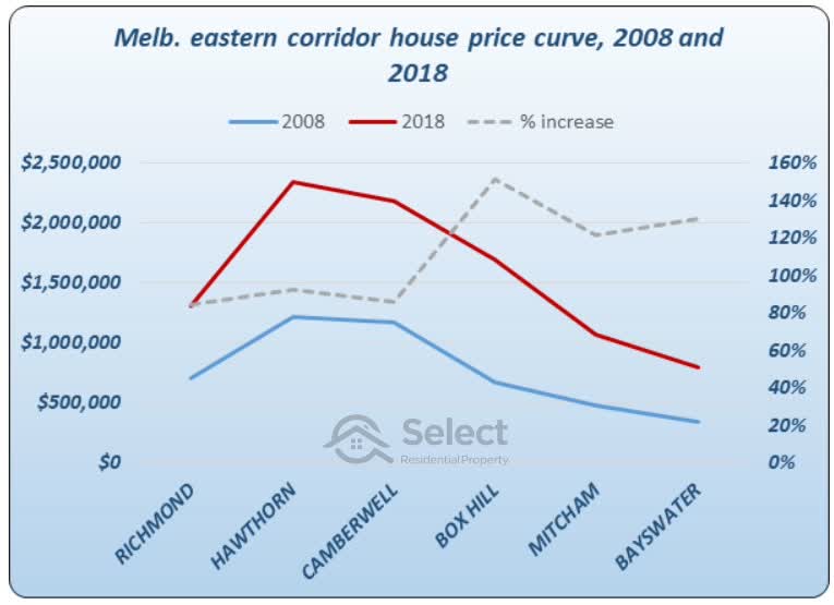
Source: SelectResidentialProperty.com.au
The worst 3 performing suburbs were actually the ones that were closer to the CBD. The best performing 3 suburbs were the furthest from the CBD.
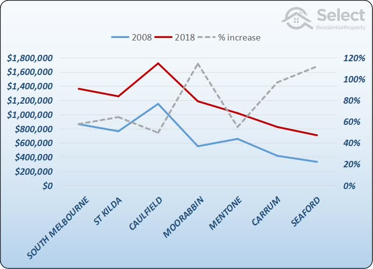
South-East
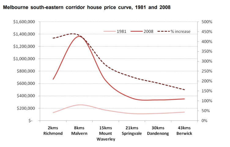
Source: ahuri.edu.au
It’s the same story with the dotted line.
Using this Intel
But what if you had employed this strategy…
Source: SelectResidentialProperty.com.au
You’d get the same reversal of results over the following 10 years.
South
The last corridor was the southern corridor.
Source: ahuri.edu.au
It’s a bit higgeldy-piggeldy this one. But you can kind of see the general trend is there.
Using this intel
What happened over the next decade?
Source: SelectResidentialProperty.com.au
Again, the trend virtually reversed. AHURI’s report would not have served investors well over the following decade in every corridor mentioned.
Why does it reverse?
After years of examining the long-term growth charts comparing two suburbs, I’ve seen that quite often the lead swaps over their history. And the longer the time-frame, the more times the lead swaps.
“The winner depends on when you choose to put the start and finish lines”
Analysing data in this end-to-end fashion doesn’t give reliable results. Combine with this the small sample size and you can see why the results were misleading.
- Bad analysis methodology
- Inconsistent distances from CBD
- Specific suburbs
- Too few suburbs considered
- Too few CBDs considered
- Short time-frame
- Only 1 time-frame
But this was one of the first studies of its kind. We can’t be too harsh on the authors; they did the best they could with what they had available. We have a lot more data now and better analysis techniques. So, we need to at least acknowledge the effort they went to back then was actually pretty good.
RBA & REIA
Here’s a joint report from the Reserve Bank of Australia and the Real Estate Institute of Australia – two big names in data analysis and property.
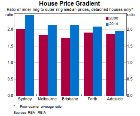
The chart compares the median values of houses close to the CBD with the median values of houses further from the CBD for each of Australia’s 5 biggest cities. It calculates the “ratio” between inner and outer ring suburb median house prices.
Chart interpretation
Each bar is a ratio between median sale prices, not a median sale price itself. You can see this ratio on the left vertical axis.
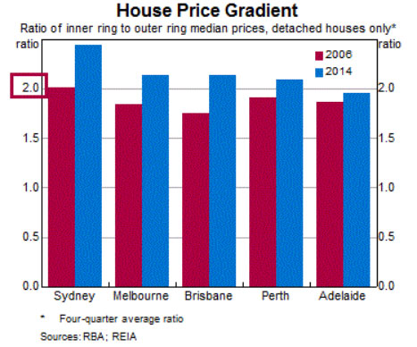
For example, the leftmost red bar shows that inner suburbs in Sydney had twice the value of outer suburbs in 2006. You can see the left vertical axis has the number 2 right next to the red bar.
But in 2014 the ratio had increased to nearly 2.5 – see the blue bar for Sydney. That means inner suburbs of Sydney were nearly 2.5 times more expensive than outer suburbs in 2014. But in 2006 they were only 2.0 times more expensive. In other words, from 2006 to 2014, Sydney outer suburbs had less capital growth than Sydney inner suburbs.
If the blue bar is taller than the red bar for a city, then it means that inner suburbs had more growth than outer suburbs from 2006 to 2014.
On the far right the blue bar is just under 2. It shows that in 2014 Adelaide inner ring suburbs were nearly twice as expensive as outer ring suburbs. But in 2006, eight years earlier, the red bar shows that the inner suburbs had a slightly lower ratio compared to outer ring suburbs.
So, the height of the bar shows by how much inner suburbs were more expensive than outer suburbs.
The colour of the bar shows whether the data was for 2006 or 2014.
Chart purpose
The idea is to compare ratios over time to see if the ratio has changed. The chart shows red bars next to blue bars to highlight the change in ratios.
As you can see, for every city its blue bar (2014) is taller than its red bar (2006). So, the chart is suggesting that there is a change in the ratio over time for every city. The argument put forward is that growth in values is faster in the inner rings than in outer rings.
But there are a couple of problems with this analysis. Firstly, focussing on the positives:
- Good analysis
- Multiple CBDs
- Large cities
- Many suburbs
The analysis covers 5 cities and these are the largest cities in the country. That’s much better than just focussing on Melbourne.
And instead of picking out a handful of suburbs, hundreds of suburbs in each city are considered. That makes the sample size much larger and the results far more reliable.
However, you’ll notice from the title, they only split the comparison into two groups – inner and outer rings.
- Bad analysis methodology
- Only 2 rings
- Only 1 short growth period
We don’t know what method was used to classify a suburb as “inner” or “outer”. There may have been a set of “middle” suburbs that weren’t included.
But most importantly, there are only 2 years considered: 2006 and 2014. This is only one time-frame and a short one at that.
Try again
Here’s the same kind of analysis performed for a different 8-year period. This period is for the 8-year period prior to the RBA-REIA report.
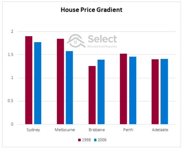
Source: SelectResidentialProperty.com.au
Sydney, Melbourne and Perth ratios actually declined across this 8-year period. This means in those cities over that time-frame the outer rings grew faster than the inner rings. However, Brisbane inner suburbs did grow faster than outer suburbs. And in Adelaide there was no real difference.
I can’t show a chart for the 8-year period following 2014, because at the time I’m writing this, it’s only 2020.
Using a different period shows that the winner is determined not so much by proximity to the CBD but when you set the start and finish lines of the comparison. This makes perfect sense given what we know about the ripple effect.
City growth spurts start in the centre and flow out towards the fringes. When inner suburbs have finished their most recent growth spurt, outer suburbs may only be starting theirs.
SGS Economics & Planning
The following chart is another one I’ve seen referred to. It’s from SGS Economics & Planning.
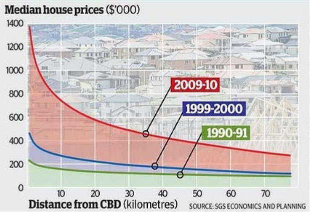
The chart shows prices of property versus distance from the Melbourne CBD for 3 different points in time shown by 3 lines. The lines show that suburbs are more expensive the closer they are to the CBD.
The green line shows the difference in prices across the city as they were back in 1990-1991. This was probably measured using median house prices of properties that sold during 1990 and 1991.
The blue line shows the same thing, but for a point in time 9 years later. You can see that across the city, prices have gone up regardless of how far a property was from the CBD. But the properties closer to the CBD (left side) went up by more than the properties far from the CBD (right side).
It was a similar story for the red line. This was measured ten years later using sales across 2009-2010.
Assessment
This is a better study because instead of cherry picking a handful of suburbs, we’re assuming they considered all suburbs within 80 kms from the Melbourne CBD. And secondly, instead of looking at only 1 timeframe, 2 timeframes are considered.
It looks like there are 3 timeframes because there are 3 lines on the chart. But the timeframe is represented by the gap between each line, so there are actually only 2.
- Good analysis methodology
- Large suburb count
- 2 timeframes
- Bad analysis methodology
- Only 1 city
- Not long enough periods
However, this is again only one city. And again, the timeframes are too short. We need longer timeframes and we need to include more cities while still examining a decent range of distances from the CBD.
My methodology
Here’s my own analysis which overcomes some of the prior studies’ shortcomings. I’m going to consider all cities around the country with a population of 1,000,000+. This gives us clear enough CBDs and loads of suburbs in each city – the vast majority of Australia’s properties, in fact.
Source: ABS 2018 Estimated Resident Population
The analysis must also cover multiple time-frames, especially long-term and multiple distances from the CBD.
What constitutes a ring?
Before going on I need to define what constitutes an inner ring? Past studies have assumed we all know what constitutes an “inner”, “middle” and “outer” ring.
But why choose 5km as a boundary and not 10, 7 or 3? So, to try and maintain a consistent and fair approach for each city, I’ve taken a slightly different approach.
- What is “inner”?
- Closest 10%
Instead of coming up with arbitrary distances in km from the CBD for each city, I’ve categorised a suburb as being within the inner ring if it is one of the closest 10% of suburbs to the CBD. I’ll clarify that later. But there’s another point to address.
Why did past studies choose only 2 rings: inner and outer? Surely 3 rings would be better: inner, middle and outer.
But why stop at 3? A clearer relationship can be established with more rings.
It will also show if there is no clear relationship.
Or it might show a sweet-spot like rings 3, 4 and 5.
So, in my research I split the suburbs up into 10 rings rather than 2 or 3. This way, we can chart the growth rates of each ring to see more clearly if there is a correlation.
If we have too many rings, the sample size in each ring gets too small and the results become unreliable. 10 seemed like a good number to establish a trend but it’s not too many to make any one ring too small – so long as we choose cities with sufficient suburb numbers.
- What is “inner”?
- Closest 10%
- How many rings?
- 10
Irregular shaped cities
And this approach easily handles cases where the shape of cities is not a perfect circle due to natural boundaries like mountains, rivers or the ocean.
This approach of using the closest 10%, works consistently for each city regardless of its size or shape and how that has changed over time.
Another benefit of this approach is that each ring will have roughly the same number of suburbs. This way it’s harder to argue that one ring’s growth calculations are less reliable than another’s. Although there is a bias, which I’ll cover later.
Also, because cities expand, what was considered outer ring decades ago, could now be considered middle ring. Using a decile approach means we can look at the same city across different time-frames and get a consistent result. We don’t have to guess where the “middle ring” was 30 years ago and shift the boundary for each ring for each time-frame.
Rings as deciles
You’ve probably heard of the first 25% of a data set being referred to as the first quartile. And the second 25% is called the second quartile. Well, when we break into 10 groups, the word used for each group is called a decile.
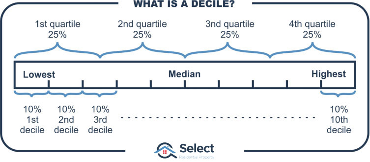
The closest 10% of the city’s suburbs to the CBD are in the first “decile”. Those suburbs that are in the furthest 10% are in the last decile, the 10th.
For example, since Sydney has around 700 suburbs, there are roughly 70 suburbs in each decile.
- 1stdecile
- BARANGAROO 1 km from CBD
- NORTH SYDNEY
- ROSE BAY 5 km from CBD
- …and many more
- 2nddecile
- BRONTE 6 km from CBD
- SUMMER HILL
- BALGOWLAH 9 km from CBD
- …and many more
- …more deciles
- 5thdecile
- DUNDAS 18 km from CBD
- THORNLEIGH
- CRONULLA 22 km from CBD
- …and many more
- 6thdecile
- WESTMEAD 22 km from CBD
- MENAI
- FAIRFIELD WEST 26 km from CBD
- …and many more
- …more deciles
- 9thdecile
- EAGLE VALE 41 km from CBD
- PITT TOWN
- PENRITH 49 km from CBD
- …and many more
- 10thdecile
- GLENMORE PARK 50 km from CBD
- BLAXLAND
- KATOOMBA 85 km from CBD
- Yeah Katoomba is now considered part of Sydney!
- …and many more
We can apply this decile approach to any city now and avoid arguments about the size of rings and what constitutes inner or outer.
I applied this approach to the top 5 largest cities in Australia. This list hasn’t changed a lot over the last few decades. Although Perth has been interesting.
All cities have a population of at least 1mil currently. By using more than one city, the discoveries will have wider applicability than just Melbourne for example.
Research results
Here’s what I found by examining growth data for the last 40 years.
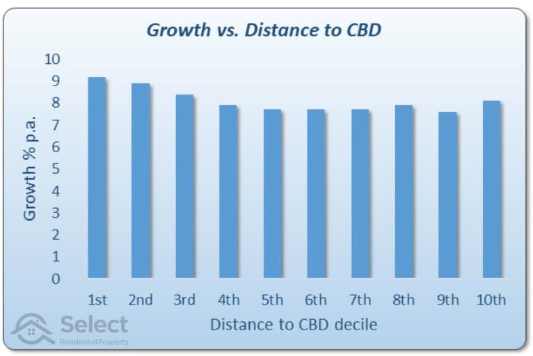
The axis at the bottom is the distance decile I explained earlier. The 1st decile is the one closest to the CBD which appears on the left of the chart.
The 10th decile is the furthest from the CBD and appears to the right of the chart. Each decile contains 10% of all a city’s suburbs. The cities examined included: Sydney, Melbourne, Brisbane, Perth & Adelaide.
Assessment
The outermost decile clearly underperformed the inner most. So, at first glance it appears as though there may be something in this tactic of buying closer to the CBD.
However, there are a couple of issues. Firstly, notice the trend of diminishing growth the further you are from the CBD. It stops about half way through the deciles. It could be argued that this tactic might only work when choosing between the inner rings.
Also, notice that most of the deciles had growth between 8% and 9%. That seems very high by today’s standard, especially over 40 years. I’m using the Core Logic 12-month medians dating back to 1980. Could our data have included an outlier era of abnormally high growth that favoured certain rings?
And remember what I said about when you set the start and finish line. We should have a look at the last 20 and 30 years. Anyway, 40 years is too long to wait for above average growth, especially if you’re planning on retiring early.
20-year growth
Growth versus distance from the CBD for the last 20 years looks like this:
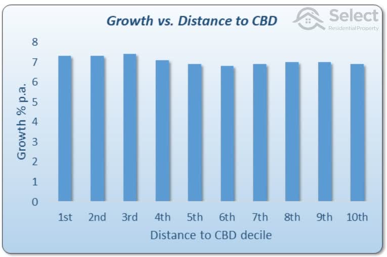
The 20-year comparison is a lot flatter. This is what we’d call a “statistically insignificant” correlation. The growth rates are all very similar. And more importantly, they’re all what we’d consider to be “normal” now days.
30-year growth
Growth versus distance from the CBD for the last 30 years looks like this:
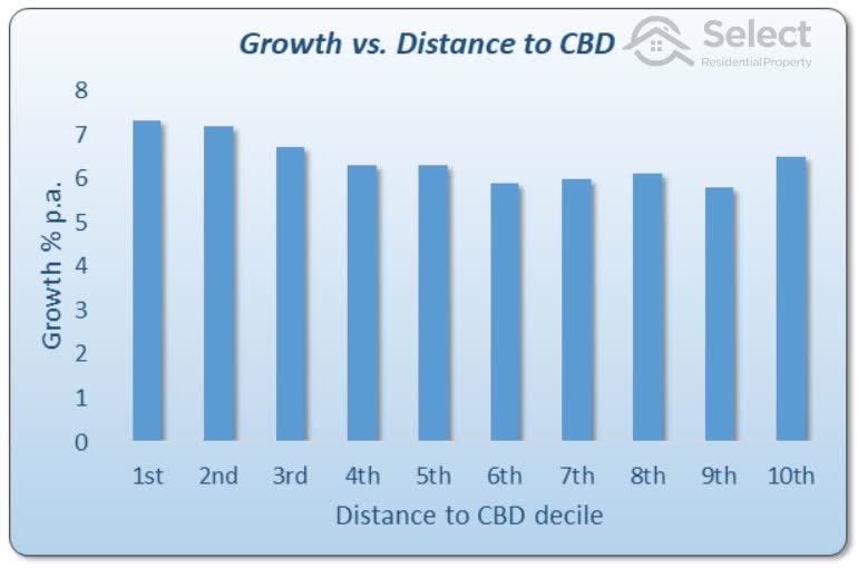
This chart shows there is actually a trend towards higher growth the closer to the CBD. But given how evenly we distributed suburbs; we can’t assume the 10th decile is an outlier. It’s beaten 6 of the other 9 deciles but is the furthest from the CBD. There could be more to the story than is told by these charts.
10-year growth
For completeness, here’s the same chart but covering the last 10 years.
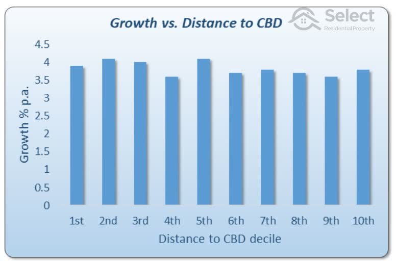
Again, the trend has reverted to being relatively flat and there are more inconsistencies like the middle ring being the best.
Changing the cities examined didn’t really alter the overall results. However, there may be some argument that specific cities have a closer relationship to CBD proximity and capital growth than others. It might come down to traffic congestion and the relative spread of amenities or jobs around the city. Some new infrastructure or jobs node might alter the course of growth.
But at this point examining different long-term periods, I have to admit that there might be a case for buying closer to the CBD. But there are some more issues that need to be addressed which places more doubt on the tactic.
Performance bias
There’s a fundamental problem with the way in which capital growth was calculated for the prior section. And there are a couple of other issues to consider too:
Subdivisions
Outer ring suburbs are more likely to have blocks of land undergo subdivision. This will skew the growth calculations for outer rings unfairly lower than for rings in which subdivision is less common.
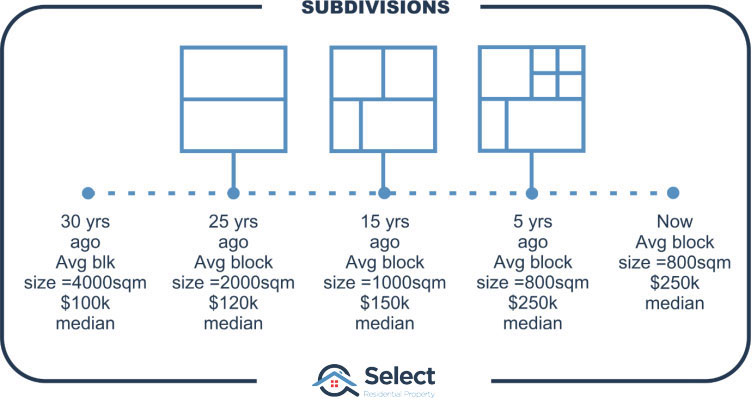
Fictitious case
Imagine an outer ring suburb 30 years ago where the average size per block was 4,000 square metres. This is enough space to fit half a dozen houses easily. Also, imagine the median for this outer ring suburb back then was $100,000.
Now if over the next 5 years these 4,000 sqm blocks were split in half, there’d be a suburb full of 2,000 sqm blocks. They should be almost half the value they were 5 years ago since they’ve been split in half. But imagine each new block has been serviced with sewerage, power and curbing – adding to their value. And there’d also be some capital growth on the land value too.
So it’s unlikely that splitting every $100k block in half would cause the median to drop to $50k. Assume each block is worth $120k five years later.
It looks like there’s been 20% capital growth, from $100k to $120k. But really the growth has been a lot more. If two 2,000 sqm properties were re-combined into one 4,000 sqm property again, the value might be $240k (= 2 x $120k). That’s 140% capital growth – a lot more than 20%!
Let’s say this process continues. Over the last 3 decades some blocks may have been subdivided a couple of times. The average block size may have come down to only 800 square metres and the median might now be $250,000.
Although this appears to be a 2.5 times increase in value over 30 years, it’s actually much better. If the properties had been kept at 4,000 square metres instead of being subdivided, they may be worth well over a million now. But because there are none left that big, it looks like there’s been less growth if we calculate growth using change in medians.
Subdivisions screw with median growth calcs
If the majority of properties in the outer-most decile were split in half only once sometime in the last 30 years, the median would be half what it would be if the majority weren’t subdivided. That’s a 100% difference in true total capital growth.
Assuming the outer-most ring was subdivided in this way, the true growth would be higher than every other decile.
Inner vs outer subdivisions
But what if inner ring suburbs underwent the same kind of subdivision?
Analysis I conducted of changes in block sizes over the last few years shows that the inner most decile has a fairly static block size. Over the last 4 years the median block size has dropped by only about 1% per annum country wide in inner decile suburbs.
Contrast this with the outer most decile which has had a block size reduction rate 5 times faster. Block sizes in the outer most ring were possibly 4 times larger 30 years ago. But the inner-most ring block sizes were only about 30% larger than what they are today.
- Inner decile 1% pa block size drop
- Outer decile 5% pa block size drop
- Outer decile blocks possibly 4 times larger 30 years ago
These are rough estimates, but show the extreme impact subdivision can have on value. Subdivisions artificially reduce the true median growth calculation. Areas with more subdivisions (i.e. outer areas) will have a falsely lower capital growth calculation.
Square metre land values
The best means therefore of comparing growth profiles of inner rings to outers is by examining the change in square metre land values. That way it doesn’t matter how big a block is or how many times it’s been subdivided over the years.
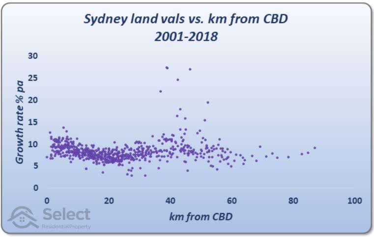
This chart is a scatter plot showing the growth in per square metre land values from 2001 to 2018. Each dot on the chart represents a suburb somewhere in Sydney.
The higher the dot, the more growth land values had in that suburb over the time-frame. Remember this growth is in per square metre land value. I’ve used the median per square metre land value for each suburb and I’ve eliminated all cases where there were less than 100 land valuations for the suburb.
If the dot was over to the left of the chart, it was for a suburb close to the CBD. Dots over to the right of the chart, represent a suburb far away from the CBD.
If proximity to the CBD meant faster growth in land values, then we’d expect the dots to be higher on the left of the chart, closer to the CBD. And we’d expect suburbs further from the CBD to have dots in the bottom right corner of the chart. But it doesn’t look like that’s the trend.
The overall trend
Speaking of trends, I’ve added one to the chart. It’s the dashed amber line. This is the line of best fit which runs through the centre of the dots.
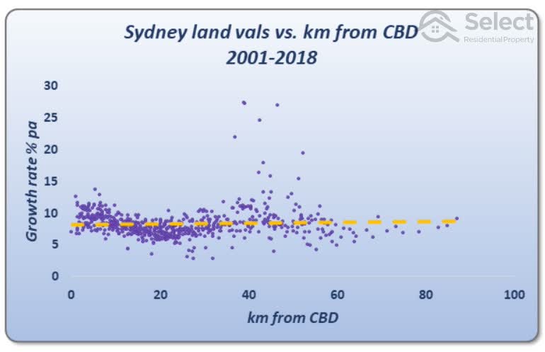
As you can see the trend line looks pretty flat. This adds more weight against the argument that proximity to the CBD is a growth driver. It didn’t really work out for Sydney over this time-frame according to change in per square metre values.
A closer look suggests there might be something we can use if we limit suburbs to the first 20km. But then why would it reverse for the next 20km? This kind of inconsistency hints at an unreliable trend.
Also, this data was for only one city and a relatively short time-frame. Unfortunately, data isn’t available for a much longer time-frame or for other cities.
BTW, land is the asset portion of a property while the dwelling/building is the liability. This is a very important concept for property investors. For more on that, check out these other topics in the series…
Aiming for lots of land misses the point
Avoid properties with high depreciation
Timing
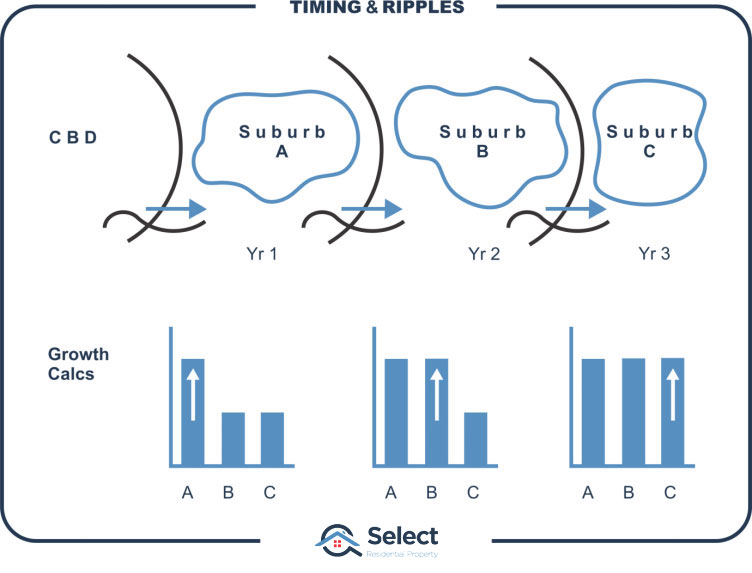
Another issue with the analysis is timing. Not all areas of a city grow at the same time.

Booms usually start in the city centre and ripple outwards. It can take a few years for the growth in the city centre to make its way to the outskirts. If measurement of the capital growth of inner ring suburbs over the last 30 years was performed at the end of an inner ring boom but before that boom had rippled into the outer ring suburbs, the figures would appear more favourable to the inner ring. Completing the calculations another year or two later could have a decidedly different result.
Some might argue that because the period of analysis is over a few decades, it covers multiple cycles and doesn’t matter. But that’s not true. It definitely does matter. This is because of the nature of compound growth:
“The vast majority of growth happens in the recent past.”
A 100-year-old property may double in value in the next 10 years.
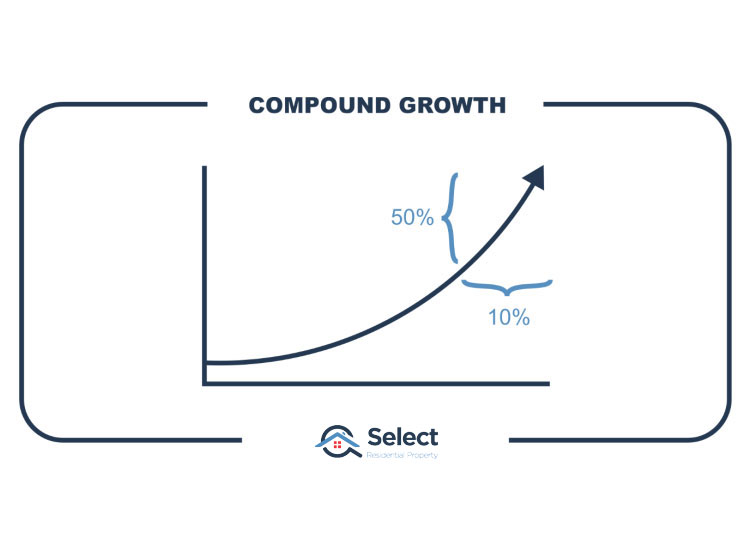
In other words, 50% of value comes from less than 10% of history. That’s why research on a single city may show completely different results. We need to cover a large number of cities in diverse stages of their cycles.
Yield
Another thing to consider is yield. There’s an inverse relationship between yields and distance from the CBD.
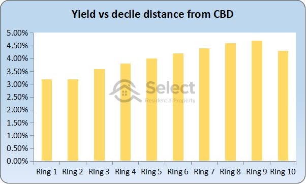
That is, the further away you are from the CBD, the higher the yields tend to be.
You can see in this chart that the suburbs closer to the CBD, to the left, have lower yields than the suburbs further away to the right. In fact, there’s 1.1% more rental income per annum in the outer most ring than there is in the inner most ring.
The relationship between yield and distance from the CBD is a lot clearer than the growth difference.
Issue summary:
- Subdivisions
- Not considered
- Unfair to outer rings
- Timing
- Measure growth at end of a full city cycle
- Or at the start
- But not in middle
- Yield
- Inner ring yields < outer ring yields
Other considerations
Overall, performance might have appeared slightly in favour of inner rings until subdivisions and yields were considered. To further complicate the comparison there are some non-performance related factors to consider, like:
Risk
Inner ring suburbs have more expensive properties than in the outer rings. More expensive properties have been shown to be more volatile than cheaper ones as this chart shows.
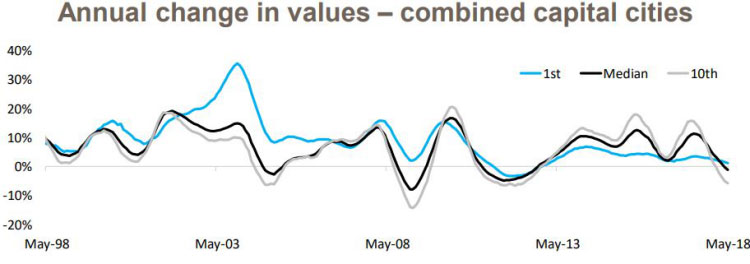
This chart comes from Core Logic’s decile report. They’ve plotted the growth of the top 10% most expensive property markets in each capital city. That’s the grey line. They’ve also plotted the growth profile of the cheapest 10% of property markets in all the state capitals, that’s the blue line. The black line is the combined capitals median growth rate. The data covers a 20-year period.
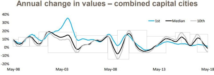
In the following copy of this chart, I’ve boxed each period from peak to trough for the expensive areas which are shown in grey.
I’ve also boxed each period from peak to trough for the cheap areas which are shown in blue below.
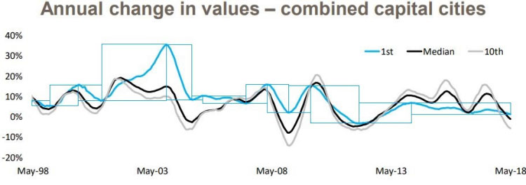
Although there are some exceptions, in most cases, you can see that the grey boxes are taller than the blue boxes. In most cycles, the grey line has had higher peaks and lower troughs than the blue line.
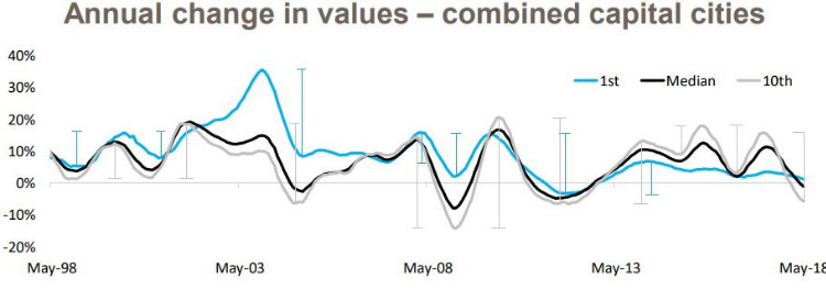
This means that the more expensive property markets, closer to the CBD are more volatile. Volatility is a measure of risk. The more volatile a market is, the riskier it is considered to be.
Also, the chart shows that negative growth is more common in expensive markets than in cheaper ones.
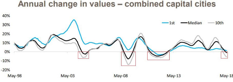
Out of the 4 cases when prices went backwards, expensive markets had the worst growth. Cheaper markets actually missed negative growth in 3 of those 4 cases.
Diversification
Diversification is another weapon an investor can use against risk. Instead of spending $2m on an inner ring property with all your eggs in that one basket, you could spread the eggs around into 2 properties in different suburbs of a middle ring. They could even be in different cities.
- Risk
- Inner rings are more volatile
- They fall the most in recessions
- And inner rings don’t allow for diversification
Flexibility
There might be a case where you need to sell your property. You might not need all the sale proceeds, but you can’t sell half the property.
A single expensive property prevents you from being able to sell down a portion. A couple of cheaper properties, gives you the option to offload just one.
Capital Gains Tax (CGT)
If the occasion arose to sell your property, you would have to pay CGT. The CGT would be based on your marginal tax rate for the year in which you sold the property.
If you had instead bought 2 properties at half the price, you could sell one on June 30 of one financial year and the other a day later in the next financial year. This might significantly reduce the overall CGT paid for owners not in the top tax bracket.
Stamp duty
Stamp duty is based on property price. Most states have bracketed stamp duties – the more expensive properties have higher stamp duty rates than cheaper ones.
Buying closer to the CBD, you’d pay more in stamp duty than buying 2 cheaper properties further from the CBD. Long-term though, stamp duty is virtually inconsequential.
Timing entry
Ideally, you want to buy just before prices start their next growth phase. When a city-wide boom happens, it starts from the centre and ripples outwards. You have the recent 6 to 24 months of inner ring price growth history to view. You can use it to time entry into a middle ring suburb. But there’s no such cue for when inner rings start booming.
- Timing entry
- Easier for middle and outer rings
- Harder for inner rings
Suitability
An investor’s ideal market is:
- Low risk
- High growth
- High yield
Usually, an investor must pick what is most important for them at a certain stage in their life. For those nearing retirement, for example, low risk will be a high priority. Similarly, a high yield will be important to cash-flow their retirement lifestyle.
- Low risk
- High growth
- High yield
At the other end of the spectrum, younger investors that are building equity will consider growth to be more important.
- Low risk
- High growth
- High yield
Ironically, older investors are more capable of buying in the more expensive inner rings because they usually have so much more equity. But they’re the investors more likely to want cash-flow to fund their retirement. And inner rings have the lowest yields.
Younger investors on the other hand will not be able to afford inner ring suburbs, but they might be in a better position to cope well with cash-flow losses and with more time to recover from periods of worse negative growth.
For the majority of property investors, inner rings will be a less suitable choice for their current stage of life.
Opportunity
Inner ring markets lack the ability to change rapidly. Inner ring markets have everything they need already: transport nodes, shops, work centres, etc. They have already fully gentrified. They are unlikely to go through a significant change that spikes their growth rate.
Outer ring suburbs may have nothing to begin with. But the extension of a train line, for example, may dramatically improve growth prospects.
Other considerations summary:
- Risk
- Inner rings are more volatile
- They fall more during recessions
- And inner rings are more expensive, making diversification harder
- Flexibility
- You can’t sell half an expensive property like you can sell 1 of 2 cheaper properties
- CGT
- Two cheaper properties allow an investor to time exit for lower CGT liability
- Stamp duty
- Stamp duty is charged at higher rates for more expensive properties
- Timing
- Inner rings start the boom, cueing middle and outer rings
- No cue to time entry into inner rings
- Suitability
- Inner rings too expensive for young investors
- Inner rings have poor yields
- Risk is no good for retirees
- Opportunity
- Outer rings can gentrify
- Inner rings already have
Will past performance be repeated?
Just because a location had outstanding prior capital growth doesn’t mean it will continue to have such growth into the future. In fact, the more years of above average growth a property market experiences, the more likely the next years will be below average. See the Apples & Oranges presentation in this series for an explanation.
How come inner ring markets are more expensive?
Ok, so if inner ring suburb performance is not so good, then how did the inner rings get so expensive?
There are two simple explanations:
- Started expensive
- Longer history
Inner ring suburbs have always been more expensive. It wasn’t because of superior growth. Over the years, they have simply maintained the same percentage difference in values compared to suburbs further away.
The other option is they started growing sooner. 50 years ago, there weren’t suburbs in the outer ring. It was farmland. Their capital growth started when land was cleared and a new estate was created and it was given a suburb name.
Just because inner ring suburbs are more expensive, doesn’t mean they have had superior historical growth.
Filters and calculations
I’ve added this section for those interested in the calculations and filters I’ve applied. Skip ahead to the conclusion if that doesn’t interest you.
All data for suburb price growth calcs was based on Core Logic 12-month medians (sales over a 12-month period). And there had to be at least 24 sales over that period.
I only considered suburbs with at least 500 houses and only those within significant urban areas with a population of 1 mil or more.
I excluded suburbs whose growth rates were unrealistic. Over a 40-year period negative growth is highly unrealistic as is 15%pa.
The growth for unit markets was excluded from consideration on the assumption that unit markets are not a good representation of price in most middle and outer ring suburbs. Interestingly though, when I threw units into the mix, the trend line was almost dead flat.
For the growth in Sydney land values I used Valuer General data. I based growth calcs on change in per square metre values over that period using land valuations and parcel sizes.
I also ignored properties with block sizes smaller than 100 square metres and those greater than 100,000 square metres. And I excluded land values less than $10,000 or more than $10 mil.
Conclusion
Past reports suggesting properties closer to the CBD outperform those further away have been flawed. The data hints there might be something in it, but there are issues with growth calculations caused by subdivisions. There are other negatives with the strategy – like volatility, diversification and yield. Overall, there are more important tactics investors should focus on to beat the averages. CBD proximity is largely over-rated.
In summary,
- Past reports flawed
- Tenuous claims
- Mild relationship
- Better decisions to focus on
- Unsuitable strategy for majority
Thanks for reading this far. For more supporting info, check out some of the other topics in this series I mentioned earlier. Another one that might interest you is: